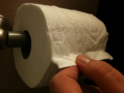
This just in from the Department of Usability Improvements in The Most Unusual Places: the manufacturer of this toilet paper has come up with an ingenious design for indicating where the roll “starts:” at the point where the end of the paper trail is glued on, this roll sports a little fold.
This fold makes it easy to see where the roll starts, and pulling on the fold conveniently breaks the glue bond.
What’s more, the fold can also be easily found by groping around for it. This not only makes it easier to use for the vision-impaired, but also improves its usability when used in one of the enclosed multi-roll dispensers often found in public restrooms.
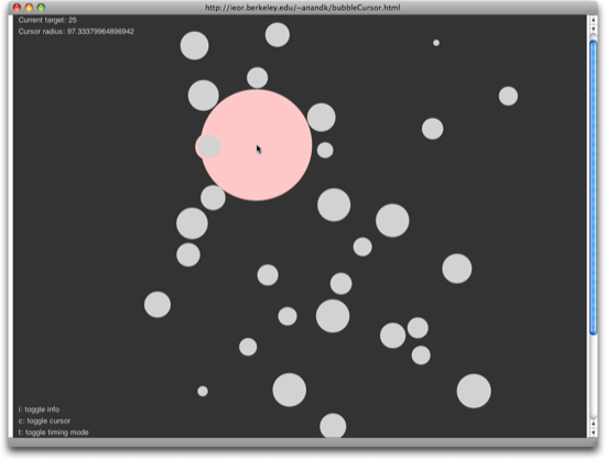
Anand Kulkarni has developed an interesting and fun demo of the bubble cursor, a UI concept conceived by Tovi Grossman and Ravin Balakrishnan.
Standard mouse pointers usually have just a single-pixel “hot spot.” It is this single pixel’s position that determines which UI element receives the click when the user presses a mouse (or trackpad, etc.) button. Because of the hot spot’s tiny size, it requires precision to hit a specific target on screen, especially if the target is small, too.1
Grossman and Balakrishnan address this problem by expanding the cursor’s “hot spot” to a circular “hot area.” The area’s size dynamically adapts to the cursor’s position in relation to nearby UI widgets so that, at any given time, exactly one widget is selected as the click target.
Grossman’s and Balakrishnan’s 2005 CHI paper (1.1MB PDF) explains the idea in detail and contains research which shows that the bubble cursor is consistently more effective than single-pixel and fixed-size area cursors.
Unfortunately, though, you cannot disable or modify the area indicator around the cursor. It would be interesting to see whether changing the area indicator influences the feel of using the bubble cursor and, if so, in what way. I’d especially like to try out the demo without any visual feedback except highlighting of the current click target.
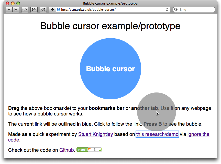
Update 2010-10-05: Stuart Knightley has implemented the bubble cursor as a JavaScript bookmarklet that works with just about any webpage, so you can test this interaction concept in a real-life setting. As an extra feature not included in Kulkarni’s demo, this bookmarklet lets you toggle the display of the cursor’s click area.
When I decided to submit my first-ever Ignite presentation, I knew from the start that it would be about usability. After juggling a few topics for Ignite Fort Collins #6, I settled on “How Gestalt Psychology Can Help You Make Better High-Tech Purchasing Decisions.”
With only twenty slides and five minutes available per talk, you can barely begin to scratch the surface of something like Gestalt Theory. But five minutes do suffice to grab some of your audience’s mindshare and get them interested in learning more about your topic.
Which is where this blog post comes in, whose link is conveniently featured on the last slide of my talk.
How to gauge a product’s usability before you buy
The motivation behind the talk is to get average customers interested in the topic of usability. Why is it that similar products can provide very different user experiences? What is it that makes a product easy to use? How can I tell if a product will be easy to use before making a purchasing decision?
If this is something that interests you, my article, “The Ten Rules for Usable Technology,” is for you. It explains what good usability is, and how you can apply a set of simple rules to gauging a product’s ease-of-use before you part with your money.
More on Gestalt Theory
While the Gestalt Laws presented in my talk — Closure, Similarity, Proximity — are among the most important ones, Gestalt Theory extends way beyond these three. To learn more about this subject, here are three starting points for your intellectual journey.
Wikipedia’s article on Gestalt Psychology provides a concise overview over the topic including its history, fundamental principles, and the people behind it.
As I said in my presentation, there is no excuse for technology being difficult to use.
Usability has been a subject of scientific research for decades. Just being aware of something as — surprisingly intuitive — as the Gestalt Laws should enable product designers to make every one of their creations reasonably easy to use.
And yet, the spectrum of badly designed products ranges from simple alarm clocks that make it a pain to set the alarm time, all the way to smart phones that hide the number pad so successfully that average users have a hard time making a phone call…
By refusing to buy products that are difficult to use, every one of us can contribute to putting the pressure on high-tech companies and convince them of the value of good, human-oriented design.