One week ago today, Apple held a press event called “Back to the Mac.” One of the highlights of this presentation was a first sneak peek at the next release of the Mac OS X operating system, Mac OS X 10.7 “Lion.”
Among Lion’s new features is FaceTime for Mac, an application that lets you make video calls to other Macs as well as iOS devices that are equipped with a “FaceTime camera,” like the iPhone 4 or the iPod touch.
Apple is offering a public beta version of FaceTime, so you can take the software for a test-drive right now. TidBITS’ Glenn Fleishman has done so and offers a hands-on overview of the software.
What you will read below, though, are a few observations about very odd design decisions in FaceTime. This is not about FaceTime’s iOS-inspired appearance, which is acceptable since a number of Apple applications, like Logic, Final Cut, or iTunes, sport a non-standard look-and-feel.
This is about how FaceTime behaves.
The unpredictability of a FaceTime call
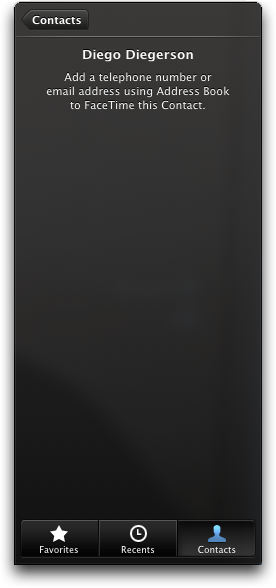
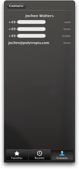
FaceTime compiles its own list of Contacts from, and keeps them synchronized with your Address Book database. Contacts in FaceTime only list phone numbers and email addresses, because that is how other FaceTime users are identified.
To make a call in FaceTime, you click a name in the Contacts list. This single click can trigger one of three actions: If the selected contact contains…
-
… no phone numbers or email addresses, FaceTime will ask you to add the required information in Address Book. Unfortunately, there is no button to go directly to the contact’s Address Book card from FaceTime. (Are they really using “FaceTime” as a verb here?)
-
… a single phone number or email address, FaceTime will initiate a call.
-
… multiple phone numbers and/or email addresses, a dialog panel comes up so you can pick which number or address to call.
Technically, the FaceTime application cannot predict whether an email address or phone number can actually accept a FaceTime call until you try placing an actual call to that contact. If the call fails, FaceTime notifies you that the contact “is not available for FaceTime.”

Unfortunately, the same message is used when you call someone who can take FaceTime calls, but just happens to be unavailable at that moment. Hence, it takes a successful call to verify that a contact is, indeed, reachable on FaceTime.
The only way to track successful calls is in the application’s Favorites list: A camera icon that is displayed next to each contact initially displays a question mark. That question mark disappears after you successfully called that person.
The Contacts list does not display any such visual cue, though.
Adding Favorites the hard way
You can “favorite” contacts via the Plus button in the Favorites panel or through the Add to Favorites button in a contact in the Recents list.
Clicking the Plus button in the Favorites panel brings up the Contacts list, and you “favorite” a phone number or email address by clicking it. After each selection, the list disappears and you’re taken back to the Favorites panel.
Contacts that are listed in Recents can be handled more conveniently, as they provide an Add to Favorites button. Click the button to bring up a contact, click a number or address in their details panel, and the new favorite will be indicated by a blue star next to it.
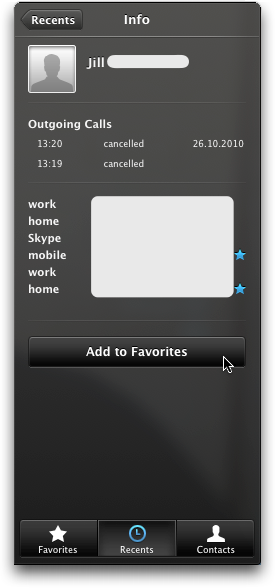
Interestingly, the Add to Favorites button is not included in the Contacts list, and neither are the blue stars.
Overall, adding or removing entries from the Favorites list seems unnecessarily tedious. This process would be so much easier if you could click a star next to a number or address right inside the Contacts list to toggle it on or off. And this could even be implemented in addition to the two processes outlined above.
Search the Contacts list? Well, kinda.
If you want to jump to a specific name in the Contacts list, you can do so by typing the name’s first few letters. What you type will be matched against the full names, starting from the beginning.
If the full name you are looking for includes a first name or an academic title, you need to include that in your “search.” Hence, you cannot search for someone whose last name is “Jones” simply by typing “Jo.”
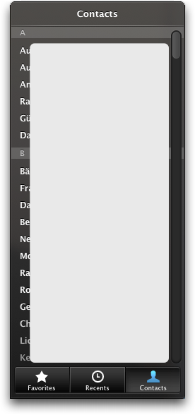
Consequently, it is often quicker to manually browse the Contacts for a name. If you have several hundreds or even thousands of addresses, though, this shortcoming in FaceTime may cause you quite a bit of grief and anger.
It boggles the mind why, if so many design ideas were adopted from the iPhone, the FaceTime developers did not to also bring over the simple and effective search field that is found in the iPhone’s Phone or Contacts applications.
Keyboard shortcuts? Yeah, a few.
Besides scrolling with the mouse, the Contacts list can be navigated with the Arrow keys. The Arrow Up and Arrow Down keys step through the list, one contact at a time, or take you to the first and last list entries when used in combination with the Alt key. There does not seem to be a way to scroll page by page, though.
Pressing the Return key when a name is selected triggers one of the three actions explained earlier for mouse clicks. As soon as you are taken to a contact’s details, however, you’re stuck. While you can use the Arrow keys to select an email address or phone number in the details panel, hitting Return at this point doesn’t do anything.
To get back to the Contacts list, you must click the Contacts button — neither the Escape key, nor any combination of Arrow and modifier keys show any effect in this situation, either.
The disregard for keyboard shortcuts is not limited to the Contacts list, but is evident throughout the entire application. It’s no surprise, then, that activating Full Keyboard Access for use as an assistive technology is pointless, as well.
In its current version, a mouse or trackpad is an absolute requirement for using the FaceTime software. As a sad consequence, for people with physical disabilities, for whom FaceTime would be a wonderful communication tool, the application may be literally inaccessible.
To add insult to injury, a few useful keyboard shortcuts that do exist remain undocumented: pressing Command-1, Command-2, or Command-3 will take you to the Favorites, Recents, or Contacts lists, respectively. These shortcuts could have been “advertised” in a View menu, inside tooltips for the buttons, or via the online help. Instead, you can only find them via trial-and-error or by sheer coincidence.
Forcing iOS behavior down Mac users’ throats
Mac OS X provides a wonderfully simple and effective UI element for maintaining lists. It has intuitive Plus, Minus, and Pen buttons for adding, deleting, or editing list items; re-sorting items is as easy as dragging them around with the mouse; and the delete and re-sort operations even work with multiple items at a time.
And yet, the FaceTime developers decided to adopt the iOS way of managing the list of Favorites. Before you can delete or re-sort Favorites, you need to activate an Edit mode, in which the list looks and feels exactly like a list on an iOS device.
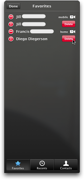
The only apparent difference between the implementation in FaceTime for Mac and its counterpart on an iPhone is that, in the former, you can “arm” multiple items for deletion. Clicking the Delete buttons will still only delete the contact that it is associated with.
As expected by now, pressing the Backspace or Delete buttons does not do anything in this panel, and pressing Escape fails to leave the Edit mode. Press Return, however and you place a call to the selected contact — what doesn’t work in the Contacts list where it should, will work just fine while you’re in Edit mode in the Favorites list…
Similar usage idiosyncrasies are found in other places, e.g., in the form for creating a new Apple ID (whose credentials you use to sign into FaceTime) from inside the FaceTime application.
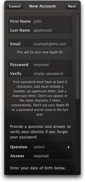
This form does support jumping from field to field by hitting the Tab key, but the currently selected field is not highlighted properly. While a blinking cursor in a text field provides a decent clue, the popup menus leave you guessing. Note how the popup menus open without the respective field being highlighted at all:
The [Secret] Question field is skipped when tabbing, so, again, you have to resort to the mouse or trackpad to access a specific UI element. This also applies to the actual selection, as there is no keyboard support inside the Question panel or for leaving it.

Had the developers opted for a popup menu for the Question, interacting with one UI element — the popup menu — would have sufficed; now it requires interactions with three — the Question button, the list of questions, and the Cancel or Done button.
By the way, did you notice that you can resize the FaceTime window? Although the resize widget’s familiar diagonal stripes never appear, you can drag the bottom-right corner of the FaceTime window.
Temporarily pulling the plug on FaceTime
According to the FaceTime webpage, “[w]henever someone tries to reach you, the call rings through on every Mac you own even if FaceTime isn’t running.” While this is handy, you may sometimes want to prevent others from reaching you so you can focus on your work, etc.
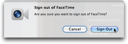
To “silence” FaceTime, you can use the Sign Out command found in the FaceTime menu, and this command even has a handy keyboard shortcut. When you do sign out, though, your account settings as well as the entries in your Favorites and Recents lists are lost — a consequence that the Sign Out alert fails to mention.
A better option is to toggle the FaceTime On/Off switch which is located in the preferences panel, and only in the preferences panel.

This dichotomy between “harmless on/off switch hidden inside the preferences” and “command that throws away your data and is easily accessible via menu item or keyboard shortcut” does not make sense.
It rather feels like a design error in that the FaceTime On/Off functionality is the one that should have its own item in the FaceTime menu, and the sign out command should be hidden in the prefs.
Facing the future of OS X software
When I see the “beta” label attached to a piece of software, I expect that application to be essentially complete in terms of features, looks, and interactions. Betas are for crushing remaining bugs and for applying that final splash of polish to minor details in the UI.
When Apple offers a public beta, that usually is what you get, so what about all these weird details in FaceTime? Those gaping holes in the list of keyboard shortcuts are easily fixed and may have resulted from rushing this public beta out the door.
FaceTime’s adaptation of many UI elements and interactions from iOS, however, cannot be dismissed as mishaps. This is especially true for the Favorites list, which would easily win Most Irrational Design Decision of the Year, if such an award existed.
Who knows, maybe Apple decided to implant these designs into Macintosh software to support users of iOS devices who want to move from a Windows box to a Mac, and who may appreciate that the newly encountered Mac feels reassuringly similar to their familiar iPhone or iPod touch.
Would that be an acceptable rationale for almost totally stripping a high-profile Mac OS X application of it’s “Mac-ness,” though? No, definitely not.
Mind you, I really like the functionality of FaceTime, but — truth be told — for the first time since Mac OS X was introduced some ten years ago, I am getting worried about the future of my favorite OS’ look and feel.
Here’s hoping that the big cat with the furry hairdo will show that these worries are unjustified.
Update 2011-06-11: FaceTime was officially released in February 2011, and some user interface details differ from the public beta version. You can find out more about this in “A Minor Face-Lift for FaceTime“.