Evangelizing Usability at Ignite

When I decided to submit my first-ever Ignite presentation, I knew from the start that it would be about usability. After juggling a few topics for Ignite Fort Collins #6, I settled on “How Gestalt Psychology Can Help You Make Better High-Tech Purchasing Decisions.”

With only twenty slides and five minutes available per talk, you can barely begin to scratch the surface of something like Gestalt Theory. But five minutes do suffice to grab some of your audience’s mindshare and get them interested in learning more about your topic.

Which is where this blog post comes in, whose link is conveniently featured on the last slide of my talk.

How to gauge a product’s usability before you buy

The motivation behind the talk is to get average customers interested in the topic of usability. Why is it that similar products can provide very different user experiences? What is it that makes a product easy to use? How can I tell if a product will be easy to use before making a purchasing decision?

If this is something that interests you, my article, “The Ten Rules for Usable Technology,” is for you. It explains what good usability is, and how you can apply a set of simple rules to gauging a product’s ease-of-use before you part with your money.

More on Gestalt Theory

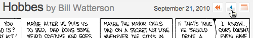
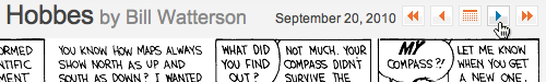
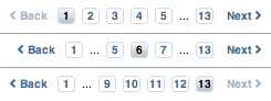
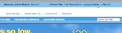
While the Gestalt Laws presented in my talk — Closure, Similarity, Proximity — are among the most important ones, Gestalt Theory extends way beyond these three. To learn more about this subject, here are three starting points for your intellectual journey.

A great introduction, presenting further Gestalt Laws, is presented in the first 45 minutes of this video from the Designing Interactive Systems 1 course from RWTH Aachen University.

Wikipedia’s article on Gestalt Psychology provides a concise overview over the topic including its history, fundamental principles, and the people behind it.

If you’re a designer who would like to get a feel for how to apply the Gestalt Laws to your work, read “The Rules of The Gestalt Theory And How To Apply It to Your Graphic Design Layouts” at the The All Graphics Design blog. This article also features lots of great example images.

Let’s put the pressure on

As I said in my presentation, there is no excuse for technology being difficult to use.

Usability has been a subject of scientific research for decades. Just being aware of something as — surprisingly intuitive — as the Gestalt Laws should enable product designers to make every one of their creations reasonably easy to use.

And yet, the spectrum of badly designed products ranges from simple alarm clocks that make it a pain to set the alarm time, all the way to smart phones that hide the number pad so successfully that average users have a hard time making a phone call…

By refusing to buy products that are difficult to use, every one of us can contribute to putting the pressure on high-tech companies and convince them of the value of good, human-oriented design.

Update 2010-09-24: Added YouTube video.

Don’t Move That Control!

Bill Waterson’s “Calvin and Hobbes” has been one of my favorite comic strips for years. Although I have quite a few of their wonderful books in my dead-tree library at home, in weak workday moments devoid of self-discipline, I sometimes check out the comic’s online version.

When I did so today, I noticed something odd: somewhat absentmindedly and occupied with other trains of thought, I repeatedly clicked on (what I assumed was) the “previous comic” navigation button.

Until, that is, I realized that, instead of moving backwards through older comic strips, I was actually going back and forth between only two of them. The reason? Bad UI design.1

When you point your web browser to the generic web link http://www.gocomics.com/calvinandhobbes, the website displays the most recent comic strip — you’re at the “end” of the publishing timeline. There are no more-recent comics than the one shown.

Consequently, the designer decided that not to display the navigation controls for moving “forward” along the comic’s timeline: the only available controls are for moving to the very first Calvin & Hobbes comic; for moving to the previous comic; and for bringing up a calendar widget.

As soon as you move to the previous comic, however, you also need controls for moving to the next strip, as well as for moving to the most-recently published one. The designer (correctly) placed these to the right of the calendar view to balance out the “first” and “previous” buttons.

Because the navigation buttons are right-aligned with the comic strip, though, the button for “next comic” ends up in the exact position that was occupied by the “previous comic” button before.

Unless you make up for this shift by moving the mouse pointer, you click on “next,” then “previous,” then “next” again, then “previous” again, and so forth.

Don’t hide. De-activate!

Just like in native software applications, unavailable UI widgets on web pages should be represented by grayed-out, un-clickable placeholders. That way, all controls remain in their original place at all times.

When implementing such a navigation widget, however, designers need to make sure that the whole group renders properly for all navigation states.

Here’s why that is important: the page navigation for Customer Reviews on the iTunes Store does use “de-activated” widgets for “previous” and “next” links. The ellipsis graphic is slightly narrower than the number buttons, though. As a result, when an ellipsis is displayed, the alignment of the buttons is slightly off. In case of two ellipses being shown, the “back” link slightly moves position, as well.


  1. Admittedly, my absentmindedness played a big role here, too, of course. I dare say, however, that this does not make the design any less problematic. 

More on Missing Airline Reward Miles

In my last blog post, “In Search of Missing Airline Reward Miles,” I had taken a closer look at how to claim uncredited miles via an airline’s website. Objects under test were Lufthansa’s Miles & More and British Airways’ Executive Club programs.

Since then, I have signed up for another loyalty program, called EarlyReturns, and offered by Denver-based Frontier Airlines. Before signing up, I had already flown with Frontier a few times. Using the boarding stubs from these flights, I had the opportunity to see how Frontier’s process for claiming uncredited miles stacks up against BA’s and Lufthansa’s.

Finding the claim form

The login form for the the Frontier Airlines website is located at the top edge of the site’s home page. Once the login process is completed, your name and a list of four links appear in the login form’s place. All four links are relevant to your user account: Redeem Miles, My Reservations, Account Activity, and Sign Out.

During my testing of the Lufthansa and BA websites, I had assumed that what I was looking for — namely some link or help related to claiming uncredited miles — would be located on the account statement page. So, I clicked on Account Activity.

At first sight, the Account Activity page looks a bit cluttered, which is mainly due to the fact that four separate navigation menus are spread around the page.

The Account Activity Summary section, however, provides a concise overview over your EarlyReturns membership level2, the date of last activity, your current milage balance, and — placed prominently right beneath the balance — there is the line: “Missing Miles? > Contact us”.

Although the wording is extremely concise, it is instantly understandable what “Missing Miles? > Contact us” means, and the link is located just where you would most expect and need it. What’s more, even on monitors with an 800×600 resolution, that line is above the fold and, thus, within direct view.

Submitting the flight details

What you see when you click the “Contact Us” link comes as a bit of a surprise: instead of a form for entering flight details, the page contains Frontier’s phone number, and their postal and email addresses3.

On the one hand, it is a nice touch that Frontier offers humans as first-level customer support contacts instead of requiring its passengers to tediously enter flight details into a more or less well-designed form.

On the other hand, though, the contact page does not state what information Frontier requires to process a mileage claim. Is the ticket number sufficient, or do I have to include more details like the route, date, etc.?

Getting help

The website’s EarlyReturns FAQs help pages provide more information on this. A link to a page with these FAQs is found in the lower right-hand corner of the Contact Us page.

Among the questions is one that is titled “Can I get credit for a previous flight if I am a new or existing EarlyReturns® member?” The answer to this question clearly explains how you can claim missing miles: mail in the ticket stubs or send them an email with your membership number and the “13 digit e-ticket number starting with ‘422’.”

Admittedly, the FAQ page for the EarlyReturns program is very long, so it will take a while to find this specific question. But with a bit of patience, finding the required information is simple, because the link to the FAQ page is in a prominent place; the relevant question is properly phrased; and the help text is concise, to the point, free of distracting marketing babble, and it contains exactly what you need to know.

And yet, this information would be even more useful if it were placed directly on the EarlyReturns contact page, so you would not have to go hunting for it in the first place.

Receiving my mileage credit

It took Frontier less than an hour to reply to my email in which I had sent them the details of my flights. In their reply, they promised that the “new balance will be reflected online in 24 to 48 hours.” The miles showed up in my account within little less than a day.

Kudos to Frontier for handling this process so much more customer-friendly than (at least) one of their major, global-carrier competitors!


  1. There are three membership levels in the EarlyReturns program, and their names are “Base,” “Ascent,” and “Summit.” I love it how Frontier applies its Rocky Mountains marketing theme even to these kinds of details. 

  2. It certainly does boggle the mind that this email address is not a clickable link.