Most mobile phone applications access or synchronize at least some data via the internet. If this connectivity is not available — for example, if you’re in an area that has flaky mobile service coverage –, some apps start behaving in “interesting” ways.
To explore this further, I unplugged my home modem’s WAN cable (which stands for “Wide Area Network” and, in this case, refers to the internet at-large), so the phone could still connect to our wireless base station. What the device cannot do in this situation, is deduce the connectivity problem from a system setting, as would be the case if I had activated its airplane mode.
ams Formel 1
This app is a front-end for accessing Formula 1 racing news provided by German car magazine, auto motor und sport. If there is a connectivity issue, the app displays a meaningful error message at the top of the screen just seconds after launch (“Data could not be loaded. Please check your connection. Tap to retry.”).

Because the message is anchored in place on the page, it never gets into the way of accessing any cached content like recent news articles, race track information, and the season’s schedule. And since the message is not contained in a modal dialog box, you don’t have to dismiss it before you can access that content, either.
On pages whose content has not been cached, the screen stays blank and shows an easy-to-understand message. (“This page is not available. — [Load Again] — [Details]”)

A somewhat more extensive help text near the bottom of the page can be summoned by tapping Details, which link could use a bit of affordance TLC. I also wish the developers would have translated the technical error message including an error code into a more user-friendly message. Overall, though, the system feedback is solid and reliable.
Apple App Store
Right after launch, the app tries to access the server (as you can tell from the network activity spinner at the top of the screen), but the page remains completely blank, so it’s hard to tell what is going on.

Only after a long delay does a terse error message appear. Even that notice failed to appear reliably during my testing, however.

The Purchases screen displays the list of all of your applications. Both the download and open buttons are active.
If you try to install an application by tapping its download button, the standard progress animation starts, but the icon simply returns to its default idle status after a while. The application does not display an error message.
Apple Mail
Mail clearly indicates at the bottom of the screen when it is trying to download new messages.
Eventually, though, it just reverts to displaying the time of the last email update while, interestingly, the data progress spinner next to the wifi icon keeps on spinning.

Nothing in Mail’s user interface hints at a network problem.
Apple Weather
You can swipe through all locations, but the pages are blank except for the location name.

No error message appears.
Avis [car rental]
Right after launch, the app does not seem to try to connect at all. Once you enter data into a form that requires communication with the server, however, a (custom, car-shaped) progress indicator appears. It takes a long time until the connection attempt times out and an error dialog pops up.
Thankfully, the progress indicator does not block the application, so you can navigate back to the home page if you run out of patience before the error message appears.
Other locations in the app potentially confuse the user with less accurate errors like the one you’ll saw after tapping Find more locations near:….
A reassuring feature is that both the Call Roadside Assistance and Customer Assistance functions, which are located on the app’s home screen, bring up dialog boxes from which you can easily contact the company in case of an emergency.

Note the very thoughtful writing which clearly sets the expectation for what will happen when you hit the confirmation button, and how the Call label neatly ties to the word “Call” in the dialog box’s title.
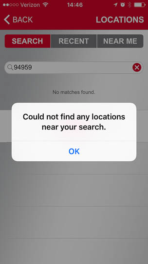
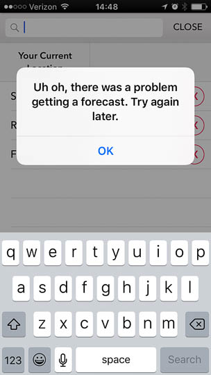
Dark Sky
Quickly after launching and presenting its “Current Location” screen, Dark Sky displays an error message and changes to the location search screen. The message text is rather cryptic, and does not hint at the actual networking problem.
(Please allow me to insert a quick rant here. I’m sure designers have the best of intentions when they start an error message with “oops,” “uh oh,” etc. Running into an error message is never fun, though, so when it does happen, my tolerance for cuteness is rather low. An attitude that I know most of my friends share, as well. So please only use “oops” and its brethren if you’re designing a user interface for children. Seriously.)
After selecting a stored location from the list, a different but similarly confusing error message pops up:
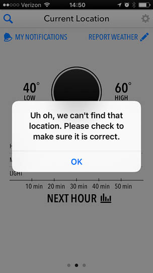
Dismiss the second error dialog box, and the app will resort back to “Current Location,” and although it cannot actually update its data, it will still display (placeholder?) values for low and high temperature.
The app does not prevent you from navigating between its map view (which is absolutely gorgeous when filled with data), the weekly forecast screen, and the somewhat hidden extras page. (To see the latter, tap any of the three temperatures on the main screen).

With the exception of a few, non-functional controls, all of these pages are blank.
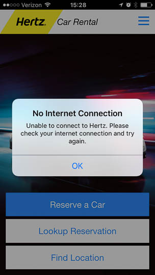
Hertz [car rental]
The app will launch normally, but once you tap a button on the main screen, a progress spinner will appear. After a pleasantly short wait time, a perfectly phrased connection error message pops up.
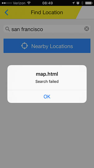
Once you dismiss the error dialog, you can still fully navigate the application, even though some key functionality fails silently. For example, when you type a city into the Find Location screen, tapping the keyboard’s Search button seems to be doing nothing. The keyboard remains visible, but there are no indications anywhere that the app is actually trying to retrieve information.
After several seconds of inactivity, an error message finally does appear, but it’s contents are not helpful at all. What’s more, this message is clearly intended for developers: By identifying map.html as the culprit, it exposes program internals that a normal user should never have to worry about — at least not in a (pseudo-)native mobile application.
Tapping Lookup Reservation is even worse: What you get now, is a completely empty space. The app will remain in this state indefinitely as best I can tell, so you cannot even navigate back to the main screen.

Another roadblock (no pun intended…) that I ran into is that, when you select Contact Us from the hamburger menu, a loading spinner appears. Due to the black text and icon on the dark background image, this is very difficult to see. More annoyingly, this progress indicator does not time-out either, so the app is now blocked until you force-quit it.

At least the Emergency Roadside option from the same menu works well, as it summons a dialog box from which you can directly call the company’s emergency hotline.
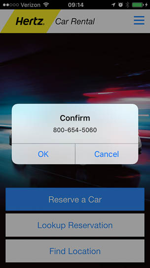
As an aside, note the major differences in this dialog box between the Avis and Hertz apps: Both offer the same functionality of calling the respective company’s hotline, but the usability is hugely different because of the text inside the dialog.
Where Avis provides perfectly clear information about what will happen when you tap the Call button (namely, “Call Avis Roadside Assistance”), the dialog box in the Hertz app uses the generic, and therefore essentially meaningless, “Confirm” as the dialog title, and the equally generic “OK” as the call button label.
These differences even extend to the labels of the respective menu items: Avis’s “Call Roadside Assistance” is a full sentence with excellent information scent; in comparison, Hertz’s “Emergency Roadside” sounds odd, and oddly incomplete.
Insight Timer
In this meditation app, entire pages remain completely blank, and there are no messages pointing to the lack of connectivity.

The one section that still works is the “[Meditation] Timer.” Alas, as far as I can tell, the application does not synchronize the log: Any sessions you complete while your phone is offline are simply ignored, even after you get back online.
Instapaper
As an offline article reader, Instapaper is explicitly designed for off-line use. Upon launch, the app automatically checks if new articles are ready for downloading. If the phone is offline at this point, the synchronization fails silently. Which, in this particular case, doesn’t seem that problematic since this initial sync process is transparent to the user, anyway.

When you manually trigger a sync, however, a progress spinner does appear in the app’s user interface, but it just keeps on spinning. There is no error message at all.
OmniFocus
As a mobile task manager, OmniFocus synchronizes data, and it exposes that functionality very clearly to the user with a dedicated button (compared to the more obscure “pull screen down and release” gesture, for example).
If you tap the button while there is no internet access, the spinner will start, and it will stop after what feels like some five minutes.
Unfortunately, there is no error message, so the network access attempt in this app, too, is just failing silently.
One Football
One Football (to my American friends: this is actually about soccer…) displays a clear error message on most pages, but it takes quite a long time before it stops the connection attempt and shows the message.

The software does cache some season leaderboards as well as news stories.

While the leaderboards look complete except for some missing team logos, tapping a story’s title takes you to an empty page. At least you can safely get back to the main screen from those empty pages.
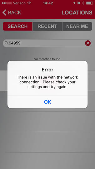
49ers [fan app]
The San Francisco 49ers fan app displays a clear error message on almost all screens, as well. It, too, takes quite a while before it aborts the connection attempt, though.
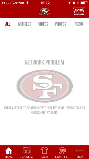
What’s odd is that the message is grayed out to the point that the text is difficult to read due its low contrast. The use of all-caps characters doesn’t help much in that regard, either. I also wonder if less experienced users are familiar with the difficult-to-discover “pull down the screen to refresh the app” gesture. If not, being told to “please pull to refresh” will likely be more confusing than helpful.
Maybe “please pull down the screen to refresh” or “please swipe down on the screen to refresh” would make this a bit more accessible. (Which, of course, would need to be confirmed through usability testing.)
Alas, unlike ams Formel 1 and One Football, the 49ers app does not cache any content.
Some suggestions to alleviate the mobile app connectivity misery
As always, following a few design principles can help build much more pleasant and effective user experiences:
-
Assume that network outages do happen
When developing an application that requires network access, don’t assume that connectivity will always be magically available, nor that, if access is available, it will provide fast transfer speeds.
-
Set reasonable time-out durations
Progress indicators that spin endlessly, or functions that fail silently, should have been a thing of the past a long, long time ago.
There’s nothing wrong with trying to connect for a while, but don’t test the user’s patience too much. Although it’s difficult to choose a “perfect” wait duration, my preference is that it not exceed 30 seconds.
-
Offer informative feedback
Display a clear error message that points to the root cause, namely that the server could not be reached or, better yet, that the device is not connected to the internet.
If possible, avoid displaying messages that identify the secondary effect (“Could not find location”) instead of the root cause (“Could not reach server”).
-
Avoid blank pages
Avoid completely blank pages at all costs. In terms of user interface modules, never load from a server what can be implemented natively in the app.
If it’s feasible, cache some content. For example, allow sports fans to look up their favorite teams’ season schedule, etc. even when the app can’t get online.
-
Never ever lose the user’s data
If its core features work without internet access, an application must store all relevant data that the user enters, and synchronize it when connectivity is restored.
This is especially important for applications that synchronize or store data transparently, so that users can’t verify, or intentionally trigger, the successful transfer of that data.
My personal design role model
Of the apps described above, ams Formel 1’s design works the best for me: The error notification appears quickly and clearly describes the problem, yet does not get in the way. Being able to access at least some of the app’s content is a welcome plus.
By the way, the fact that there’s at least one app that can quickly and reliably determine the problem, is proof that doing so is perfectly technically feasible. There is no factual excuse for other apps to not provide a similarly user-friendly way of handling connectivity errors.