A Great Design for Capturing In-App User Feedback

Most of my favorite software applications are made by indie developers. What makes their products stand out is that they do fewer things, but do those fewer things better. They are more focused on specific tasks and target a smaller, more discerning user audience. The result is a superior user experience, which typically also extends to the way you contact their customer support teams.

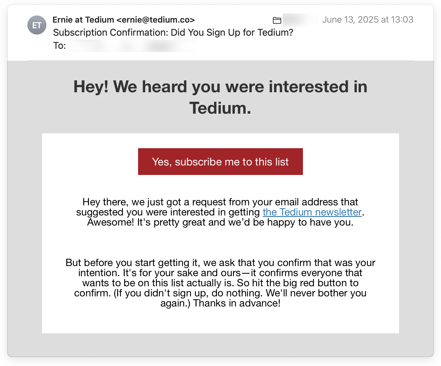
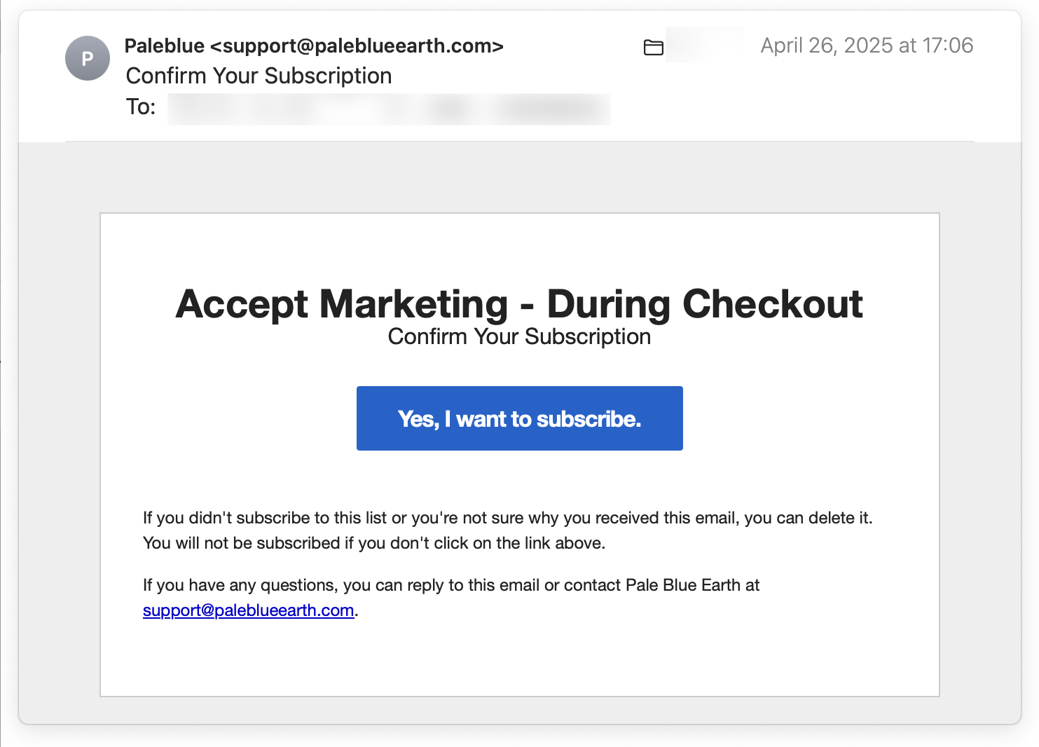
Instead of steering you towards AI chatbots, overcrowded customer forums, or phone hotlines with long wait times, smaller developers let you contact them more conveniently and more directly. The most common mechanism to initiate that contact is via a command in the Help menu, such as Contact Support, Contact Us, etc. Selecting that command does one of two things: it either opens a web page with several contact options, or it creates a blank email, pre-addressed to the appropriate destination. Both of these methods do share the same drawback, however: they make you switch contexts.

Context-switching increases cognitive load

After selecting the command, you find yourself in your browser or email client instead of the actual application. So if you want to experiment with anything in the application while you compose your support request, you now have to jump back to that application. And then return to the browser or email client to continue capturing your thoughts. And possibly back and forth a few times before you’re ready to hit “Send.”

Admittedly, not every user might find this problematic. Especially when submitting a feature request or bug report, however, I want the details to be spot on. And so I often find myself going back and forth several times between trying something out and writing my message to the developer.

Such context switching requires considerable cognitive effort, especially for neurodivergent users. I didn’t quite realize just how annoying this feels until I discovered a more seamless design. This design integrates the contact feature into the application, whose name is Unclutter.

Unclutter is a nifty macOS utility for temporarily storing files and text notes that you might otherwise dump on your computer’s Desktop. Instead of, well, cluttering up the latter, your temporary notes, files, and your clipboard history live in a drawer that’s attached to the bottom of the menu bar. Don’t need it? It disappears completely — until you summon it via customizable mouse or keyboard interactions.

Requesting support should be simple, convenient, and direct

Unclutter has a single menu which contains a Provide Feedback on Unclutter… menu item. Selecting that command does not take you to the browser or email client, but summons a dialog box in the application.

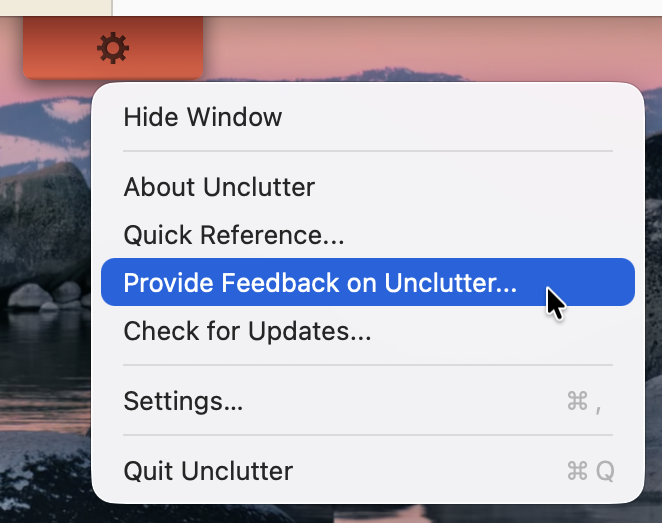
(I wish the command was labeled Contact us… for a bit more information scent. Then again, it makes me irrationally happy that some designers and developers still care about properly using the ellipsis character “…” in a menu command!)

In the dialog box, a huge text field provides ample space for typing in a detailed message. Via a segmented control, you explicitly choose what kind of message you’re sending: a general question, a feature request, or a bug report.

The feedback window has the usual layout with the Close/Minimize/Zoom traffic lights in the title bar. The segmented control for selecting the feedback type sits immediately beneath the title bar. The text field takes up the majority of the window. There are two buttons labeled Cancel and Send Feedback.

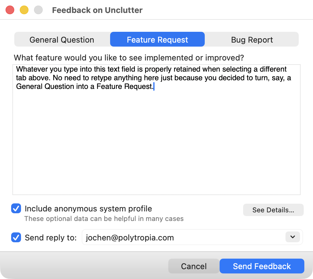
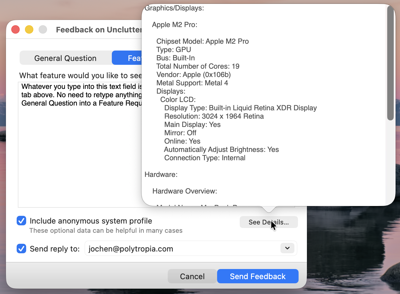
For feature requests and bug reports, you can optionally include an anonymous system profile. Privacy-conscious users can click the See Details… button to view the exact information that is included in the profile. Finally, you can choose whether you’d like to receive a reply from the developers.

The system profile information is shown in a pop-over panel that is attached to the See Details button. It displays data such as the computer model, the chipset, display type, etc.

(Note how there’s nothing in this window that tries to trick you into signing up for a newsletter, or similar marketing junk. This feature is all about letting you contact the makers of that application, and that’s it!)

Not every dialog box needs to be modal

Despite its appearance, this dialog box is not modal. You can fully interact with the application while the feedback window is open. That may sound trivial, but it’s a detail that relates to the context switching I mentioned earlier.

Imagine that you’re composing a feedback message and you quickly want to confirm a detail in the software’s behavior or layout. If the window were, in fact, modal, you’d have to dismiss it, check whatever you want to check in the application, and then re-open the feedback window. That would just add unnecessary interactions towards your goal of submitting user feedback. Thanks to the window remaining open and instantly accessible, though, that process is much smoother and much more frictionless.

There’s just one detail in this feature that I found a bit unsatisfying. When you click Send Feedback, there is a subtle progress indicator during the upload, but there is no explicit confirmation that the message was sent successfully. The window just closes silently. I wish that Unclutter would display a system notification or a message inside the window, to provide that little extra sprinkle of perceived closure for the feedback workflow.

What you will receive — if you select the “Receive reply” checkbox, of course — is a personal, thoughtful, and 100% human-written response from the developer. And that is absolutely priceless.

Of all the in-app feedback mechanisms I’ve encountered so far, this one easily is my favorite. I think it’s so well designed, in fact, that I wish it were the de-facto standard framework for macOS applications in the way that Sparkle is the de-facto standard for software updates. Maybe a FOSS spin-off idea for the folks behind Unclutter?

The Delight of Email Subscription Opt-In

A lot has changed in the user experience realm since I last posted an article on this site. Unfortunately, the utter nuisance of unwanted “promotional emails” — yes, SPAM! — hasn’t changed much at all.

Way back in March 2016, I took an in-depth look at the hoops users have to jump through when unsubscribing from e-mail newsletters. The dark patterns that I listed in that post are still in wide use today: pre-selecting opt-in checkboxes; using confusing language; making unsubscribe links difficult to find; and forcing users through plenty of gratuitous interactions before completing the opt-out process.

There’s a positive side to all this, however: It’s really simple for Companies to demonstrate that they do, indeed, care about their customers’ user experience. All it takes is a reliable opt-in process before sending out any emails. Many online publications do this already.

When someone submits an email address to sign up for a digital newsletter, these sites send an email containing an unambiguous button or link for confirming the subscription request. Here’s a typical example, taken from Ernie Smith’s excellent newsletter, Tedium: The Dull Side of the Internet:

Hey there, we just got a request from your email address that suggested you were interested in getting the Tedium newsletter. Awesome! It’s pretty great and we’d be happy to have you.

But before you start getting it, we ask that you confirm that was your intention. It’s for your sake and ours—it confirms everyone that wants to be on this list actually is. So hit the big red button to confirm. (If you didn’t sign up, do nothing. We’ll never bother you again.) Thanks in advance!

The button to complete the sign-up process in the Tedium confirmation email is very visually prominent and large enough to click on easily. It also has the easy-to-understand label,

If you do not want to subscribe after all, all you have to do is delete this email. And if you do intend to signup, just click that confirmation button or link. That’s it, and it’s a very small price to pay compared to the tedium of unsubscribing from a newsletter that was sent to you without your consent.

True opt-in for commercial emails

When it comes to company newsletters, I’ve only seen this kind of true opt-in process on a single site: Pale Blue Earth, a manufacturer of rechargeable batteries.

The website unfortunately does pre-select an “Email me with news and offers” checkbox on the check-out page. Even if you miss that detail, the very first email you’ll receive from this company — besides any that are directly related to a purchase — is titled, “Confirm Your Subscription.”

The explanation in the email body is on par with the one from the Tedium newsletter:

If you didn’t subscribe to this list or you’re not sure why you received this email, you can delete it. You will not be subscribed if you don’t click on the link above.

If you have any questions, you can reply to this email or contact Pale Blue Earth at support@paleblueearth.com.

The headline in the Pale Blue Earth confirmation email is a perfectly honest,

Companies who spam you don’t care about customer experience. Period.

For the vast majority of companies, spamming their customers is an integral part of “customer engagement.” The consequence of that strategy is that dark interaction design patterns appear at two stages in the process: First to trick users into signing up for promotional emails, and the second to make it as tedious as possible to unsubscribe.

I was delighted that Pale Blue made it so easy to not get their newsletter. That consideration for their customers’ user experience instantly reflected on how I perceive of that company as a whole, and whether or not I will consider them for future purchases. (Spoiler alert: I will!)

This is a surprisingly simple detail that instantly makes a company stand out from their spam-happy competition. It boggles the mind that so few company choose that over unnecessarily tormenting their customers.

A UI for a Sit/Stand Desk — How Complex Can It Be?

The sit/stand desk in our home studio is the best furniture investment we ever made. Prolonged sitting is linked to serious health risks, and a sit/stand desk helps alleviate those risks. I also feel that literally changing my perspective at the desk helps me think more clearly and concentrate longer.

Two directions equals two buttons

The desk is motorized, and its entire user interface consists of two buttons embedded in a little control panel. The triangular shape and orientation of the buttons clearly reflect which one will raise the desk, and which one will lower it. Push a button, and the desk starts moving; release the button, and the movement stops.

A small plastic enclosure contains the two buttons. The enclosure is mounted directly underneath the desktop. Both buttons are next to each other, but with ample space between them to prevent pressing the wrong one by mistake.

You can easily tell the buttons apart even without looking at them: a little bump is molded onto the top of the “Up” button, while the surface of the “Down” button is perfectly smooth. By just feeling for that bump, you can identify the desired button.

As a neat detail, the entire panel fully slides underneath the desktop, so you can’t accidentally bump into it and hurt yourself.

Adjust your desktop with the touch of a butt(on)

In my previous job, I was lucky enough to also have a sit/stand desk at work. It’s a different model from the one we have at home. Besides offering buttons for manually adjusting its height, this model features three preset memory slots and even displays the current desk height.

While I think that the height display is a bit gratuitous and gimmicky, the memory slots are a nice feature. Being able to “drive” the desk all the way to your preferred standing or sitting height with a simple tap of a button makes that adjustment more convenient and more precise.

Unfortunately, the convenience and precision come with an annoying side effect, and it’s the control panel’s design that is to blame.

The control panel houses six buttons, arranged in two stacked rows of three buttons each. The top row has buttons 1 through 3 for recalling memory presets. The second row holds the button for storing a new preset, and the

The control panel is implemented as a touch screen. This makes it way too easy to trigger any of the desk’s functions by just leaning against the desk’s edge. If you trigger any of the three presets this way, the desk will relentlessly move towards the height it just recalled from memory.

Of course you can make the desk’s motor stop, but doing so is not obvious: you “just” need to touch any of the panel’s buttons to do so. Once you learn this, it might be easy enough to remember, but having a dedicated “cancel” or “stop the motor” affordance exposed right on the panel, would be much more user-friendly.

The fundamental accessibility flaw of touch-control buttons

There is a much bigger problem with using a touch panel for this kind of application, though, and it’s a more general issue, too: the near-complete lack of accessibility for vision-impaired users.

The markings and labels on the buttons are screen-printed, and the layer of paint is so thin that you can hardly feel them at all. Hence, you cannot easily differentiate and locate the six buttons just by running your finger tips over the panel. And, of course, this being a touch panel, running your fingers might also immediately trigger a button.

Just like users with 20/20 vision need meaningful visual feedback on their computer screens, vision-impaired users need meaningful acoustic and/or tactile feedback.

In this particular example, the simple, mechanical two-button solution provides just that, including the fine detail of the bump on the “Up” button. While modern, sleek, and “shiny,” the touch-screen approach pales in comparison when it comes to usability and accessibility.