In November 2006, British Airways started deploying a redesign of “Club World”, their long-haul business class cabin. While retaining its predecessor’s unusual seat arrangement1, the overall appearance has become bolder and “edgier”. The redesign also resulted in changes to how some of the cabin’s key features — the “privacy divider”, the reading lights, and the electric seats — work, unfortunately making each one more difficult to use than before.
Please respect my privacy
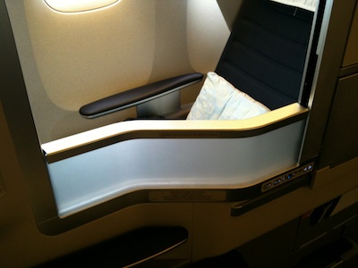
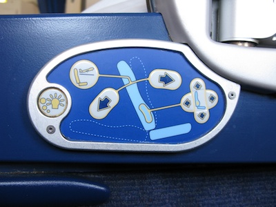
Because of the cabin’s seat layout, you more or less look directly into your neighbor’s face when seated. For this reason, a “privacy screen” is mounted between pairs of seats.
In the previous cabin design, this screen was a large, sturdy fan that was operated manually. The hinge was made from aluminum whose color contrasted nicely with the deep blue fan, providing a reasonably clear visual clue as to how the fan was operated: just pull on the open edge to unfold it, and you are effectively shielded from your “next-door” neighbor’s gaze.
The new cabin design sports a screen made from frosted-plastic segments and is operated by an electric motor. Pressing a button, which is located on top of the divider, lowers and raises the screen.
For use by the cabin crew, the location of this button is just fine. When seated, however, you cannot see the button, and there is no label that points to its location. From a passenger’s point of view, therefore, there is no indication of how to lower or raise the privacy screen, and I have seen quite a few frustrated passengers who tried to operate the screen manually — by pulling it up or pushing it down — to no avail.
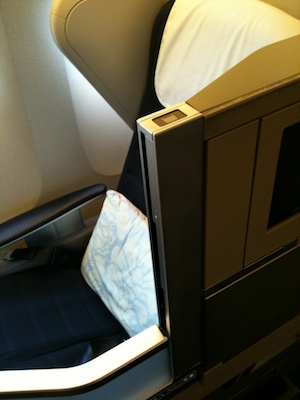
A better solution would be to place buttons on each side of the divider wall, so that each passenger could easily find and reach them. Placing them higher up on the wall would prevent inadvertently pressing it while moving around in the seat; this would also keep it easily accessible for crew members standing in the aisle.
To make the operation easier still, the design should use dedicated buttons for raising and lowering the screen, arranged vertically to create a natural mapping of the controls vs. the movement of the screen.
Shine a light
Both the old and new cabin feature adjustable reading lights for each passenger. The old design used a “satellite” housing mounted on a ball-joint, so that the light could be adjusted vertically and horizontally.
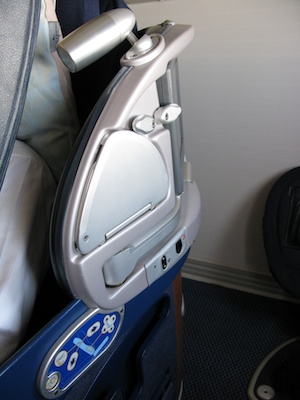
The button to switch the light on or off was part of the seat control panel, and pressing the button cycled through four operation modes: low, mid, and high brightness, and off. Although it was placed away from the light, the button’s unambiguous icon made it easy to identify, and the position on the control panel made it easy to find and convenient to access.
In the new Club World cabin, the light and its brightness control are mounted in a little recess in the divider wall slightly behind and above the passenger’s head. A sliding fader controls the brightness, and a tab lets the passenger adjust the light’s angle. The movement is limited to one pane, however, since the light is mounted on an axle instead of a ball-joint.

Because of its location, adjusting the light’s position as well as its brightness is much more awkward than before. Even worse is that the designers did such a “great” job of hiding the light, that some passengers have trouble even finding it.
Lights provide a wonderfully natural visual clue: once you switch them on, you’ll likely be able to locate them. So, all that is required to help users find a light is placing its switch in an easily discoverable location.
In this specific case, the designers should have left the light switch in its original position next to the seat controls. Just by operating the switch, passengers would have been able to find the light itself.
Controlling your seat
The Club World seat in is an impressive piece of technology: powered by an electric motor, it can be adjusted from an upright-back office chair position via a deck-chair-like “Z-shape” to fully flat.
For take-off and landing, the seat must be brought into a specific position by pressing a dedicated button: as long as this button is pressed, the seat moves towards this position, and once it has reached it, the motor will stop. A green light on top of the divider wall serves as an indicator to the cabin crew that the seat is locked into the take-off/landing position.
On the old seat control panel, the graphics made it easy to recognize the shape of the seat, and the arrows perfectly illustrated how the seat or the lumbar support would move when pressing the respective button. Although it may not have been directly obvious what the button with the airplane was for, it’s position and the link between this and the two arrow buttons indicated that it somehow affected the seat position.
The person who designed this panel made good use of the Gestalt laws by letting the bezel flow around the light button and using the blue background for the seat controls to create a visual clue that these are two distinct groups of controls.
Within these two groups, it was obvious that there was a group of four buttons for controlling lumbar support and a group of three buttons for the seat angle. Taking this concept even further, the latter group was divided into a one-button and a two-button group via the shape of the buttons: perfectly round vs. “lozinge”-shaped.
All in all, this was a textbook example for intuitive control layout and mapping. Now compare this to the new layout.
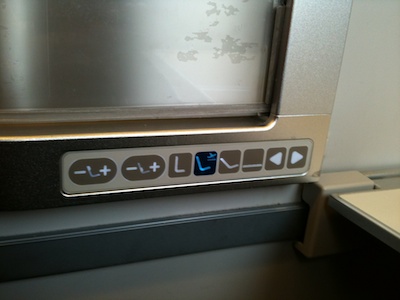
All buttons are arranged on a single line, and they are all in direct proximity of each other. The visual “grouping indicators” — the oval frames around the two two-button groups on the left and the blue color on the center button — are very subtle.
The graphic representation of the seat has been reduced to an extreme: Is that an “L”? What does it stand for? What do the arrow buttons move, and in what direction do they move the thing that they move?
The mapping of these arrows is actually reversed from the old design: they are mapped vs. the seat surface, i.e., when pressing the arrow facing away from the seat back, the seat surface will move towards the passenger’s feet, and the seat back will move backwards/down, and vice versa.
In fact, I pressed the wrong button several times, because I intuitively expected the arrows to be mapped vs. my upper body as was the case with the old design: when I want to sit up, I want the seat back to be moved to a more upright position, moving my upper body slightly forward. Consequently, I would hit the button pointing away from me — and achieve exactly the opposite of what I intended.
Once you have made sense of the new controls, you’ll understand that the buttons with the “seat stick figures” are seat position presets for “fully upright”, “deck-chair”, and “fully flat”.2.
How to improve this control panel, then, if the goal is to absolutely have them arranged on a line as they are now?
I’d start by removing the three preset buttons altogether, and using the newly found space to place the remaining buttons a bit further apart to create three groups: lumbar/neck support (four buttons), take-off/landing seat position (one), and seat-back adjustment (two). For good measure, I’d also move the switch for the reading light into this panel, and place it at the far end facing the seat-back to align the button mapping with the physical position of the light vs. the seat.
Finally, I would add a graphical representation of the seat back — similar to the icon found on the lumbar and neck support buttons — to the two arrow buttons, and also reverse the buttons’ functions to re-create the mapping found in the previous design’s control panel.
Don’t ignore usability over aesthetics
When updating the visual aspects of a design, it is imperative to keep an eye on how a redesign affects the usability of a device. In the case of BA’s “Club World” cabin, the designers may have achieved more elegant, more stylish aesthetics, but they also caused the usability of the passenger-facing controls to degrade noticeably.
What’s more, I’m convinced that it would have taken a usability expert a single short flight in the new cabin to identify all of these problems and suggest effective improvements.
-
Of two adjacent seats, one faces towards the front of the plane and the other towards the rear. This allows for more shoulder room for each passenger without requiring more floor space for each seat, and it also creates a very pleasant cocoon-like feel when seated. ↩
-
To be frank, I’m having trouble seeing the point of these presets: I can reach the first and last positions simply by pressing the appropriate arrow button until the seat has reached that position, making these two buttons redundant. As for the “deck-chair” preset, I’m convinced that passengers are perfectly capable of finding a comfortable position resembling this one without having to resort to using a dedicated button. ↩