A Hair Dryer for Scientists

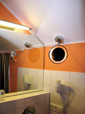
Although my hair is “a bit” longer than average, I am too lazy to use a hair dryer unless I’m in a hurry and need to dry my hair fast. In one such situation, I had to wonder whether the hair dryer had been conceived by a designer who’s into science. Check out the verbose labels next to the switches:

Complex and information-laden labels for the switches on a hair dryer.

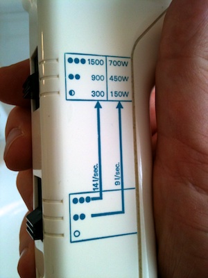
The mapping and visibility of the two switches are excellent: when holding the hair dryer in your hand, moving the switches upward (i.e., in the natural “more” direction) increases air throughput and temperature, and from the notches in the enclosure the user can easily tell that each switch has three settings. The printed labels, however, provide excessive and overly technical information.

Does an average user immediately understand what the units mean: that “l/sec.” stands for air throughput and “W” for power consumption of the heater element, i.e., temperature? And if they do understand, will they know how much warmer 1500W feels versus 900W? How much stronger 14l/s is compared to 9l/s?

Just as confusing for someone who is into math, is that the half and full bullet characters do not scale with the stated units: the ratios of the power settings are 1x – 3x – 5x1, not 1x – 4x – 6x, as implied by the bullets, and the same holds true for the other switch. And then there are the arrows between the two switches plus the table.

That is a lot of pseudo-scientific appeal for something as straightforward as a hair dryer. Consequently, I am certain that, instead of trying to interpret the labels, most users will choose a configuration by simply trying out different settings and picking the one that feels right. I know I did, and I do hold an engineering degree…

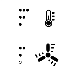
In this case, simplifying the labels might cost the hair dryer some of its “a-device-for-true-pros” appeal, but it would make it much easier to use for the majority of its users. As an alternative to what you see in the picture above, I would prefer something as plain as this2:

An alternative label design showing a thermometer for temperature and a fan for air throughput, and bullets to indicate respective settings levels.

  1. Note how the highest setting 1500|700 adds more confusion as it breaks the 2x ratio of the other two pairs in the table. 

  2. Thanks for keeping in mind that I am not a graphics artist.  

Touch-up Makeup Mirror

When using devices for some length of time, we tend to get used to their idiosyncrasies and develop ways to work around any design details that may have stumped us at first. Therefore, staying at hotels provides great opportunities for observing the use of simple, everyday things like door handles, light switches, TV remotes, etc., because their designs may differ enough from what we use in our own homes that we can gain some insightful first-usage impressions.

As an example, on a recent trip I noticed this interesting makeup mirror. The ring of frosted glass gives a clue that there might be a light in the mirror, but there is no visible power switch to be found.

Wall-mounted round lighted mirror

Well, that’s not entirely true, because, as soon as you touch the mirror — e.g., by running your fingers along its surface in search of that switch — you will realize that the mirror’s chrome enclosure is the switch: it’s touch-sensitive! So, in a way, the switch is “highly visible” after all.

Due to the total lack of visual clues (and instructional notes near the mirror), however, it is just not obvious that the mirror’s light works in this manner. In other words, the device does not support the user in understanding how it is operated at all, making accidental discovery of the light switch the norm.

What’s more, the light does not only toggle between on and off, but offers three brightness levels. Touching the surface cycles through these three levels and the off state, so to switch it off, you may have to tap the mirror several times.

Worse yet, when you adjust the mirror to see yourself in it, you will, of course, change the light’s setting every time you touch the mirror’s enclosure.

A four-state switch placed on the mirror’s front panel would easily solve all four of the mirror’s usability problems:

  • provide a visual clue beyond the frosted glass ring that there is a light in the mirror,
  • make it easy to discover how to operate this light,
  • visual indicate how many settings there are,
  • make switching the light off a one-tap operation at all times, and
  • allow adjusting the mirror without also affecting the light.

And, of course, it could “even” be implemented in the form of four closely-grouped touch-sensor pads to demonstrate that the manufacturer’s engineering department knows how to master this technology…

By giving visual appearance a higher priority over usability, the designers may have achieved to create a cleaner-looking, more elegant makeup mirror. But every day, countless hotel guests pay the price for this decision by standing in front of that mirror, scratching their heads and wondering how to switch on that darned light.