Press for Coffee (W)here?

In his seminal book, “The Design of Everyday Things,” Donald Norman introduces the term “affordance” which …

… refers to the perceived and actual properties of the thing, primarily those fundamental properties that determine just how the thing could possibly be used. A chair affords (“is for”) support and, therefore, affords sitting. […]

Affordances provide strong clues to the operations of things. Plates are for pushing, Knobs are for turning. Slots are for inserting things into. Balls are for throwing and bouncing. When affordances are taken advantage of, the user knows what to do just by looking: no picture, label, or instruction required. […] When simple things need pictures, labels, or instructions, the design has failed.

How bad design makes a simple device hard to understand

A coffee pump pot, the likes of which can be found at hotel breakfast buffets the world over, easily falls into the “simple things” category: all you need to do to use it is to place a container under the spout and press a button to dispense the breakfast beverage of choice into said container.

Why, then, did someone feel the need to apply a sticker screaming “PUSH HERE” to this pot’s pump button? Is this an indicator that “the design has failed,” as per Norman’s quote above? Let’s see…

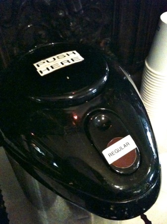
When I tried to use this pot, I first pushed on the location of the “Regular [Coffee]” label. When that didn’t work, I tried the indented area just above it, only to realize that doing so unlocks the lid.

It took a while for me to even see the “PUSH HERE” sticker and understand that it denotes the pump button.

The real-life implications of “affordances”

This pot has a total of three UI elements that afford pushing: the indented area and the brown dot on the unlock lever, and the pump button. So why did I assume that, of these three, the brown dot with the “Regular” label on it was the control I had to use to get some coffee out of the pot? There are several explanations:

  • Stickers aside, the brown dot is the only element of the pot that stands out visually, whereas the actual pump button blends in so well that it almost looks like a lid. Therefore, the perceived affordance of the brown dot to operate like a push button is stronger than that of the pump button.

  • The brown dot is closer to the spout than the pump button. Therefore, its logical link to the spout is stronger than that of the pump button.1
  • The placement of the “Regular” label further strengthens the visual cue that the brown dot needs to be pressed to get coffee: In every desktop or mobile computer UI, a control’s label is placed so close to the control itself that the term “intimate relationship” comes to mind.

    In the case of, e.g., menus, menu items, and buttons, the label appears right on top of the widget. Consequently, the label on top of the brown dot creates the same association as a similar label on a button in a software application: “[Press here to get] Regular [coffee]!”

  • When placing the cup underneath the spout, you tend to focus your view on that area, so it is easy to overlook the “push here” sticker on the pump button that is a bit farther away.

Usable without explicit instructions

Of all the other guests I observed using this coffee pump pot, a few immediately knew how to operate it. I assume that these users simply were already familiar with this specific model. Most others, however, did struggle until they, too, eventually worked out the intricacies of this device.

If I were tasked with improving this design to make it more accessible to experienced and inexperienced users alike, I’d try this:

  • Make the pump button stand out by placing a large brown dot and an easy-to-read label on the button’s top stating the type of coffee.

  • Make the unlock lever blend in and, thus, easy to overlook, by removing the brown dot and the “Regular” sticker. Maybe even reduce its size or move it to a slightly less prominent location.

In other words, guide the user’s gaze towards the pump button and away from the unlock lever to fine-tune the perceived push affordance of either control.


  1. Once you’ve learned about Gestalt Laws, you can’t help but notice them all over the place. Like, in this case, the Law of Proximity. 

The Shower Curtain that has its Priorities Wrong

During recent travels, I noticed a novel design for shower curtains. Whereas most curtains are mounted to their rod with eyelet hangers made from metal wire or plastic, these curtains utilize plastic disks that are sewn into the curtain’s fabric.

These disks have a horizontal slot at one side; slots in neighboring disks are pointing towards each other and the fabric between the slots is cut as well. In other words, the center holes in two neighboring disks are “connected” by these cuts and slots.

Pro: easy-on, easy-off

Thanks to this nifty design, removing the curtain from its rod is very easy: open the curtain all the way, grab a stack of disks and bend them to open the slots, and then slide them off the rod.

Standard eyelet hangers usually need to be taken off the rod one hanger at a time. In contrast, with this new design, several hangers can be removed at once, saving hotel staff quite a bit of time and effort when exchanging the curtains during cleanup.

Con: difficult-to-close

When you try to close the curtain, however, you realize that the design is flawed.

You can easily pull the curtain along from one end until it is about two thirds down the rod. At that point, the disks will start to lie flat against the rod, which generates a surprising amount of friction between them.

In fact, the friction will increase to the point where you cannot move the curtain any further along unless you start pulling at the curtain’s center section to move the remaining folds along.

Optimized for the less-common use case

There are two groups of “users” for a hotel shower curtain: the guests who will open and close the curtain when taking a shower, and the service staff who will exchange the curtain for cleaning.

Compared to curtains that are mounted the “old-fashioned” way with eyelet hangers, this disk-hanger design makes it more difficult for the guests to close the curtain while making it easier for the service staff to remove and replace it.

But how often will a curtain like this be opened or closed, and how often will it be replaced?

Assuming that most hotel guests will take a daily shower or bath, and that curtains are only exchanged when new guests move into the room, this curtain will be closed and opened many more times than it is removed from its mounting rod. This is even more true for rooms that are occupied by more than one person.

I think it is fair to say that, while this new design shows off an interesting and inspiring fresh approach, it effectively has been optimized for the less-common use at the expense of its main usage.

What’s more, as much as I appreciate making things easier for service personnel: annoying hotel guests due to having optimized the design of an everyday thing like a shower curtain for non-guest user groups, is a very risky decision.

A New Poster Child for Web Form Validation

Most websites that allow or require data to be entered into free-form text fields validate this data before accepting it. This is to ensure that, for example, email addresses are valid, phone numbers adhere to a certain format, or that the contents of “Choose Password” and “Retype Password” fields match.

An iterative (and painful) approach to form validation

All too often, form validation is a painful iterative process for the user. It typically goes something like this.

You enter the data into the web form and click Submit. If an error is found in any of the fields, the page with the form is displayed again, now including a message stating that “One or more fields contain invalid data” and highlighting some of the form’s fields.

If you’re lucky, you will find more information on the page about how to fix the errors, like “Phone numbers may only contain digits and dashes”2 or “The password contains invalid characters.”3

When you think you’re done correcting the issues, you hit Submit again, and you may very well be presented with the next batch of fields whose contents don’t validate.

And so it goes until the website deems any and all of your entries to be worthy of acceptance.

Real-time. Relevant. Plain English.

UJAM, a promising new online music creation tool that was launched only recently, provides a much more user-friendly approach to form validation.

The first impression that you get when you open the UJAM.com sign-up page, is that of a standard web form (albeit a very elegantly designed one). As soon as you start entering data, though, whatever you enter is validated immediately and in real-time.

Each text field has its own validation result message displayed right next to it. This message can reflect one of three states — Info, Error, and OK — which are indicated through icons as well as color. Additional information, including instructions on how to fix any errors, is given in plain language.

Plain and simple options, too

The checkboxes at the bottom of the registration form are just as plain and simple: accepting the Terms of Service and the Privacy Policy is straight-forward, and either option links to the related documents.

The two opt-in opportunities — for subscribing to the UJAM newsletter and for allowing UJAM to share your information with third-parties — provide concise information on what either checkbox does. Just as importantly, this web form does not leverage double-negations or similar dark pattern tactics to lure the user into accepting an option against their will.

I may be a bit blinded by the fact that I’m really excited about what UJAM has to offer (and I do not use the term “excited” lightly), but I doubt that I have ever felt quite as confident about properly filling out a web form on the first try as I have when I signed up for a UJAM account.

Update 2011-05-18: In hindsight, it was a good idea to include the disclaimer about me being “a bit blinded:” When I pointed other UX designers to this web form, they immediately criticized some of its design details, and rightfully so.

The validation messages are intrusive: As soon as you begin filling out the form, the validation process starts, and the resulting messages appear almost instantaneously. As a result, the website will most likely reprimand you for an error in your email address or your password, just because you are not typing fast enough.

Additionally, the validation process repeatedly cycles through “no message” to “gray empty message” to “validation status/error”, as seen in this little video clip.

Intrusive, indeed!

Here are a few ideas to make the validation system appear less pushy:

  • Display the informational messages for all fields as soon as the page loads.
  • Increase the delay with which the validation status message is updated.
  • Instead of using a red or green background for the entire message area, restrict color to the icons and the hairline around the text entry field.
  • Use smoother transitions so the changes in icon and text are not quite as abrupt.

Some of the validation messages are curt: The messages should be friendlier than, e.g., “Password is too short”. This specific example also is less than unhelpful, because it does not explicitly state how many characters are required.

Phrasing this as a positive call-to-action makes the interaction with the form friendlier and easier: “Enter a password that is at least 8 characters long.”

The links to the ToS and Privacy Policy are hidden: The text strings “Terms of Service” and “Privacy Policy” next to their checkboxes are clickable, as are most occurences of “Privacy Policy” in the longer text section in the upper right.

During my first visit to this site, these links were easy to find, because of their solid black text color that nicely contrasted the gray of the copy text.

Apparently, the designers have modified this, because those links now have the same color as the copy text. Since they are not underlined or set in bold, either, there is no visual indication of their “clickability” at all.

UJamLinks

Only when you hover over one of the links will the text color be changed for highlighting, as in this screenshot. “Terms of Service” in the upper checkbox is a link as well, but it is literally impossible to recognize it as such.


  1. A common problem with many websites is that they insist that phone numbers be entered in the North-American ten-digit format, even if the site is aiming for an international target audience. 

  2. It never ceases to amaze me how many websites that present this error, fail to provide a simple, explicit list of characters that are allowed for use in a password.