Most websites that allow or require data to be entered into free-form text fields validate this data before accepting it. This is to ensure that, for example, email addresses are valid, phone numbers adhere to a certain format, or that the contents of “Choose Password” and “Retype Password” fields match.
An iterative (and painful) approach to form validation
All too often, form validation is a painful iterative process for the user. It typically goes something like this.
You enter the data into the web form and click Submit. If an error is found in any of the fields, the page with the form is displayed again, now including a message stating that “One or more fields contain invalid data” and highlighting some of the form’s fields.
If you’re lucky, you will find more information on the page about how to fix the errors, like “Phone numbers may only contain digits and dashes”1 or “The password contains invalid characters.”2
When you think you’re done correcting the issues, you hit Submit again, and you may very well be presented with the next batch of fields whose contents don’t validate.
And so it goes until the website deems any and all of your entries to be worthy of acceptance.
Real-time. Relevant. Plain English.
UJAM, a promising new online music creation tool that was launched only recently, provides a much more user-friendly approach to form validation.
The first impression that you get when you open the UJAM.com sign-up page, is that of a standard web form (albeit a very elegantly designed one). As soon as you start entering data, though, whatever you enter is validated immediately and in real-time.
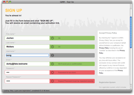
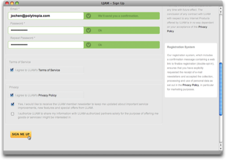
Each text field has its own validation result message displayed right next to it. This message can reflect one of three states — Info, Error, and OK — which are indicated through icons as well as color. Additional information, including instructions on how to fix any errors, is given in plain language.
Plain and simple options, too
The checkboxes at the bottom of the registration form are just as plain and simple: accepting the Terms of Service and the Privacy Policy is straight-forward, and either option links to the related documents.
The two opt-in opportunities — for subscribing to the UJAM newsletter and for allowing UJAM to share your information with third-parties — provide concise information on what either checkbox does. Just as importantly, this web form does not leverage double-negations or similar dark pattern tactics to lure the user into accepting an option against their will.
I may be a bit blinded by the fact that I’m really excited about what UJAM has to offer (and I do not use the term “excited” lightly), but I doubt that I have ever felt quite as confident about properly filling out a web form on the first try as I have when I signed up for a UJAM account.
Update 2011-05-18: In hindsight, it was a good idea to include the disclaimer about me being “a bit blinded:” When I pointed other UX designers to this web form, they immediately criticized some of its design details, and rightfully so.
The validation messages are intrusive: As soon as you begin filling out the form, the validation process starts, and the resulting messages appear almost instantaneously. As a result, the website will most likely reprimand you for an error in your email address or your password, just because you are not typing fast enough.
Additionally, the validation process repeatedly cycles through “no message” to “gray empty message” to “validation status/error”, as seen in this little video clip.
Intrusive, indeed!
Here are a few ideas to make the validation system appear less pushy:
- Display the informational messages for all fields as soon as the page loads.
- Increase the delay with which the validation status message is updated.
- Instead of using a red or green background for the entire message area, restrict color to the icons and the hairline around the text entry field.
- Use smoother transitions so the changes in icon and text are not quite as abrupt.
Some of the validation messages are curt: The messages should be friendlier than, e.g., “Password is too short”. This specific example also is less than unhelpful, because it does not explicitly state how many characters are required.
Phrasing this as a positive call-to-action makes the interaction with the form friendlier and easier: “Enter a password that is at least 8 characters long.”
The links to the ToS and Privacy Policy are hidden: The text strings “Terms of Service” and “Privacy Policy” next to their checkboxes are clickable, as are most occurences of “Privacy Policy” in the longer text section in the upper right.
During my first visit to this site, these links were easy to find, because of their solid black text color that nicely contrasted the gray of the copy text.
Apparently, the designers have modified this, because those links now have the same color as the copy text. Since they are not underlined or set in bold, either, there is no visual indication of their “clickability” at all.
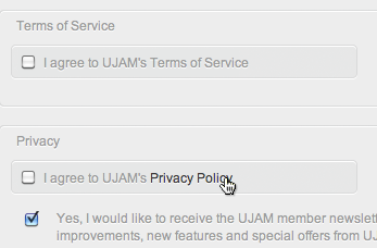
Only when you hover over one of the links will the text color be changed for highlighting, as in this screenshot. “Terms of Service” in the upper checkbox is a link as well, but it is literally impossible to recognize it as such.
-
A common problem with many websites is that they insist that phone numbers be entered in the North-American ten-digit format, even if the site is aiming for an international target audience. ↩
-
It never ceases to amaze me how many websites that present this error, fail to provide a simple, explicit list of characters that are allowed for use in a password. ↩