In his seminal book, “The Design of Everyday Things,” Donald Norman introduces the term “affordance” which …
… refers to the perceived and actual properties of the thing, primarily those fundamental properties that determine just how the thing could possibly be used. A chair affords (“is for”) support and, therefore, affords sitting. […]
Affordances provide strong clues to the operations of things. Plates are for pushing, Knobs are for turning. Slots are for inserting things into. Balls are for throwing and bouncing. When affordances are taken advantage of, the user knows what to do just by looking: no picture, label, or instruction required. […] When simple things need pictures, labels, or instructions, the design has failed.
How bad design makes a simple device hard to understand
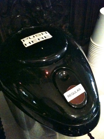
A coffee pump pot, the likes of which can be found at hotel breakfast buffets the world over, easily falls into the “simple things” category: all you need to do to use it is to place a container under the spout and press a button to dispense the breakfast beverage of choice into said container.
Why, then, did someone feel the need to apply a sticker screaming “PUSH HERE” to this pot’s pump button? Is this an indicator that “the design has failed,” as per Norman’s quote above? Let’s see…

When I tried to use this pot, I first pushed on the location of the “Regular [Coffee]” label. When that didn’t work, I tried the indented area just above it, only to realize that doing so unlocks the lid.
It took a while for me to even see the “PUSH HERE” sticker and understand that it denotes the pump button.
The real-life implications of “affordances”
This pot has a total of three UI elements that afford pushing: the indented area and the brown dot on the unlock lever, and the pump button. So why did I assume that, of these three, the brown dot with the “Regular” label on it was the control I had to use to get some coffee out of the pot? There are several explanations:
-
Stickers aside, the brown dot is the only element of the pot that stands out visually, whereas the actual pump button blends in so well that it almost looks like a lid. Therefore, the perceived affordance of the brown dot to operate like a push button is stronger than that of the pump button.
- The brown dot is closer to the spout than the pump button. Therefore, its logical link to the spout is stronger than that of the pump button.1
-
The placement of the “Regular” label further strengthens the visual cue that the brown dot needs to be pressed to get coffee: In every desktop or mobile computer UI, a control’s label is placed so close to the control itself that the term “intimate relationship” comes to mind.
In the case of, e.g., menus, menu items, and buttons, the label appears right on top of the widget. Consequently, the label on top of the brown dot creates the same association as a similar label on a button in a software application: “[Press here to get] Regular [coffee]!”
- When placing the cup underneath the spout, you tend to focus your view on that area, so it is easy to overlook the “push here” sticker on the pump button that is a bit farther away.
Usable without explicit instructions
Of all the other guests I observed using this coffee pump pot, a few immediately knew how to operate it. I assume that these users simply were already familiar with this specific model. Most others, however, did struggle until they, too, eventually worked out the intricacies of this device.
If I were tasked with improving this design to make it more accessible to experienced and inexperienced users alike, I’d try this:
-
Make the pump button stand out by placing a large brown dot and an easy-to-read label on the button’s top stating the type of coffee.
- Make the unlock lever blend in and, thus, easy to overlook, by removing the brown dot and the “Regular” sticker. Maybe even reduce its size or move it to a slightly less prominent location.
In other words, guide the user’s gaze towards the pump button and away from the unlock lever to fine-tune the perceived push affordance of either control.
-
Once you’ve learned about Gestalt Laws, you can’t help but notice them all over the place. Like, in this case, the Law of Proximity. ↩