When I recently followed a link from a tweet, I ended up on the Display Blog, a weblog dedicated to the display technology business.
The site’s super-simple appearance immediately appealed to me. There is nothing on the page that can distract you from actually concentrating on reading the blog’s articles.
Page navigation is simple, too: there’s a title banner linking back to the site’s entry page, and the standard pair of Previous Entries/Next Entries links. That’s it. No chronological archive, no tags, no keywords, no blog roll, …
Wonderful!
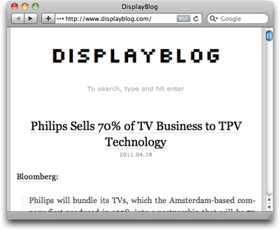
There is an unusual one-line “instruction” right beneath the title banner, though, according to which you can also search the site. The way to do so sounds almost magical:
To search, type and hit enter
To see if that would actually work, I followed these instructions in the most literal way: I just started typing a few letters, and hit the Enter key.
Nothing happened.
That’s, of course, because you first have to click on that very line of text to activate a search box which is hiding in the same location.

Now, when you type, you can also see what you type, and hitting enter does bring up a page with search results.
Analog or digital: simple things should not require instructions
Within the realm of websites, a search box is a “simple thing.”
Average users have a basic understanding of how to perform a search on a website. At least, as long as the search field is easy to find, provides sufficient visual cues that say “I’m a search field!,” and operate in a standard manner.
The only reason why “instructions” are required on the Display Blog page is simply this: it’s because the search field does not look like a search field.
It’s just a small box drawn in a line that is so thin and light, you can hardly see it at all in the top-most screenshot above. It does not have a “Search:” label, it does not display a loupe icon, it lacks the inset shadow that has become fairly common for text entry fields, there is no button labeled “Search” — nothing about the search box itself says “I’m a search box!”
Even worse, the instructions that are provided, are incorrect since they omit the very first step in the process, namely “click here.”
If it ain’t broken…
The easiest way to fix this search box is to simply use a standard design. And that design does not even have to look dull or lack more extensive features. Just have a look at this search box on Lukas Mathis’ blog, Ignore the Code.
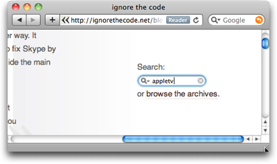
It looks like a standard OS X Aqua-style search box, has a cancel button, and a menu with search history. And yet it is easy to find even for non-Mac users, because its label explicitly states what it is: “Search.”
There is an equivalent to “if it ain’t broken, don’t try to fix it” in user interface design, and its essence is:
If users are familiar with a de facto standard way to use a certain feature, stick with that standard in your own designs.
If you break this rule, you will most likely create unnecessary usability problems like the ones I ran into with this search box on the Display Blog.