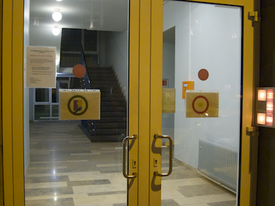
When you enter a building with multiple entrance doors, which door are you most likely to pick?
Your first attempt at entering will most likely be through the door that is closest to the bell button panel, and you will probably try to open that door by pushing against the edge that is next to the button panel.
Applied to the doorway in this photo, then, you’d try to walk in through the door on the right, and push against that door’s right side to open it, right?
Wrong, alas!
Not your average doorway
The position of the door handles already gives away that you’d have to move the door’s left edge, the one away from the button panel.
And if you look closely at the right edge of the door frame, you can see the door’s hinges, which means that you have to pull, not push, the door to open it.
As if that wasn’t irritating enough already, you actually cannot get in through the right-hand door at all! A sticker on the inside identifies it as an emergency exit, and an alarm will sound when you open it.
The proper way to enter this building is to use the door on the left.
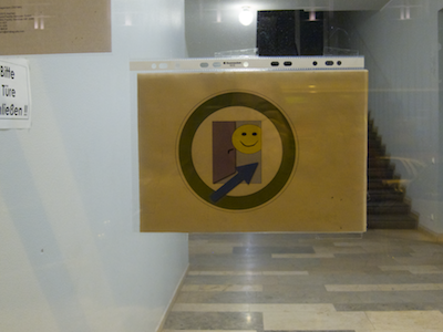
Giving visitors a sign
This entrance must have stumped quite a few visitors, because there are signs that indicate which of the doors is the entrance, …
… and which is the emergency exit.
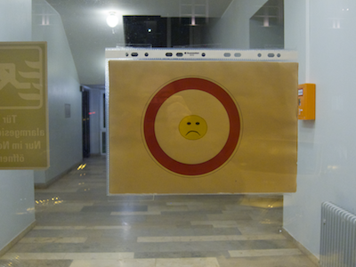
Although “home-made”, these signs take a few clues from traffic signs to convey their meaning. I wonder, though, how much cognitive effort and time it takes to understand those meanings due to the custom “icons”.
Why not use regular traffic signs instead? Their appearance is more common, so your brain can more easily recognize the signs and, consequently, make sense of them more quickly.
https://uiobservatory.com/media/2012/ChallengingDoorwaySignage.png” alt=”Traffic signs “Drive Straight Ahead Only” and “No Entry” plus plain-text instructions as replacements for the two signs mounted on the door.” border=”1″ width=”400″ height=”400″ />
Any remaining doubts or ambiguity as to the signs’ meanings can be addressed through explicit, plain-text explanations.
No such thing as add-on-later usability
Despite these two well-intentioned signs, I am convinced that a few visitors will still be trying to enter through the right-hand door.
With their visual and cognitive focus moving directly from the bell button panel to searching for the door handle, they will literally overlook the signs.
Fixing this doorway properly would at least require moving the bell button panel or even swapping out both doors. Both approaches would result in prohibitive costs and effort.
Which goes to show that you cannot easily make something user-friendly which has not been designed for good usability right from the start.
Update 2012-01-12: Two readers have commented on this article.
I would never expect to push on the button panel side. No pair of doors ever hinges in the middle.
Good point!
There is, however, a noteworthy difference between the entrance in this article and a “regular” pair of doors: This specimen features a vertical bar in the middle.
The vertical bar effectively divides the entryway into two separate single-leaf doorways — opening both doors will not create one double-width entrance.
It was this effect that made me assume that pushing on the side of the button-panel would feel more “natural”. After reading your comment, Ben, I’m not so sure about that anymore.
I wonder whether someone did actual user testing of double-leaf entryways. Unfortunately, I could not find anything on this topic so far.
I did, however, discover this blog post on The Evolution of Door Usability, which nicely complements what I wrote above.
My buddy, Ed Hodges, wonders:
I reckon the simplest solution would be to investigate declassifying the door as an emergency exit & just have it as a regular door, so that both work all the time. Do the fire regs really force you to have some doors alarmed?
I’m not familiar with these regulations, so I can’t answer your question, Ed. Maybe there are regulations in effect that even require the doors to be designed exactly as they are now.
Regardless of whether that is the case, though, the designer’s idea of how this entryway should work obviously differs from what some (most?) of its users are expecting.
If the designer’s and the users’ mental model matched, there would be no need for the signs in the door’s windows.