The Mystery of the Glowing TV Power Light

Why do power lights on TVs and computer monitors stay on when the device is powered up? I’ve been scratching my head over this question for quite a while now.

That obnoxious light in the corner of my eye

Granted, these status indicators make perfect sense for showing that the device is in stand-by mode instead of being completely powered down. Then again, most modern TVs and monitors don’t even have a true power switch anymore. Instead of actually disconnecting the device’s circuitry from electrical power, the on/off button just toggles between “stand-by” and “on.” In other words, “stand-by” is “off.”
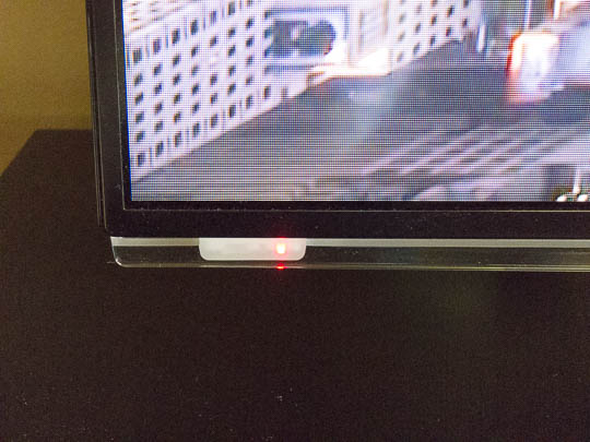
The TV's power light is housed towards the left edge of a clear plastic bar that runs along the full length of the TV screen's bottom edge. Its glow is at least as bright as a regular daylight TV image.

Of course, power lights do provide meaningful feedback, e.g., when the TV is receiving a command from the remote control, while it is powering up (if there’s a delay between switching the device on and the screen lighting up), or if there is a technical issue (as commonly indicated by unique blinking patterns).

Once the device has fully powered up, though, the fact that an image appears on the screen is more than enough feedback. At that point, a continuously glowing power light just does not provide any uniquely useful status information anymore.

These lights do bother me immensely.

When watching a movie, I often find that bright, ruby-red LED very distracting, especially if the movie’s scenery is dark and ominous. I’ve tried to find a way of deactivating the light, but short of ripping the LED out of its socket, I have yet to find a cure.

Screen on, power light off

My external computer monitor has a similar power light, and I find it at least as distracting as the one on the TV — even more so when working at night in a dimly lit studio. In its default configuration, the light glows red when the monitor is in stand-by mode, and blue while it’s switched on.
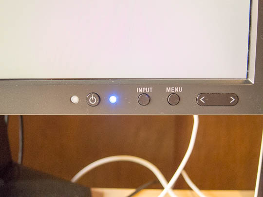
Several hardware buttons are embedded in the bottom right corner of the computer monitor's bevel. These are used for interacting with the device's on-screen configuration menus. The power LED is to the right of the power button, and it glows blue when the screen is lit.

(This monitor also lacks a true power switch, but it does have distinct “off” and “stand-by” modes. When in stand-by, the monitor will automatically light up as soon as it detects an active video signal. This is very handy as the monitor automatically switches the screen on and off when the computer wakes up or goes to sleep, respectively. In the “off” state, the screen always remains dark.)

After some research, I found a pair of promising settings deep in the monitor’s configuration menu. Besides being able to choose a blue and green color for the LED in “on” state (which I find somewhat gratuitous), there is an option for “LED Brightness.” And, yes, you can set the brightness to 0% to fully dim the LED.

As an indication of how much thought the designers invested in the monitor’s behavior, the brightness setting only applies when the monitor is on. When it’s in stand-by, the LED still glows red to help distinguish between “off” and “stand-by.” Great!
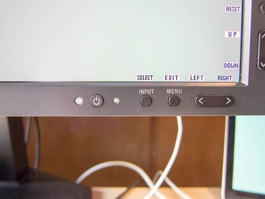
After adjusting the settings, the power LED is now completely switched off, even though the screen is lit. Success!

This is the exact behavior that I would love to see for every device that features a video screen: Provide feedback via an LED in response to certain user actions, as well as for indicating device failures — but please allow me to fully dim that light while the device is in standard, error-free operating mode, so I can focus on whatever’s on the screen, instead of what surrounds it.
Hidden Dairy, Hidden Handle, Hidden Thermostat

While I hope to finally be done with writing about claiming missing airline reward miles, another travel-related area should provide many more interesting things to share with you: Staying at a hotel.

Here are three new observations from that realm.

What’s in that fridge?

Whether you’re staying at a budget motel or pick luxury accommodation, breakfast is almost always served as a buffet. At swankier places, fruit, dairy, cold cuts, etc. are presented on elegant porcelain plates, seated on piles of crushed ice to keep the products fresh.

Less luxurious hotels usually serve pre-packaged, (more or less) brand-name-quality items that you will find at any supermarket. Instead of the more elegant “iced buffet” setup, more perishable products are simply stored in a fridge.

The challenge for the restaurant management, then, is to make it easy for their guests to find the breakfast delights they are looking for.

The straight-forward solution is a fridge with a glass door.

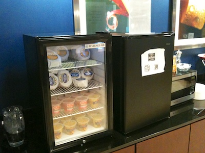
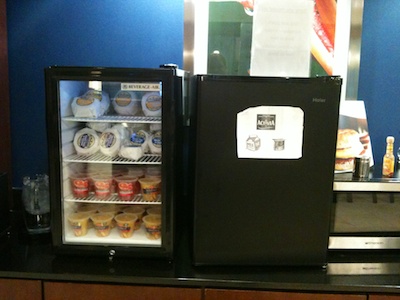
Two refridgerators side by side in a hotel breakfast buffet. One has a glass door, which lets you see what's inside without having to open its door.

You can instantly see what’s inside that fridge. Before you open the door, you can conveniently make selection, which also benefits the environment as it preserves energy.

The second-best approach is to list the fridge’s contents on its door. Best intentions of the restaurant staff notwithstanding, I found the 90s style clip-art-sporting label on this fridge a bit lacking in design prowess, but also in terms if information architecture.

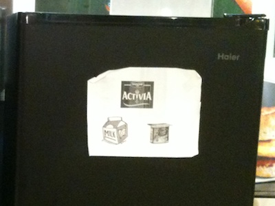
A sheet of paper is affixed to the fridge with the opaque door, showing the Activia brand symbol, a generic milk carton sketch, and an Activia yoghurt cup. All in glorious gray-and-white, and rather fuzzy at the edges.

The Activia logo at the top is only meaningful to someone who knows that brand, as is the somewhat obscure Activia-branded yoghurt cup on the right. The milk carton is more easily understood, but the “perspectivized” word “Milk” is difficult to read, especially from a distance, and especially for older eyes.

My guess is that simply placing the words “Milk & Yoghurt” in large type on that fridge would be much easier to understand for the average guest.

How (the heck!) do you open this thing?

The much more painful challenge that almost every guest had with both fridges, though, was actually opening them. Here’s a shot from a somewhat different perspective.

While you can see -- and feel -- the hinge brackets that hold both fridges' doors in place, there is no handle on either door.

See how both fridges lack an easily distinguishable handle?

Almost every person I observed was running their hands along the edges of the door to find a way to grasp it. The solution to this usability riddle is a groove that runs along the top of the door, and which you can grab — kind-a, sort-a — with the tips of your fingers.

Even after people had found that groove, they still struggled with predicting towards which side the door would open. Although the hinge brackets are visible, guests did not seem to notice them. No wonder, since the hinges’ black paint “nicely” blends in with the rest of the enclosure.

How expensive would it have been for the manufacturer to add a plain, simple, and highly visible handle to the fridges’ doors?

The position of such a handle would unmistakably indicate where and in which direction to pull, and on what side the door opens. They would also make it easier to get a good grasp on the doors, especially for older users or those with limited mobility in their fingers.

One set of controls for show, another for functionality

Moving from the breakfast buffet area into our room, this hotel features the typical, all-American, wedged-underneath-the-window air conditioning device. If you’ve ever stayed at a hotel with this kind of cooler/heater combo, you know that they can be ridiculously noisy. This specific unit was no exception.

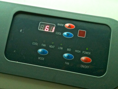
Thankfully, its control panel is in plain sight right on the unit, and the controls themselves are simple enough to quickly spot the colder/warmer buttons, as well as the main power switch.1

The design of the control panel on the A/C unit is simple enough that it's easy to find the buttons for setting the temperature, or for switching the unit off completely.

To my dismay, however, I kept pressing the buttons, but nothing happened.

My assumption was that, for some reason, guests were not allowed to change the machine’s setting. It’s that thing about “to the user, the UI is the system”. I.e., if the user interface does not seem to work, something in the system is either broken, or I’m not allowed to operate it or modify its configuration.

My assumption was wrong.

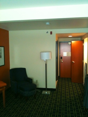
The next morning, after a somewhat sleepless night, we noticed a second control panel mounted to the wall opposite from the window, all the way across the room. You can see it in this photo, if you look very closely: It’s that minute silvery-white rectangle just below the floor lamp’s screen.

A tall floor lamp's screen at the other end of the room blocks the view of the thermostat mounted to the wall.

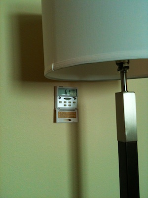
Here’s a better view:

The old-fashioned wall thermostat, ironically, has a less user-friendly user interface than the non-functional controls on the A/C unit.

It took just a few button presses to verify that this control panel worked just fine.

To whomever designed that Activia-branded dairy label for the fridge: Can you please print out a sheet that says “Adjust via thermostat on opposite wall”, and scotch-tape it over the A/C unit’s built-in controls? And, yes, in every room in your hotel, please!

Thanks!


  1. For something as simple as an A/C control panel, this is a really neat design: Note the correct mapping of the colder/warmer buttons, the helpful use of color, the application of the Gestalt Law of Proximity for grouping the controls on the panel, and the plain-language labels. 

A Stove Dial Pattern as “Off” Indicator

Have you ever wondered just after you’ve covered a few dozen miles towards your vacation destination, whether you forgot to turn off your stove? Yup, me too.

Only recently did I realize that my old electrical stove has a peculiar “feature” which makes it a bit easier to verify with a quick glance that it is fully switched off.

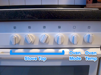
With one exception, all of its dials have seven snap-into-place positions, so that there is just one position in which a dial’s handle has a perfectly vertical orientation, and that is “off”.

Stove front panel with six dials in different positions

The exception is the dial for setting the oven’s temperature. It rotates freely and, therefore, can be set to either of two vertical orientations.

This is no big deal, however, because that dial only works in combination with the one right next to it, which controls the oven’s mode of operation. This one again offers seven positions, with the single perfectly vertical one indicating “off”.

All it takes to check whether the stove is completely switched off, then, is to see that all of its dials’ handles are oriented vertically.

The stove does have two status lights on the front panel, one for the stove top and one for the oven. Nevertheless, I have found it to be easier to visually take in the dials’ positions than to recognize whether any of the two lights is on — especially in those “from the corner of my eye” moments just before getting out the door.