More on Missing Airline Reward Miles

In my last blog post, “In Search of Missing Airline Reward Miles,” I had taken a closer look at how to claim uncredited miles via an airline’s website. Objects under test were Lufthansa’s Miles & More and British Airways’ Executive Club programs.

Since then, I have signed up for another loyalty program, called EarlyReturns, and offered by Denver-based Frontier Airlines. Before signing up, I had already flown with Frontier a few times. Using the boarding stubs from these flights, I had the opportunity to see how Frontier’s process for claiming uncredited miles stacks up against BA’s and Lufthansa’s.

Finding the claim form

The login form for the the Frontier Airlines website is located at the top edge of the site’s home page. Once the login process is completed, your name and a list of four links appear in the login form’s place. All four links are relevant to your user account: Redeem Miles, My Reservations, Account Activity, and Sign Out.

During my testing of the Lufthansa and BA websites, I had assumed that what I was looking for — namely some link or help related to claiming uncredited miles — would be located on the account statement page. So, I clicked on Account Activity.

At first sight, the Account Activity page looks a bit cluttered, which is mainly due to the fact that four separate navigation menus are spread around the page.

The Account Activity Summary section, however, provides a concise overview over your EarlyReturns membership level1, the date of last activity, your current milage balance, and — placed prominently right beneath the balance — there is the line: “Missing Miles? > Contact us”.

Although the wording is extremely concise, it is instantly understandable what “Missing Miles? > Contact us” means, and the link is located just where you would most expect and need it. What’s more, even on monitors with an 800×600 resolution, that line is above the fold and, thus, within direct view.

Submitting the flight details

What you see when you click the “Contact Us” link comes as a bit of a surprise: instead of a form for entering flight details, the page contains Frontier’s phone number, and their postal and email addresses2.

On the one hand, it is a nice touch that Frontier offers humans as first-level customer support contacts instead of requiring its passengers to tediously enter flight details into a more or less well-designed form.

On the other hand, though, the contact page does not state what information Frontier requires to process a mileage claim. Is the ticket number sufficient, or do I have to include more details like the route, date, etc.?

Getting help

The website’s EarlyReturns FAQs help pages provide more information on this. A link to a page with these FAQs is found in the lower right-hand corner of the Contact Us page.

Among the questions is one that is titled “Can I get credit for a previous flight if I am a new or existing EarlyReturns® member?” The answer to this question clearly explains how you can claim missing miles: mail in the ticket stubs or send them an email with your membership number and the “13 digit e-ticket number starting with ‘422’.”

Admittedly, the FAQ page for the EarlyReturns program is very long, so it will take a while to find this specific question. But with a bit of patience, finding the required information is simple, because the link to the FAQ page is in a prominent place; the relevant question is properly phrased; and the help text is concise, to the point, free of distracting marketing babble, and it contains exactly what you need to know.

And yet, this information would be even more useful if it were placed directly on the EarlyReturns contact page, so you would not have to go hunting for it in the first place.

Receiving my mileage credit

It took Frontier less than an hour to reply to my email in which I had sent them the details of my flights. In their reply, they promised that the “new balance will be reflected online in 24 to 48 hours.” The miles showed up in my account within little less than a day.

Kudos to Frontier for handling this process so much more customer-friendly than (at least) one of their major, global-carrier competitors!


  1. There are three membership levels in the EarlyReturns program, and their names are “Base,” “Ascent,” and “Summit.” I love it how Frontier applies its Rocky Mountains marketing theme even to these kinds of details. 

  2. It certainly does boggle the mind that this email address is not a clickable link. 

In Search of Missing Airline Reward Miles

During a recent stay in the US, I had been on two United Airlines flights. Like Lufthansa, United is a member of the “Star Alliance” group of airlines. Being a member of Lufthansa’s Miles & More loyalty program, I should have earned award miles for the United flights, but since someone else had made the booking for me, I had not been able to supply my membership number.

Unsurprisingly, when I later checked my Miles & More account, I had not received any miles for the two flights, and — ticket stubs close at hand — I set out to claim those uncredited miles via the Miles & More website.

Finding the claim form

After signing in, I went to the page with the detailed account statement. Since this page lists all recent account transactions, I thought this also was the most logical place to look for information on what to do if any transactions were logged incorrectly or simply missing.

Scanning that page for a link or a button titled “request mileage credit,” “claim uncredited miles,” or similar, yielded no result. The only link that looked mildly promising was “Account statement and mileage expiry queries” at the very bottom of the page.

I clicked on it, expecting to find concise and helpful information about what I could do within the context of the account statement page. What I got, instead, was too much marketing ramble — “Quick and easy access to information!”, “Why not subscribe to the free Miles & More Online newsletter?”, etc. — and too little helpful information. Neither seemed relevant to my task.

Next, I tried searching for “claim miles,” “get miles,” “credit miles,” “uncredited miles,” etc. via the website’s general search field. While some of the links in the search results did take me to the correct page for claiming miles– which happens to be titled “Mileage request” –, all of them were hidden behind tangential questions like “What is the time limit on the retrospective crediting of miles?”

Not one of the results included something as plain, simple, and straight-forward as “How do I claim uncredited miles?”

Now that I knew that “mileage request” is the term Lufthansa uses for “claiming uncredited miles,” I again searched the account statement page for a direct link to the claim form.

It does exist, and it is listed in the navigation menu in the account statement page’s top right corner. When opening that page, however, you cannot see it immediately, because, for some obscure reason, the designers must have thought that it is a briliant idea to hide most of the navigation menu. To disclose the entire menu, you have to click on “All functions.”

Unfortunately, there are more problems with that menu than just the fact that most of its items are hidden by default.

A navigation menu gone awry

Apart from the two words, “All functions,” there are no visual cues in that blue box that point to the existence of a hidden menu.

The icon next to the link does not resemble a standard disclosure triangle as found in, e.g., the Mac OS X Finder or Windows Explorer, and it points to the right, seemingly to a location off the screen. Which may make you wonder whether clicking it will take you to another page showing, well, all functions.

Once opened, the menu is overwhelming: the font is very small (and, consequently, so are the link target areas); there is no grouping; and the sort order seems arbitrary.

E.g., “Change PIN” and “Change Password” seem to be related to the “My profile” item, yet they are placed far apart from each other. “Book flight award” is about spending miles, as is “Gift miles”. And yet, they are separated by “Buy miles,” which is related to earning miles.

As for the menu items themselves, they seem overly curt. Adding a bit of redundance — e.g., using “Donate miles to charity” vs. “Donate miles” — may help grasping their meanings faster. Also, there is a subtle difference in the syntax of the items: some consist solely of nouns like “Mileage calculator,” whereas others contain a verb, as in “Buy miles”.

By the way, would you guess that the rather unforunately phrased “Member gets Member” takes you to a page for inviting someone to join Miles & More?

Just for kicks, here’s a suggestion for how I’d spruce up that menu by grouping the menu items and giving them somewhat more verbose labels, thus making better use of the available horizontal space.3

(Note that I have removed the “Change password” and “Change PIN” items, because I would probably move those to the “My profile” page.)

MY ACCOUNT
View my detailed mileage statement
View my credit card statement
Go to my profile

MY ITINERARY
View my bookings
Print passenger receipt
Enter passenger data for visits to the USA

EARN MILES
Calculate the miles you earn
Claim uncredited miles

SPEND MILES
Book a flight award
Book an upgrade award
Give miles as a gift
Donate miles to charities

Invite a friend to join Miles & More

Submitting a “mileage request”

As I stated before the menu diatribe intermezzo, I had managed to find the appropriate page for having the miles from those two United Airlines flights “retrospectively credited” to my account. One more click on that page took me to the form for entering my flight details.

A very welcome feature of this form is the “Number of flights” popup menu: you can enter up to ten flights in one session, which, I would assume, should be more than enough for most travelers.

Unfortunately, there is a lot of information that needs to be entered per flight, however, and it is not all that obvious where to find the respective data on the ticket stub. A page called “Ticket examples” that explains where to find what, comes in really handy at this point.

I do wonder, though, why I needed to enter the departure and arrival airports: shouldn’t the website’s database backend “know” a flight’s route based on the flight number and flight date, which I had to provide, as well?

When you’ve completed your data entry, and clicked the submit button, a summary page is shown, and when you confirm that, you’ll see a confirmation page, informing you that “Your flight is forwarded for verification.”

After a few weeks’ time, I re-checked my account, and the miles for the two United flights had been “retroactively credited.” But while the task was finished successfully, it could have been quite a bit easier if…

  • the Lufthansa website would use more intuitive wording for the task of “submitting a request to add award miles to my account for a flight that does not show up in my statement yet,”

  • the search engine would find results based on more common search terms than “retroactive milage credit,”

  • the navigation menu was not hidden by default,4
  • the request form would not require entering so many data items.

Same task, different approach

For a quick comparison, I went to the British Airways website to see what their implementation of this workflow looks like.

Similar to the Lufthansa website, British Airways’ site provides both a concise account overview and a detailed account statement. Right beneath the list of transactions on the latter page, there is a nondescript box, titled “See also”. And what do you know is inside that box: a link, saying “Claim missing BA Miles.”

As I said earlier, I assume that claiming uncredited — or “missing” — miles is one of the most often-used functions on the account page. Unlike their Lufthansa colleagues, the designers of the BA site seem to share this point of view and placed a respective link right where I as a user need it and, consequently, where I will look for it first.

The link is easy to find; it is easy to understand thanks to perfectly clear phrasing; and it takes you directly to an entry form.

The actual entry form page provides concise help in the form of bullet points; a link to an FAQ list, which — unlike Miles & More’s “Questions about your Account Statement” — happens to actually be an FAQ list; a few related links. And it requires you to enter exactly one data item: the ticket number.

At the time of writing this article, I did not have any uncredited miles to claim from BA, but just to see what was on the next page, I entered the ticket number of an older flight that had already been credited to my account. Here’s what I got:

Since I have never submitted a claim with BA, I have no idea how much data you have to enter if an uncredited flight is found. I deem it fairly obvious, however, that the overall process is much smoother on BA.com than it is on the Miles & More site:

  • I don’t have to go search for the “Claim missing BA miles” form because the link to it is located exactly where I would look for it in the first place.

  • The language used by BA makes it easier to understand where that link takes me.

  • For the first step of the process, all I have to enter is the ticket number.

  • Based on the ticket number, the BA website verifies whether miles have already been credited for the corresponding flights, which may spare me additional effort in case I have simply overlooked them on my account statement.

Of course, this is only one task of many that you can perform on an airline’s website. And yet, I find it striking that a standard function like claiming uncredited award miles can differ so fundamentally in how easy, convenient, and sometimes even pleasant they are to use.


  1. This is, of course, only my personal idea of a “better” navigation menu. For an actual website overhaul, something like a card sorting exercise combined with user testing should be employed to come up with an “optimal” solution. 

  2.  Considering that there is ample vertical space on that page, and that making things easy to find on a webpage is an important design goal, hiding that menu is a design decision that completely baffles me. 

What Time is Your Zone?

Support for time zones has become ubiquitous in digital devices. The designs of the user interfaces for setting the time zone differ quite a bit from device to device, and from software program to software program. That is, they make for some great observation material.5

In this article, I will have a closer look at the time zone settings of three desktop operating systems: Apple Mac OS X 10.6, Microsoft Windows 7, and Ubuntu Linux 10. Specifically, I want to find out how easy it is to select the desired time zone via these two approaches:

  1. If a user already knows her destination’s time zone, she will select it directly. (For this case, I posit that it is easier to remember a time zone by name than by UTC offset.)

  2. If a user does not know her destination’s time zone, she will search for the name of her destination, or the name of a bigger city that is close by. The corresponding time zone will then be determined the software.

Apple Mac OS X 10.6

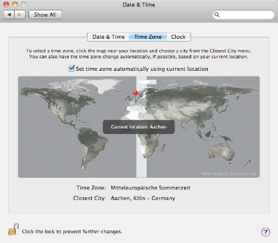
At the center of the time zone preferences in Mac OS X is a world map, which highlights the current time zone and the current location. Underneath the map, the time zone’s name is displayed, and a combo box shows the name of the “closest city”.

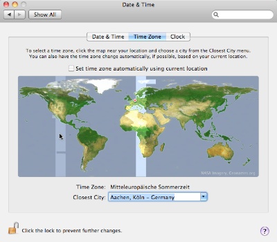
When you move the mouse pointer across the map, the time zone underneath it is highlighted. Clicking anywhere on the map changes the time zone and finds a city close to the geographical location that you clicked on.

When you open the combo box, the menu will list only cities that are, indeed, geographically close to the selected one. E.g., with Denver, Colorado, selected as the “Closest City,” the menu will contain several US cities within that time zone, but no Canadian or Mexican ones.

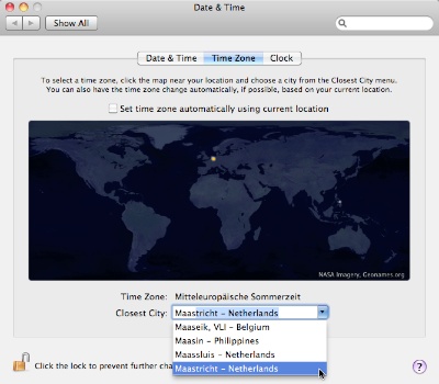
The combo box also serves as a search field for place names. As soon as you start typing, your search term is auto-completed, and a menu of further matches pops up. Every match is shown on the — now darkened — map with a pulsing white dot, and the current selection is highlighted by an orange dot.

Above the map is a check box to have OS X automatically determine your current geographical location and select the appropriate time zone.

Selecting a time zone by its name is inconvenient, because there is no UI control that lets you select a time zone directly by name.

Unless you know where the desired time zone region is on the world map, you will need to keep clicking on the map and checking the Time Zone text field until you have found the right one. If the name of the time zone that the mouse pointer hovers over was displayed as a tooltip or in a bezel as seen in the screenshot above (“Current location: Aachen”), this operation would be faster and more convenient.

Unfortunately, the way OS X provides time zone names is highly inconsistent: for some time zones, clicking on the Time Zone text field will toggle between a time zone’s name and its abbreviation (e.g., “CEST” and “Central European Summer Time”); for some, it will toggle between the UTC offset and the abbreviation (e.g., “GMT-08:00” and “AKDT” [that’s “Alaska Daylight Time”]): and for others, it will offer the UTC offset only.

I wish Apple would clean this up so that, for every time zone, the display will always toggle between its full name (plus its abbreviation in parentheses) and the UTC offset.6

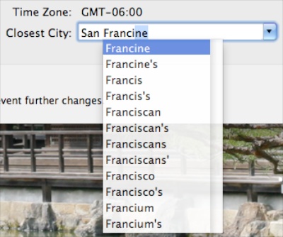
Finding a time zone via a place name works like a charm: as mentioned before, as soon as a you start typing into the combo box, the preferences panel will compile a list of matching place names inside the combo box’s menu, and mark each one on the map.

The list of cities is extensive and includes many lesser-known mid-size towns like Venlo in Holland, Slough in the UK, or Broomfield, CO, in the US, so that you will easily find matches beyond the usual major metropolises.

Also noteworthy about this design is, unfortunately, the annoying behavior when trying to leave the city search: once you’ve started typing into the combo box, hitting the Escape key will not leave the text field and reset it to its previous selection.. Instead, it will open a menu with what appear to be spell-check suggestions.

In the context of searching for a city name, the spell-check menu does not make too much sense. Being able to use the Escape key to revert the combo box to the previous location would be the better design choice.

As far as I can tell, in the current implementation, you can only end a search by clicking somewhere on the map, which, of course, also changes the time zone/closest city selection.

Microsoft Windows 7

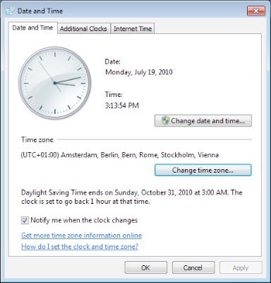
In Windows 7, you change the time zone in a small dialog box which contains a popup menu with a list of time zones and a checkbox for automatic Daylight Saving Time adjustment, and which displays the current date and time for the selected time zone.

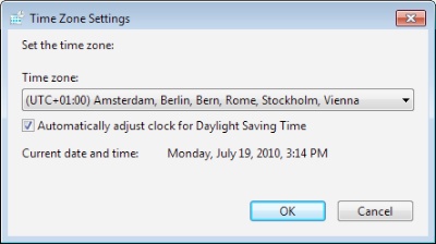
You open that dialog box by clicking the button “Change time zone…” under the Date and Time tab in Windows’ Date and Time control panel.

The dialog box’s popup menu has multiple entries for each time zone, which are identified as UTC offset. Each entry also lists a number of cities, which are grouped roughly by geographical region.

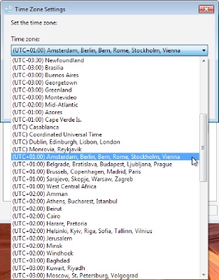
Selecting a time zone by its name is limited to North American time zones — Pacific, Mountain, Central, Eastern, and Atlantic — as these are the only ones included in the menu. For any other time zones, the user needs to know the UTC offset, or resort to searching via place names.

A major issues with this design is that the menu items do not reflect changes for daylight saving time, so that quite a few of the menu’s entries are simply incorrect when DST is in effect.

For example, Denver, Colorado, has Mountain (Standard) Time, which is UTC-07:00, or Mountain Daylight Time, which is UTC-06:00. The menu in Windows 7, however, only offers “(UTC-07:00) Mountain Time (US & Canada),” which time zone “name,” during DST, is off by an hour.

Finding a time zone via a place name is very tedious for two reasons: first, the menu includes only a few major cities for each time zone. And second, if you don’t have a rough idea in which time zone your destination is located, you will have to search through much of the menu due to it being sorted by UTC offset, and not by geographical region or place name.

Also noteworthy about this design is the fact that the dialog box with the time zone menu is modal versus the Date and Time control panel. Therefore, you cannot move the control panel as long as the dialog box is open.

Truth be told, moving the time zone menu and DST checkbox into a dedicated dialog box seems like an odd decision. I don’t see how this has any advantages over placing both elements right inside the Date and Time control panel.
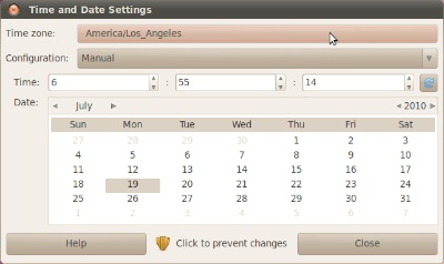
Ubuntu 10

Similar to Windows 7, Ubuntu 10 offers a modal dialog box from within its Time and Date Settings.7 Since Ubuntu handles windows differently than Windows (no pun intended…), though, you can at least move the Time and Date Settings window while the Time zone dialog box is open.

The Time zone dialog box sports a scrollable map view and a popup menu. When hovering the mouse pointer over the map, one of a number of marked locations is highlighted, and its region and name are displayed beneath the map. Clicking on the map selects the highlighted location and updates the popup menu accordingly.8

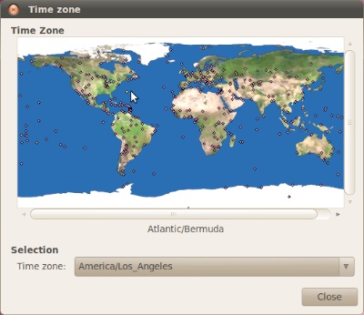
The popup menu is a flat list of places grouped by geographical region, and each menu item lists both the region and the place name.

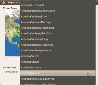
Selecting a time zone by its name is impossible, because despite its label, the “Time zone” menu does not actually list any time zones. It lists place names; time zone names or GMT/UTC offsets are missing completely.

Finding a time zone via a place name works reasonably well thanks to the menu’s grouping and sort order.

Separating the two levels of hierarchy — regions and place names — into separate user interface controls would probably make this kind of search even easier To this end, a hierarchical menu would be an option, as would be two separate menus for region and place, with the entries in the latter being filtered based on the selection of the former.

Also noteworthy about this design is that clicking on the map not only selects a location, but also zooms into the map. Right-clicking on the map zooms out again, and there are only these two zoom levels.

Linking two unrelated functions into one user action like this is bad design. Similarly problematic is providing a related undo-function that is difficult to discover: in this case, it is highly likely that you will run into the zoom-in function by accident when making a selection on the map. Finding out that the _un_zoom function is triggered by right-clicking, however, will take more (unnecessary) effort.

This detail would be easily solved by dedicated zoom buttons placed near the map. Then again, the map dialog box is resizable, and the map resizes with it. Therefore, the click-to-zoom feature seems more like a UI gimmick to me than a useful feature, and I would consider removing it altogether.

Regarding another detail, some of the entries in the Time zone menu contain a third hierarchy level for US states or country names, such as in “America/Argentina/Cordoba” or “America/North_Dakota/New_Salem”. The latter highlights another oddity: underscores instead of blanks. A user interface should be optimized for human use, and humans prefer blanks in these cases. For the sake of consistency, these two details should be fixed as well.

Some suggestions for what to keep in mind when implementing time zone support

After playing around with these three control panels, I would suggest the following guidelines for implementing time zone support:

  • Allow the user to directly select a time zone by name, and/or let her find one via a place name search.

  • If only one selection method is provided, make it the more-natural-for-humans place name search.

  • Sort time zone menus by time zone and include both UTC offset and time zone names.

  • Group place name menus by region, and sort them by region, then by place name.

  • Include a large set of places so that users can easily find one close by.

  • Ideally, provide an actual text search field for place names.

  • If a map is provided, clearly highlight both the selected time zone and the selected location, and identify both by name.

  • If you have the know how, implement automatic selection of the time zone. This will always beat manual selection in terms of accuracy and ease-of-use. If, that is, it is reliable. (If it’s not, then do not implement it at all.)

This is merely a personal list that has not been verified by any actual user testing. If you think that something should be added to this list, or needs clarification or plain correction, please email me with your feedback.


  1. If you would like to learn more about time zones in general, including their history, the Wikipedia article on the subject provides a lot of interesting insight. 

  2. Wikipedia has an extensive list of all time zone names and their abbreviations

  3. I’d love to know on how many operating systems this preferences panel is labeled “Date and Time,” and how often “Time and Date” is used. 

  4. If I’d feel tempted to feed my prejudice about how most open source developers lack attention to detail in UI design, I’d spend some time nitpicking about the different capitalization of “Time zone” versus “Time Zone” in this dialog box…