Before I launched this website in January of last year, it took me quite a while to decide how to leverage categories and tags towards making it easier for you, valued reader, to find articles that interest you.
Applied Information Architecture
Eventually, I settled on using categories for indicating the general category of the product I was writing about, and applying tags to list the user interface elements I was focusing on.
Every article was assigned exactly one product category and one or more UI detail tags, e.g., “Press for Coffee (W)here?,” that covers a coffee pump pot, was categorized as “household items” and tagged “buttons” and “labels,” and “The Bubble Cursor in Action” zoomed in on “cursors” and “target acquisition” while observing “usability basics.”
What’s with the wacky language in the second example, you ask?
Originally, I thought it was kind of funny in a geeky way to “zoom in on” the UI details while “observing” a product category. Maybe you noticed that the custom URLs reflected this, too: for tags, I used a construct like:
Similarly, categories were linked to via:
Just too much stuff
Over the last few months, that system has turned out to be way too complicated.
With every article I published, I was tempted to add new tags and categories to reflect new UI elements and product categories that I “zoomed in on” or “observed,” respectively.
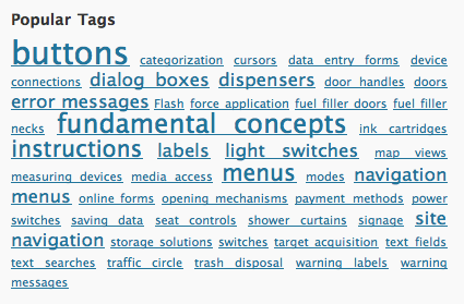
This becomes obvious when you have a look at the tag cloud:

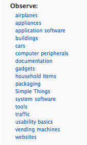
You will most likely not have seen this tag cloud before, because its contents were not exposed on the site — unlike the list of categories, which appears to be almost as uselessly messy as the tag cloud:

It was time to fix this, and I hope that the new approach will do just that.
Simplify, simplify, simplify
In the first step, I have completely removed all tags, and not just from being displayed in the articles’ by-lines, but also from the article database.
Secondly, for categories, I have been musing on how, exactly, I want to group the articles on the site. Most UI-related websites and blogs I follow focus almost exclusively on digital devices and software user interfaces. As soon as I fully realized that, I knew that it would make the most sense to categorize my articles based on the complexity and very general category of the devices covered.
Hence, this is the simplified categories structure that I came up with:
-
Usability Basics: Fundamentals of the science of human machine interaction and the art of user interface design.
-
Simple Things: Everyday things with a limited, yet often intriguing user interface, like door handles, coffee pots, and make-up mirrors. According to Donald Norman, users should be able to use these kinds of devices without having to read a manual.
-
Appliances: Stand-alone devices with more complex user interfaces, e.g., ticket vending machines, home theater components, and car dashboards.
-
Computer Software: Any software that runs on personal computers, “smart phones,” tablet computers, etc. This covers applications and operating systems as well as websites.
-
Documents: User manuals, questionnaire forms, etc. This category might as well have been labeled “content usability.”
- Services: Processes or workflows which are based on interactions between individuals and organizations.
It’s these six categories that you will see in the side bar from now on, and I hope you find them easy to grasp and convenient to navigate.
As for the tags, searching for UI elements like buttons or cursors via the site’s search field should bring up more relevant results than the tags I had applied manually. They will not be missed, I’m sure.
Whaddayasay? Lemme know!
Let me know what you think about this change: pop me an email and share your likes and dislikes about the new setup with me.
Update 2013-02-26: Added the Services category.