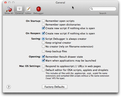
Among the well-established user interface controls are checkboxes and radio buttons for making selections from a list. With “well-established” I mean that users (tend to) have a common understanding of what checkboxes and radio buttons look like, and how they behave.

The difference in behavior between checkboxes and radio buttons lies in how many items you can select at a time.
A list of checkboxes allows you to select items arbitrarily: When clicking one checkbox, this has no effect on any other checkbox within the same list. You can check none, some, or all of the items.
Radio buttons, just like their namesake, let you select exactly one item at a time. Clicking on a radio button unselects the previous selection, and there always is an initial selection.1
Interestingly, there is no well-established UI control yet that requires you to select at least one or more list items (vs. zero or more for checkboxes).
In some cases, designers do have to find a workaround for this problem. More often than not, though, there is no actual need for the one-or-more approach to start with. Here’s an example for the latter.
America’s latest premium TV channel: “None of the Above”
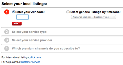
Across the US, TV programming differs slightly between regions and providers. Most websites that offer TV listings let you configure their schedule accordingly. On the TV Guide website, for example, you do so by filling out a simple four-step questionnaire.

In the final step of this process, you select any premium channels you subscribe to via a list of checkboxes. The odd thing about this design is the bottom-most option: “None of the Above”.
https://uiobservatory.com/media/2011/ListSelectionTVGuide.png” alt=”Fourth step of TV Guide form, showing a checkbox list of premium TV channels plus an option for “None of the Above”” border=”1″ width=”400″ height=”232″ />
Its appearance is perfectly identical to the other list items, which usually means that it should also behave identically, and control the same kind of functionality.
Nevertheless, if you do click this checkbox, any selections you may have made from this list are cleared, so that “None” is the only selection. Un-checking it again, however, does not restore your previous selections.
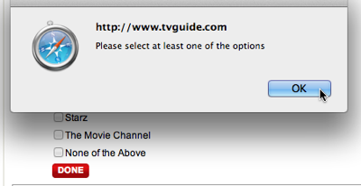
Because this option visually blends in with the others, it is also easy to overlook. If you do, and make the “mistake” of not checking any of the options, an error message appears, requesting you to “Please select at least one of the options”.

Unless you had discovered the “None” option and understood its meaning at this point, seeing those instructions may confuse you: “But I haven’t subscribed to any premium channels. Why, then, should I have to select one?!”
There are several ways to make this process more user-friendly, like making the “None” option stand out visually, by rephrasing the error message to make it easier to understand, etc.
When “None of the Above” should not be an option
The easiest solution in this case, though, is to simply remove the “None” option altogether. Not checking any of the available premium channels already constitutes the common understanding of “Nope, don’t have any of these!”.
Generally speaking, there are cases in which it does make sense to include a “None” option — namely for radio buttons! For checkboxes, however, the status of all checkboxes being unchecked perfectly covers the “None of these” option already.
-
No matter how many web designers very obviously think otherwise, displaying a group of radio buttons without any selection is bad design. By definition, a radio button has an initial selection.
If there is none, you have to guess whether whether you are expected to make a selection, or whether it is OK to leave it as is. Also, you cannot easily revert the radio buttons to their initial indeterminate state.
The easy fix for an indeterminate group of radio buttons is to add another option labeled “None [of these]”, and select this as the default. ↩