Improving File Searches With Search Tokens

Thanks to powerful search features that have been developed in recent years, you no longer need to manually browse your computer’s hard drive if you’re looking for a file. Instead, you let the machine’s search technology find the file for you.

As another advancement in this field, Apple introduced a novel UI element in OS X 10.7 Lion: The so called “search token” aims to simplify compound searches.

Entering compound file searches

A compound search combines searches across several metadata fields to fine-tune the list of resulting matches.

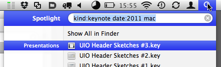
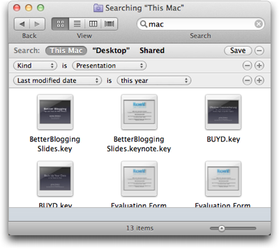
For example, to find all presentations about Mac topics from this year1, you might look for files whose …

  • kind is (Keynote) presentation,
  • date is this year, and
  • contents include “Mac”.

Previous versions of Mac OS X offered two methods for entering this kind of search. The more efficient one uses Spotlight with search operators like “kind:” or “date:”.

To run the example search, you would enter “kind:pdf date:2011 mac”2 into Spotlight’s search field.

Apple has published a complete list of Spotlight operators as well as further information on how to use Spotlight operators on their support website.

FinderSearchSpotlight

Besides having to remember which operators are available, and what their correct spelling is, you must know about this Spotlight feature in the first place. The chance of accidentally discovering it is very slim.

The second method for entering a compound search is by using the metadata fields in the Finder’s search window.

FinderSearchWindow

While entering a search this way is not as efficient as using Spotlight operators, it is much easier to discover, and the menus provide a built-in reference for the searchable file attributes.

The best of both of these methods has been combined into the new “search tokens”: Pure text entry and a menu of search suggestions.

Entering compound file searches with tokens

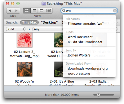
As soon as you start typing something into a Finder window’s search field, a menu pops up. Its contents are grouped by the metadata fields in which your search string was found.

FinderSearchSuggestions

When you see what you’re looking for, you select its menu item with a mouse click or via the cursor keys on your keyboard. There is no need to switch between keyboard and mouse while you refine your search.

When you make a selection from the menu, the search is encapsulated in a lozenge-shaped token, which combines your search term with the metadata field within which the search is performed.

FinderSearchToken

After adding a new token, you can continue typing to further refine your search.

FinderSearchTokenCompound

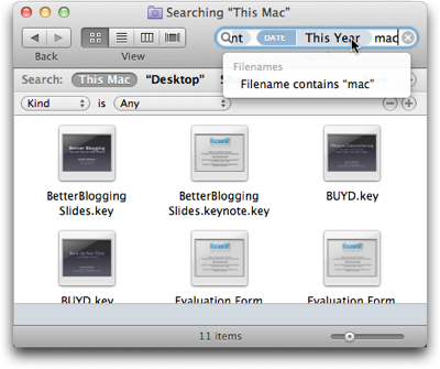
Unfortunately, the search field has a maximum width of about 35 characters, regardless of how you configure the toolbar in the Finder windows.

On average, this should be sufficient room for two or three search tokens. If you enter a more complex search, however, you cannot see the entire set of criteria at a single glance anymore.3

Combining the best of both worlds — and adding a caveat

Entering compound searches with the new search tokens merges the efficiency of typing into a text field with the discoverability of a menu.

Thanks to the tokens, you need to type even less than if you used Spotlight operators. That’s because you only need to enter the search terms, but not the operators themselves, as you pick these from the menu.

Besides the limited space in the search field, the current implementation of search tokens has one caveat: They only support a small subset of all available file metadata fields. Many more are available in the search section underneath the Finder windows’ toolbar.

Despite these shortcomings, the search tokens make performing compound searches of medium complexity more convenient and more efficient than either of the older methods.


  1. This article was written in 2011. Therefore, even though it was published in early 2012, it refers to “this year” as being 2011. 

  2. According to Apple’s documentation, “date:this year” is supported as well, but I couldn’t get it to work on my machine. Hence the hard-coded “2011”. 

  3. There is a workaround, but it’s rather tedious: If you save a search and then select Show Search Criteria from the resulting Smart Folder’s context menu, the search criteria will not be shown as tokens anymore, but appear in the search fields underneath the toolbar. 

OS X’s Most Un-Mac-like Feature

It’s surprising how often my Macs fail to recognize a CD or DVD when I insert it into the optical drive. The disk is properly pulled into the drive slot and spins up, but its icon does not appear in the Finder.

In order to force-eject such a rogue disk, you have to restart the Mac and hold down the mouse button during the boot process. Before the log in screen appears, the disk will pop out of the drive.

OS X Help page, explaining how to eject disks that refuse to be ejected via the regular command

This brute-force method has worked for me every time I used it, but it is massively disruptive.

Imagine doing creative work on your computer. You have meticulously arranged numerous windows from multiple applications into a super-efficient workspace.

And now you have to close all apps and shut down the entire machine, just because the OS does not properly recognize a CD.

Insane!

You can’t select what isn’t there, …

Why won’t the OS let me select some icon in the Finder and then execute the Eject command? Well, if there is no icon that represents the disk in the drive, how would you select it?

Part of the problem is that the Mac’s Finder differentiates between a (physical) drive and the (logical) volumes stored on that drive. This differentiation also applies to drives with removable media.

In the Finder you will only see icons representing volumes, but none for the physical devices. This is different on Windows.

On Microsoft’s OS, icons for drives with removable media like CD/DVD drives, etc. always appear, regardless of whether there is a medium inside that drive, or not.

In everyday use, there is a drawback to Microsoft’s design, because if you select such a drive while it’s empty, Windows will still try to read from it.

It takes a few seconds until the system recognizes that there is no medium inside the drive, and during that time you cannot continue working inside the specific Windows Explorer window. Which makes inadvertently clicking on an empty drive’s icon rather annoying.

… or can you?!

There is one application on the Mac, however, that does let you access physical drives: Disk Utility.

The Disk Utility application displaying both physical drives and logical volumes, and a Finder window listing only volumes

As you can see in the screenshot, the Finder only displays the volume — “Beyond Tomorrow” — for the computer’s internal hard drive.

In Disk Utility, in contrast, you can also access the physical hard drive as well as the optical drive. The latter is grayed out, since there is no medium inside.

This application would be the logical place for offering an Eject command that operates on the drive, not the medium. Such a function would force-eject whatever is inside the drive, regardless of whether the Finder has properly recognized it, or not.

In fact, this function should probably be deactivated, unless the Finder failed to recognize the disk, so that the user has to properly eject mounted disks to avoid data loss.

Then again, most users will have no need to ever use the Disk Utility application. They may even be scared by it due to its deep-down-inside-the-drives’-guts functionality.

A rare specimen: the non-evil time-out

That’s why I would like to see a different solution to this problem: A time-out!

As much as I loathe user interface time-outs in general, it would make a lot of sense for the computer to automatically eject a removable medium, if it is not recognized within a few seconds after it has been placed inside the drive.

Add in an error message window that informs the user, why the disk has been ejected, and you have a very user-friendly solution to an as-of-yet nasty problem.

A Somewhat Challenging Doorway

When you enter a building with multiple entrance doors, which door are you most likely to pick?

Your first attempt at entering will most likely be through the door that is closest to the bell button panel, and you will probably try to open that door by pushing against the edge that is next to the button panel.

Applied to the doorway in this photo, then, you’d try to walk in through the door on the right, and push against that door’s right side to open it, right?

Double-winged glass doorway shown from the outside with a button panel at the right. Both doors have identical handles that are located in the center of the doorway, and the right door's hinges are visible. A circular sign is posted on either door.

Wrong, alas!

Not your average doorway

The position of the door handles already gives away that you’d have to move the door’s left edge, the one away from the button panel.

And if you look closely at the right edge of the door frame, you can see the door’s hinges, which means that you have to pull, not push, the door to open it.

As if that wasn’t irritating enough already, you actually cannot get in through the right-hand door at all! A sticker on the inside identifies it as an emergency exit, and an alarm will sound when you open it.

The proper way to enter this building is to use the door on the left.

Giving visitors a sign

This entrance must have stumped quite a few visitors, because there are signs that indicate which of the doors is the entrance, …

Sign on the left-hand door with a green circle, enclosing an open door, a smiley, and arrow pointing through the door.

… and which is the emergency exit.

Sign on the right-hand door with a red circle, enclosing a frownie.

Although “home-made”, these signs take a few clues from traffic signs to convey their meaning. I wonder, though, how much cognitive effort and time it takes to understand those meanings due to the custom “icons”.

Why not use regular traffic signs instead? Their appearance is more common, so your brain can more easily recognize the signs and, consequently, make sense of them more quickly.

https://uiobservatory.com/media/2012/ChallengingDoorwaySignage.png” alt=”Traffic signs “Drive Straight Ahead Only” and “No Entry” plus plain-text instructions as replacements for the two signs mounted on the door.” border=”1″ width=”400″ height=”400″ />

Any remaining doubts or ambiguity as to the signs’ meanings can be addressed through explicit, plain-text explanations.

No such thing as add-on-later usability

Despite these two well-intentioned signs, I am convinced that a few visitors will still be trying to enter through the right-hand door.

With their visual and cognitive focus moving directly from the bell button panel to searching for the door handle, they will literally overlook the signs.

Fixing this doorway properly would at least require moving the bell button panel or even swapping out both doors. Both approaches would result in prohibitive costs and effort.

Which goes to show that you cannot easily make something user-friendly which has not been designed for good usability right from the start.

Update 2012-01-12: Two readers have commented on this article.

Ben Kennedy tweeted:

I would never expect to push on the button panel side. No pair of doors ever hinges in the middle.

Good point!

There is, however, a noteworthy difference between the entrance in this article and a “regular” pair of doors: This specimen features a vertical bar in the middle.

The vertical bar effectively divides the entryway into two separate single-leaf doorways — opening both doors will not create one double-width entrance.

It was this effect that made me assume that pushing on the side of the button-panel would feel more “natural”. After reading your comment, Ben, I’m not so sure about that anymore.

I wonder whether someone did actual user testing of double-leaf entryways. Unfortunately, I could not find anything on this topic so far.

I did, however, discover this blog post on The Evolution of Door Usability, which nicely complements what I wrote above.

My buddy, Ed Hodges, wonders:

I reckon the simplest solution would be to investigate declassifying the door as an emergency exit & just have it as a regular door, so that both work all the time. Do the fire regs really force you to have some doors alarmed?

I’m not familiar with these regulations, so I can’t answer your question, Ed. Maybe there are regulations in effect that even require the doors to be designed exactly as they are now.

Regardless of whether that is the case, though, the designer’s idea of how this entryway should work obviously differs from what some (most?) of its users are expecting.

If the designer’s and the users’ mental model matched, there would be no need for the signs in the door’s windows.