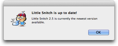
This afternoon I was getting some writing done, when, out of nowhere, this dialog box appeared:

At the time, the application that is mentioned in this message was not even running!
Little Snitch is a network utility, and it consists of a “daemon” — a software program without a user interface which runs in the background all the time — and a regular application for configuring the software. It’s the latter that allows checking for updates.
I’m not sure whether a bug caused this dialog box to appear1, but, in any case, it provides a great example for what an application should not bother its users with: Anything that does not require the user’s immediate attention, unless she explicitly requested a piece of information.
Don’t bother me unless it’s important and urgent
What’s it really say in that message? “This application is up-to-date. There’s no need for you to do anything at all about this right now. Just sayin’.”
Although this message was anything but important, it showed up front-and-center on my screen, thus interrupting my workflow, and making me lose my focus and concentration.
Compare this to warnings about my laptop’s battery being low, so that the machine will go into hibernation within a few minutes; or about the machine’s hard drive running out of space, potentially preventing me from saving any more files very soon.
In both of these cases, the computer makes me aware of something that could have a serious impact on my ability to properly use the machine. I must do something about it, and I better be quick.
These kind of critical warnings are annoying, too, but if they didn’t appear, the consequences would go well beyond annoying.
Imagine, however, what it would be like to use a computer that also “warned” you of the fact that everything’s OK! “There is lots of space on your hard drive!” “Your battery is fully charged now!” “There is still enough space on your hard drive!”
Unless you explicitly request a piece of information, e.g., by selecting the Check for Updates menu item, you should never be confronted with a dialog box that merely states that “everything’s fine”. There’d be so many of them, you wouldn’t get any work done at all.
What dialog boxes and secret documents have in common
In a way, well-designed dialog boxes are like confidential documents: They should be presented strictly on a “need-to-know” basis only. If the user doesn’t need to know now, software should just remain quiet.
In cases where there is a need to convey non-critical system status information, status icons or status bars are a much less intrusive and more user-friendly approach.
-
Automatic update checks were added to Little Snitch in the current version 2.5, which was released only last month. Therefore, it is, indeed, likely that this dialog box’ appearance is a bug. ↩