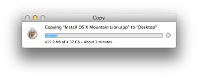
Progress bars are a staple of user interface design. They let you check the progress of a lengthier process — like copying a large file — with just a quick, cursory glance. And by observing how quickly the bar moves, you can intuitively estimate how long it will take for the process to complete.

Progress bars — they’re not just for digital devices
At London’s Heathrow airport, you can find progress bars in an unusual setting: Namely, on-board the shuttle buses that run between the airport’s five terminals.
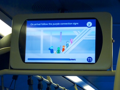
The buses feature monitors that display useful information on how to transfer between terminals. At he bottom of the screens, a progress bar visualizes the route from one terminal to another.

The number of the destination terminal is shown at the end of the progress bar1. A nifty bus icon represents the vehicle’s current position along its route.
Although the bus icon does not move along its path all that smoothly, seeing it progress at all does help ease that infamous “Are we there yet?!” feeling — especially when you’re worried about making your connection flight.
When (your users are) in a rush, stop cycling screen contents
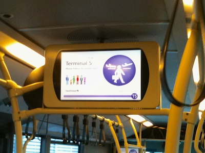
Here’s an interesting detail: While the bus is moving, the display cycles through several different information screens. Once it approaches its destination, however, it settles on a single screen, which announces the terminal you’re just arriving at.

By making the display static towards the end of the journey, all passengers immediately get off the bus, instead of possibly blocking the aisle while waiting for another screen-full of information to appear.
-
Note how the direction of movement in a progress bar is from left to right, at least in our part of the world where we read and write from left to right. I wonder whether someone who grew up with a right-to-left script would consider the opposite orientation “more natural”. ↩