For a while now, Adobe’s Flash Player has been taking an almost constant beating. The reasons: numerous security holes, unresolved accessibility problems, and general performance issues. Judging from related online discussions and blog posts, many users now respond to these issues by disabling Flash and similar plugins in their browsers.1
Let me see what you got — Flash or not
On these people’s machines, content that requires a browser plugin may not appear at all. Web designers must take that into account unless their clients don’t mind losing site visitors and, thus, (potential) customers. This is especially important if core functionality like site navigation has been implemented in Flash.
The obvious work-around is providing a pure-HTML alternative. The link to such alternative content needs to be placed in a prominent location so that it is easy to find.
An example for how not to handle this is the website of the Berkeley Center for New Media. If you visit the site with a Flash-blocker installed and activated, all you see on the site’s home page is the header banner and a Flash placeholder.
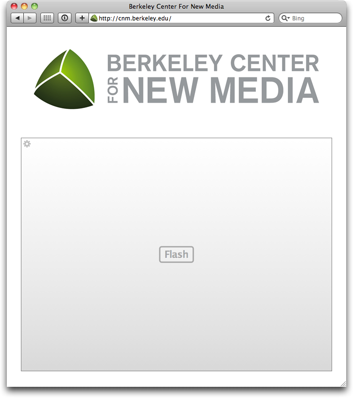
Once you load the Flash item, you will see that it contains the entire site navigation. Unless you have the Flash Player plugin installed, this website remains completely inaccessible to you. Even though a pure-HTML version of this navigation menu is available!
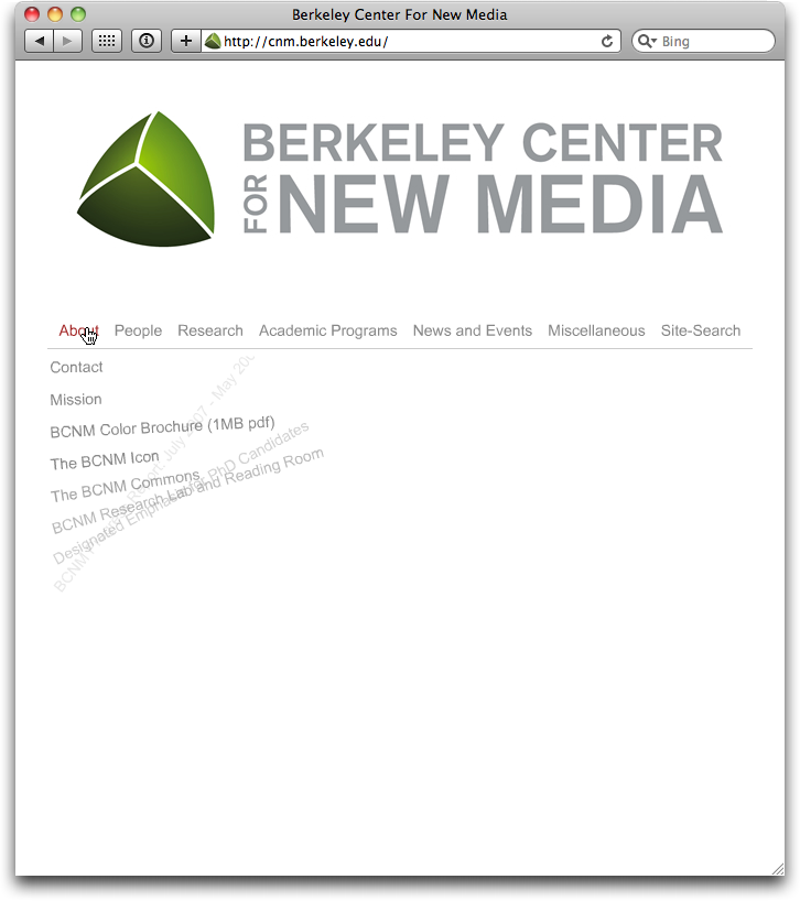
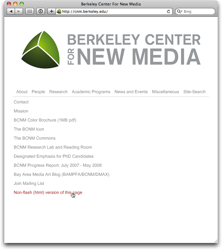
Links to the “Non-flash (html) version of this page” are listed in both the About and Miscellaneous menus — inside the Flash item.
Please accept my apologies for being really blunt here, but: placing the link to the non-Flash version inside the Flash version, is just too dumb for words. It’s like placing the spare key to a safe deposit box inside the box itself, making it perfectly useless if you lose the original.
Said “HTML version of this page” is delivered in the form of a rudimentary bullet list. The bar at the top lets you jump to a sub-section on the page, but the sub-sections themselves lack “Back to Top” links. And although all of the links look identical and most will take you to sub-pages on the site itself, a few links have other websites as their destination.
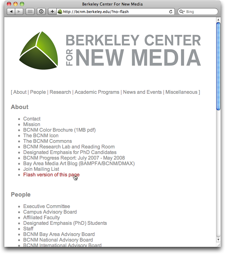
As for navigating the other pages of the site, the only option you have is to click the top banner image, which leads you back to the site’s homepage. When you follow that route, the home page always defaults to displaying the Flash version even if you had previously switched to the pure-HTML version.
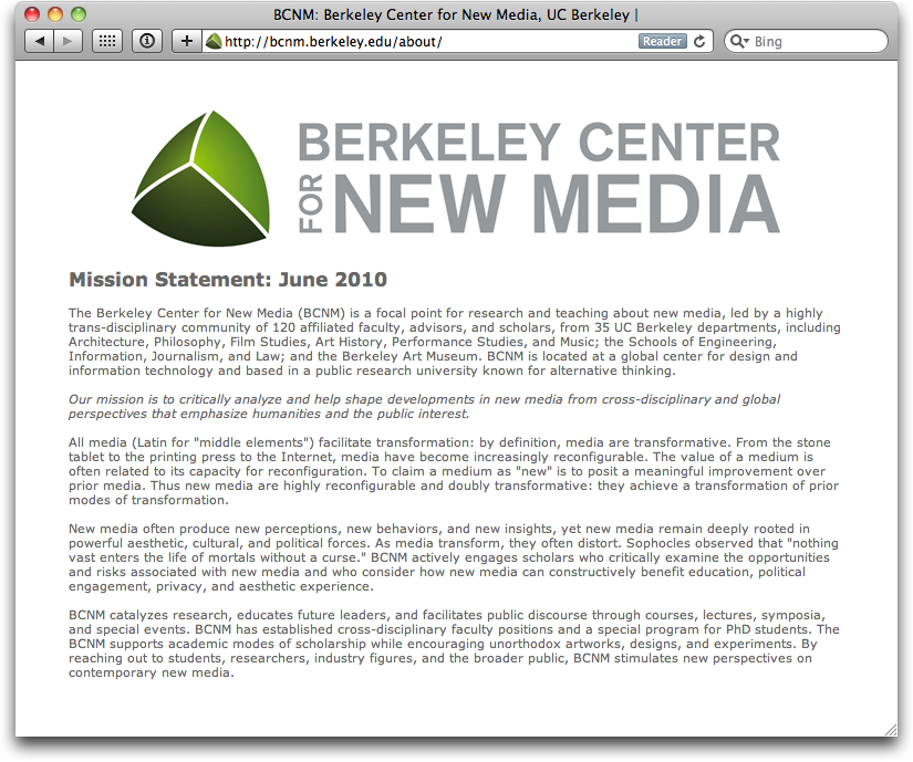
Site navigation and Flash animations don’t mix
If you take a look at the HTML code behind the navigation page, you’ll find a comment stating that “[t]hese files are an example of Dual Design, created in 2005-2006 by Guy Boo and Ken Goldberg.”
According to the Dual Design webpage, the idea is to generate both HTML and Flash versions of the navigation menu from a single XML file containing the links and their labels. The goal of this setup is to “combine the design of Flash with the practicality of HTML.”
Thanks to the Dual Design software, a webserver will serve either the Flash or the pure-HTML content based on the web browser’s query, which includes information on whether that browser supports Flash content, or not.
Unfortunately, Flash-blockers like ClickToFlash intercept the Flash data stream. I.e., even though Flash content is blocked from being displayed, the browser will still inform the server that it does support Flash. Consequently, even when you have decided to block Flash content and would prefer the pure-HTML page, the server will still provide the Flash version.
Admittedly, this is a niche problem that the developers probably had not taken into consideration, what with Dual Design having been released four years ago.
Fact is, from a developer’s technical point of view, Dual Design is an example for neat web content implementation.
From a usability engineer’s point of view, though, it’s a failure: except for gratuitously animating the links into place, it does not add anything to the user experience. Having that Flash menu at their disposal, however, has obviously convinced the developers that it wasn’t necessary to implement a proper navigation scheme for the site.
A navigation scheme which is visible and accessible on all pages; which makes it easy to grasp the site’s general structure at a glance; and which provides visual clues about the current page’s location within that structure. Oh, and, of course: which doesn’t require any browser plugins, either.
-
If you want to load Flash items on a case by case basis, try ClickToFlash for Safari or NoScript for Firefox. Similar plugins as also available for other browsers. You can, of course, take this even further and get rid of Flash altogether. ↩