As someone who loves Asian food, I find it interesting to see how restaurateurs make chopsticks and napkins available to their patrons.
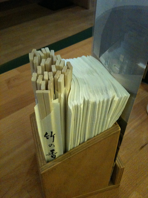
At one of my favorite sushi joints, they use simple yet neatly crafted wooden boxes for holding chopsticks and napkins plus a drink specials menu. Both chopstick packs and napkins are stored in the same compartment of that box.
Unfortunately, the restaurant staff always crams so many chopstick packs and napkins into that one compartment that it is impossible to pull out one napkin without dragging along a few more. There is just too much friction between neighboring napkins to allow a single one to slide out easily. Sometimes it is even borderline impossible to pull out a whole pack of napkins without ripping a few of them pieces.

May I please blow this “problem” way out of proportion for the sake of argument real quick? Thanks!
In a way, this chopstick-n-napkin dispenser packing method reminds me of “The Shower Curtain that has its Priorities Wrong” that I have covered previously: it’s about having the wrong priorities and, consequently, aiming for the wrong (design) goals.
If they weren’t over-stuffing the boxes this way, the restaurant staff would have to refill them more often, creating more hassle for them. As a result, however, the first, say, five or six “users” of this dispenser will have a less-than-enjoyable experience when trying to grab a napkin.
As much as I appreciate the excellent service that is provided by the wait staff at this restaurant, I feel that the customer experience should have precedence.
OK, let’s return to planet earth now to solidly re-plant our feet on the “ground of appropriate perspectives” again. But, see, I wanted to present this example to you to demonstrate just how far you can take usability OCD.