Playing games on a touch screen device can be a delightful experience: being able to directly manipulate objects with your fingers on the screen without having to go through a “control intermediary” like a joystick makes for immersive and engrossing gameplay.
With the entire screen being used as a game controller, however, game designers must pay special attention to the placement of on-screen menu navigation controls: your enjoyment of a game will decline rapidly if you’re repeatedly catapulted back to the main menu screen, just because you inadvertently hit the wrong button while tackling a difficult game level.
Aim… fire! — Aim… fire! — Aim… RESET LEVEL?!?
In the physics-based puzzle game Ragdoll Blaster 2, your aim is to hit a target with ragdolls, which you shoot from a cannon. To clear the ballistic path towards the target, you shoot the ragdolls against objects like boxes, wheels, etc. to move them out of the way, make them spin, and so on. Inertia for the win!
Your finger’s position on the touch screen aims the cannon and also controls the force with which the poor ragdolls are sent on their trajectory — the farther your finger is away from the cannon, the stronger the blast.
In the level shown below, you need to set the big wheel in motion by shooting the cannon that is mounted to the wheel’s rim (it’s the weird contraption seen at the wheel’s apex). The rebound from shooting a ragdoll applies force to the wheel, and if you aim it right so that the force is tangential to the wheel’s circumference, the wheel starts turning.
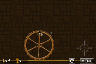
The crosshairs on the screen indicate the position of the player’s finger, which, in this case, is very close to the two on-screen buttons, “restart level” and “menu.” It’s way too easy to hit either button while feverishly tapping the screen to get that big wheel rollin’. Consequently, getting through this difficult level is extremely frustrating.
The buttons’ default position is the lower right corner of the screen. In a few levels, the designers have placed them in other corners, thus showing that they are aware of the issue. Nevertheless, in some of the game’s levels, the buttons still do get in the way, adding the kind of difficulty to solving those levels that goes well beyond what the player perceives as “pleasantly challenging.”
Ragdoll Cannon, which is one of two games found in Physics Gamebox, works off the same game idea, and it also features similar “reset level” and “menu” buttons. In this game, however, the buttons are not always tucked away in a corner of the screen, but sometimes show up nearer the screen’s center, too.
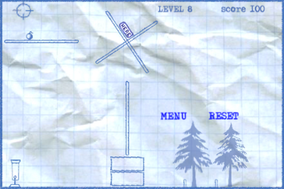
Even with the buttons being moved out of harms way as best as possible, there is a more robust approach: a slider.
When a simple tap shouldn’t do
The music performance application MorphWiz uses most of the screen to display an x/y-“keyboard:” the horizontal axis represents pitch, the vertical is used for modulation such as morphing between two different waveforms.
MorphWiz’ user interface displays only two controls that are not related to actually performing with this instrument: the sound preset selector (the two arrows) and the slider in the top left corner to bring up the app’s main menu.
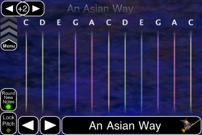
The slider works just like the one that you use to unlock your iPhone or iPad: to go to MorphWiz’ main menu, you have to consciously move the slider upwards — it’s not enough to casually brush against it with your finger, whether intentionally or by accident.
What’s more, if your finger happens to end up on the menu slider while you’re playing MorphWiz, it will ignore the finger press: if you hold down a finger to play and then move it over the menu slider, nothing happens. MorphWiz just continue to play the sound.
In true multi-touch fashion, you can access the slider while playing, but with another finger: if you operate the slider with a “new” finger in addition to the one(s) you’ve been playing music with, it does react to your input. The same applies to the two preset selector arrow buttons.
This behavior of the slider makes it virtually impossible to leave MorphWiz’s performance screen and dive into the app’s configuration mode unless you really want to do so.
Such a slider, when used for navigating away from a game screen, could also go a long way in preventing gamer frustration.
Menu navigation controls don’t always get in the way
Not all games require work-arounds for on-screen buttons, though. They work just fine as long as they are not positioned within the area of the touch screen that is used for controlling the game.
In the game Flight Control, you direct airplanes and helicopters to their respective landing strip or pad by drawing a flight path from the aircraft to the color-coded destination right onto the screen.
In this game, the button to go to the game’s main menu is positioned in the screen’s lower right corner and indicated by the “pause” symbol.
Even when the screen gets crammed with aircraft and you frantically try to keep them from crashing into each other — which, very obviously, ends the game –, the focus of the game is near the center of the screen and the risk of hitting the “pause” button by mistake is all but non-existent.
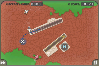
When you do hit the pause button, a dialog screen comes up in which you can choose to continue playing the current level of the game, or continue to the main menu, which will also reset the level you just played.
Consequently, unlike the Reset Level button in Ragdoll Blaster, even if you do hit the Pause button in Flight Control by accident, you will not lose any progress you have made in the game.
In other words, the worst that can happen is that you literally pause the current level, but you can always return to where you were in the game.
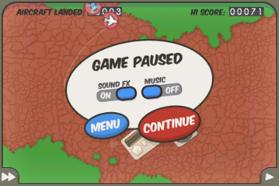
Also note how two key preferences options, namely sound effects and music, are accessible via the pause screen, as well, so you can adjust them without having to leave your current game.
A final example, the shoot-at-orbs game Orbital uses the entire screen as its fire button — with the exception of the miniature-sized “PAUSE” text in the screen’s upper right hand corner.
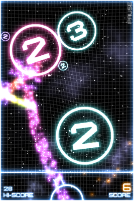
Operation of this button is similar to the Pause button in Flight Control: the chances of hitting the Pause button unintentionally is very slim, and even if you do, the current level is paused, not reset.
You only lose your progress if you continue from the Pause screen — which, of course, also sports a “Return to Game” button — on to the main menu.
When do you need to go beyond buttons?
The most reliable way for designers to decide whether to use plain buttons, and where to place them on the touch screen, is to simply play the game for a while: if you’re accidentally thrown out of the gaming action a few infuriating times too many, try to find an alternative solution. Like, for example, the Menu slider found in MorphWiz.
Applications that do use buttons should always Pause the game, instead of resetting the current level or going straight to the main menu. This adds an extra level of protection against losing game progress versus the simple buttons found in Ragdoll Blaster 2.