One of the biggest festivals on Northern Colorado’s lively music scene is Bohemian Nights, which takes place during the New West Fest in Fort Collins. Kicking off tonight1, this year’s event boasts 80 bands. A customizable concert schedule lets you pick and choose from this sonic abundance.
Here’s what I would consider a common scenario for using such a schedule: After deciding when you are free to attend the festival, you search (or filter) the schedule for all bands who will be playing while you’re there, and whose music appeals to you. You then make your selection from the resulting list.
Let’s see how easy it is to accomplish this on the Bohemian Nights website.2
Finding concert details
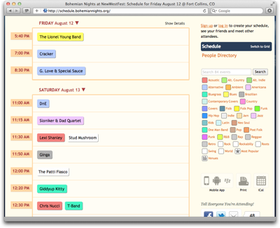
The schedule’s default view is a chronological list, grouped by day and start time.
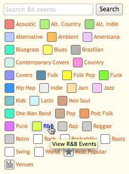
Immediately visible are only the bands’ names. These are displayed against a colored rectangle to indicate their music’s genres. A list on the right shows what color corresponds to what genre (referred to on the site as “[music] types”).
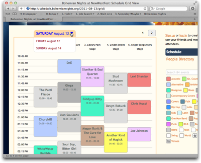
For a better overview over the schedule, you can also view the concerts on a grid. In this case, though, you can only see one day’s schedule at a time, and depending on its length, the view may be paginated as well.
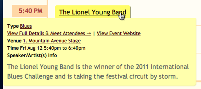
Complete information — comprising genre, date and time, venue, and a short info blurb — is available for each concert. You can view this information in three ways: hover your mouse pointer over a band name to make a tooltip-like overlay appear; …
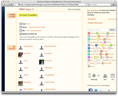
… click on a band to show the information on a separate page; …
… or click on Show Details above the schedule to display information as in-line boxes on the schedule.
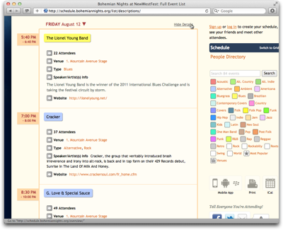
Obviously, it is rather tedious to “manually” scan all 80, or so, entries on the schedule to find interesting bands, regardless of which of these three methods you use to view the detailed information.
Equally tedious is the attempt to correlate a band’s color with the genre list. With a total of 35 genres, many of which share highly similar, if not identical colors, the limitations in your eyes’ ability to differentiate between these colors will soon become apparent.
What’s more, many bands are listed under more than one genre, but the color only reflects one of these.
A much easier approach to work along the usage scenario would be to filter the schedule, so that it would only list those events that match the search criteria.
Add some music to your day
Although this is not directly apparent, you can, indeed, filter the schedule by genre by clicking on any of the genres in the list, but you cannot select more than one genre at a time.
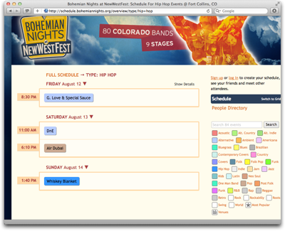
To “reset” this filter, you need to click on “Full Schedule”, which is placed far away from the genre list. Finding this function would be easier if it were implemented as an All Genres option and grouped together with the other genre “selectors”.
What the genre list does include are two items called Most Popular and Venues that are not genres at all.
By (most) popular request
Most Popular ranks performers based on the number of people who signified via the schedule’s social features, that they are “interested” in a particular band.
Note how the genre list does contain an All Types item here. That is because clicking any genre in this view will display the rankings within that genre, and All Types takes you back to the full ranking.
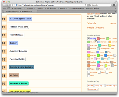
In addition to filtering by genre, you can also filter the rankings by day, but you can only select one day (or All Days) at a time. What’s more, although they have their own group and are not placed close to the genres, clicking any of the Popular by Day filters also resets the genre filter!
That is, you can see the ranking for a certain genre (or All Types) or a certain day (or All Days); you cannot filter by genre as well as day at the same time, though.
Where did those guys play again?
The Venues view looks similar to the regular schedule, but it groups the concerts by venue. Through a Venues filter section, you can limit the display to show only bands playing on a certain stage.
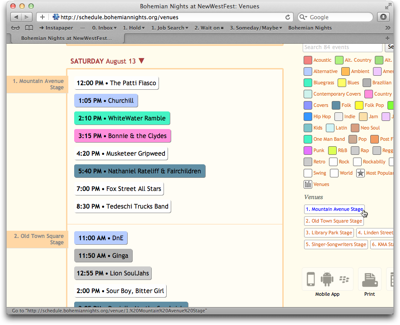
If you click on a genre in this view, you are immediately taken back to the regular schedule for that genre instead of viewing the genre grouped by venue.
Take me back where I belong
If you’re in either Most Popular or Venues view, the link to get back to the “normal” schedule view is not atop the schedule where it was when filtering the list by genre. Instead, the link to click is the header-like Schedule line above People Directory in the column on the right.
Although the Schedule link is highlighted when you’re viewing the schedule, it was difficult for me to find. It just feels illogical to have to use links in two different locations to get to the same page on the site.
Tidying up just a lil’ bit
The extensive information that is made accessible via this schedule is great for planning a visit to Bohemian Nights, but the navigation of the schedule is confusing.
The key reason, in my opinion, is that the site’s information architecture does not reflect the underlying data structures very well.
In essence, there are four different views on the available data:
-
Concert list: Grouped by date. Sorted by date and time. Filtered by genre.
-
Concert grid: Grouped by date and venue. Sorted by date and time. (Cannot be filtered.)
-
Venue list: Grouped by date and venue. Sorted by date, venue, and time. Filtered by venue.
- Most popular: Ungrouped. Sorted by popularity. Filtered by genre or date.
In all cases, filtering determines what data is being displayed, and grouping and sorting determine how the data is displayed. To make it easier to grasp this structure, the views should be separated from the filters, and this separation should also be reflected in the UI.
Based on this approach, here’s a suggestion for a slightly different layout3 for this page:
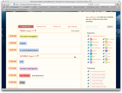
Venues and Most Popular are part of a view selection that also includes the default List view plus its Grid variation. All filter groups are always displayed in the column on the right. Instead of being links which only allow single selections, they provide checkboxes for multiple selections, and each filter operates independently from the others.
This design would not only provide more powerful filtering, but also arrange all UI elements in a consistent, logically grouped layout.
-
Friday, 12 August 2011. ↩
-
This schedule is based on SCHED, which offers “Social Mobile Apps & Calendars For Events”. For this article, I focus on the Bohemian Nights website, so I don’t know what features beyond those used on this site are provided by the SCHED software. ↩
-
Consider this a colored wireframe. It’s nowhere near production quality. ↩