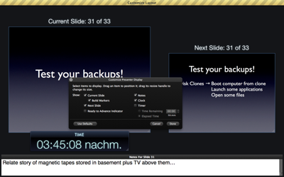
“Cancel” is Not Just For Dialogs

One of my favorite features in Apple’s presentation software, Keynote, is the presenter display. During a presentation, the presenter can view additional information on the computer’s main screen, while the actual slideshow is displayed via a projector or on a secondary monitor.1

The items that can be viewed on the presenter display, are:

  • the current slide,
  • build-markers for the current slide,
  • the next slide,
  • a Ready to Advance indicator,
  • the current slide’s notes,
  • the current time, and
  • a timer showing either:
    • a configurable count-down, or
    • the time that has elapsed since starting the presentation.

I want to see what’s coming

When in customization mode — prominently indicated by a yellowish barber pole — all of these elements can be moved freely across the screen. Some can also be resized.

The default arrangement looks like this:

KeynotePresenterDisplayDefault

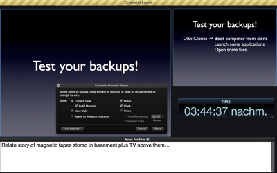
To show or hide an item in the presenter display, you un-/check its checkbox in an HUD-style dialog box.2

The buttons in the floating dialog box work just as you expect them to: when you click Cancel, all changes you made since entering customization mode will be discarded; clicking OK accepts those changes; and clicking either button will exit customization mode. If you prefer using a key press: the Escape and Return keys are properly assigned to the Cancel and OK buttons, respectively.

Take me back to where I was

There is one problem, though: if you click Use Defaults to restore the presenter view to its fresh-out-of-the-box layout, and then click Cancel, only part of the changes that were caused by pressing Use Defaults will be dismissed — namely the checkbox selection in the dialog box.

The size and position of the displayed elements, however, will remain at whatever the default settings are; they will not be discarded and, consequently, the layout will not be restored to what it was before you clicked Use Defaults.

Have a look at this screenshot, which, by the way, shows my favorite setup for the presenter display:

KeynotePresenterDisplayModified

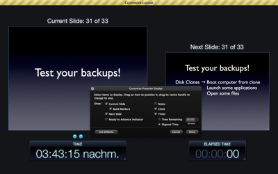
After clicking Use Defaults, then leaving the customization mode by pressing Cancel, and finally going back to customization mode, this is what the screen looks like:

KeynotePresenterDisplayAfterDefaultCancel

My original selection of what to show on-screen has been preserved, but how those items are shown now reflects the application’s defaults that resulted from pressing Use Defaults in the dialog box.

I am certain that this behavior is a bug, but it serves as a good reminder of considering the proper context for user-selected actions.

The context of Cancel and Undo operations

Pressing the Cancel button is not just about dismissing a dialog box. Much rather, it’s about preventing recent changes from becoming permanent; recent changes that result from a user action.

In a way, you could think of the cancel button’s function as “anticipated undo.”

In the case of the presenter display in Keynote, the action to be “anticipatedly undone” is the entire customization of that presenter display, and not just the change of the selections within the confines of the dialog box.

On a related note, users should be able to easily predict what, exactly, will happen when selecting the actual Undo command from an application’s edit menu.

I’ve been stumped many a time by software applications that only support undoing a selection of actions, instead of every single action that the software lets you perform.

In such applications, if the most recent action, or actions, you performed are not undoable, a seemingly random one that you performed a few steps earlier will be undone, instead. The result of that undo is not be what you expected, and, also, not what you wanted.

Applications can very easily help their users understand what, exactly, will happen when using Undo or Redo, by simply naming the relevant action in the menu command’s label.

Here’s an example from the image editor Pixelmator that makes it perfectly clear what will happen when you execute the command:

PixelmatorUndo

Pixelmator even goes one step further: for some of its commands — including Undo, Redo, and selections — the application displays a small message on the screen that automatically disappears again after a moment. This message lists what action you just performed, like “Undo Selection,” as seen below.

PixelmatorUndoBezelMsg

Thanks to the combination of explicit Undo/Redo labels and this quick status “shout-out,” no guessing is required to understand what you just (un)did.


  1. To use the presenter display, you need to check the option “Use alternate display to view presenter information” in the Presenter Display preferences panel. If you wish to view it without a projector or second monitor attached to your Mac, select Rehearse Slideshow from the Play menu. 

  2. This modal dialog box should not have been outfitted with the standard Close Window button, because that button’s functionality is ambiguous: will closing the dialog box by clicking the close button discard any changes, or will it accept the current settings and layout, before leaving the customization mode?

    The Cancel and OK buttons make it perfectly clear what will happen if you click either one, and they also make the dialog box’s close widget redundant. Hence, the latter should simply not be there. 

A Candle That Comes With a Manual

Using a candle should be as easy as placing it on a non-flammable surface or candle holder, lighting it, and enjoying its flame’s warm glow. Well, maybe not: it must be much more complicated, or there would not be a need to place such an extensive warning label on a candle. (Right?)
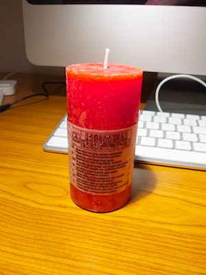
CandleWarningLabel

You won’t be able to read this label by candlelight

Besides giving the welcome hint that the “packaging” needs to be removed before use, the label states in tiny letters that the user should “Never leave burning candles unattended. Please observe the instruction symbols!”

CandleWarningLabelRemove

Have a look at these “instruction symbols,” which are placed right above the warning message. They are even more difficult to make out than the warning’s text.

CandleWarningLabelCloseup

The designer must have invested quite some thought into the symbols’ design, because it is, in fact, possible to interpret the meaning of most of them fairly easily. If, that is, your eyesight is good enough to properly see the symbols. Which begs the question: what is the point of this warning label, then?

Detailed warnings versus common sense

If there is a requirement to include the warnings — e.g., for legal regulations applicable in a geographical region where this specific type of candle is being sold –, then the text as well as the symbols should be much bigger to ensure that even users who lack 20/20 vision can easily see them and also reliably understand their meanings and intentions.
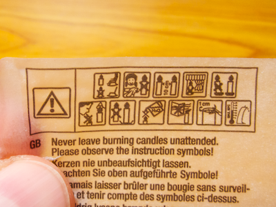
CandleWarningLabelSymbols

If, however, there is no such requirement, the label should not be there at all — except, maybe, to identify the candle’s maker and model. Pointing out all the possible hazards associated with burning a candle, however, only makes that activity seem more dangerous and more mysteriously obscure than it is.

The real issue is that excessive warning labels like this one condition people to rely on explicit instructions instead of trusting their own common sense.

Update 2011-02-09: My good friend FJ told me that he had seen similar warning labels on French and English candles. Consequently, he also assumes that some kind of formal regulation must be behind the symbols.

Apply warning labels to your candles — It’s the Law!

And he’s correct: the symbols found on the candle are based on the DIN EN 15494:2008 industry standard, which has been developed by the European Committee for Standardization and, therefore, has legal force in the entire European Union.

In the introduction to the standard, which can be viewed in German on this Chinese website, it says3:

> The risk of a fire caused by a candle due to inappropriate use can be reduced to a minimum through suitable warning notices. These warning notices should be easy-to-understand and language-independent.

At a minimum, each candle must carry a mandatory set of four warning notices:

  • “never leave a candle burning unattended”
  • “keep the burning candle out of the reach of children or pets”
  • “keep burning candles at least X cm apart”
  • “do not place the burning candle on top of or near flammable items”

The standard defines another eleven notices, e.g., to instruct the user to shorten the candle’s wick to a certain maximum length before lighting it. The candle manufacturers can freely decide whether they will include any of these on their product’s warning labels.

The warning notices can be applied as symbols or as text and …

> … have to be applied to the packaging or the product itself in a visible and easy-to-read manner. If applying the safety notices to the packaging or the product itself is not feasible for practical reasons, user information must be on hand at the point of sale.

Using the candle shown in the photos above, the symbols surely are visible, but — as I had mentioned before — their print size is so small that I doubt that users with average vision will be able to easily make them out, and the same applies to the text.

What’s more, I wonder if the committee members who authored the industry standard have, in fact, carried out user testing to verify that the symbol’s meaning is easily understood and non-ambiguous.

A detour to TV medicine warnings

Until a few years ago, ads for medicine shown on German TV had to include product-related warnings, which were usually displayed at the bottom of the screen. Due to the sheer volume of information that needed to be displayed in a few seconds’ worth of ad time, however, the text’s font size sometimes was too small to be rendered properly given the TV screen’s native resolution, let alone make them readable from normal TV viewing distances.

Nowadays, instead of including the information itself, each medicine ad is followed by the line:

> “To learn about [this product’s] risks and side effects, please consult your physician or pharmacist.”

This message is displayed as reasonably large text on screen and is also read out loud, thus also making it more accessible for vision-impaired people, as well.

When you cannot include usable information, refer the user to another source

This approach of referring customers to an expert instead of including important information in a form that makes it borderline incomprehensible, inaccessible, or incomplete, may also work for candles.

As quoted earlier, the warnings defined by the industry standard can also be made available at the point of sale. Instead of featuring the minute symbols and text on the candle’s label, why not include this text on the label…

> “Never leave burning candles unattended. To learn more about proper handling of candles, ask for the leaflet ‘Burn candles safely!’ at the store where you bought this product.”

… and provide a well-written, easy-to-understand, and easy-to-read flyer about how to safely handle candles at each point of sale?

  1. I translated the quotes from German to English myself, so they will probably differ from the official English version of the DIN EN 15949:2008. 

Affordances of a Traffic Circle

When an intersection was turned into a traffic circle in the East German city of Erfurt, money must have been tight: except for painting a circle on the ground and adding traffic circle street signs, everything else seems to have been left alone. Unsurprisingly, the new arrangement does not quite work as expected.

Flat street surfaces “afford” driving over them, and that is what many an Erfurter driver does when passing through this traffic circle. Also, the traffic circle signs have been mounted right beneath the yield signs, and judging from the video, both seem to have been mounted rather high up the pole, making them easy to overlook.

Compare the scene from the video with this traffic circle (photo by Richard Drdul):

ProperTrafficCircle.jpg

There simply is no affordance to drive straight through the center of this traffic circle — unless you don’t mind to re-shape parts of your car while doing so. If that still is not obvious enough for some drivers, the signs are placed at eye height and in the line of vision when approaching the traffic circle. Drivers literally have to see them.

Even when on a budget, there are ways to design a traffic circle that is (more or less) impossible to miss. All it takes are big, high-contrast arrows on the ground plus slightly raised curbs around the inner section, as seen here (photo by Zork Minos):

ProperTrafficCircleSimple.jpg