Unsubscribing from E-Mail Newsletters

Corporate newsletters that are actually worth reading are few and far between. If it wasn’t for rare gems like Sweetwater Music’s inSync emails with their blend of music tech news and production tips, I probably wouldn’t subscribe to any of them.

That is why I normally unsubscribe from email newsletters as soon as they show up in my inbox. I seriously appreciate it when the sender makes that process quick and painless, so I can focus on emails I actually care about.

Unfortunately, however, most companies — whether intentionally or due to ignorance — make unsubscribing unnecessarily tedious.

Haven’t signed up to our newsletter yet? We’ll do that for you, then!

A few months ago, I had ordered business cards from Moo. Their site provides a solid user experience and the quality of the final product is excellent.

But then they sent me this just last week:

According to Moo's email, they

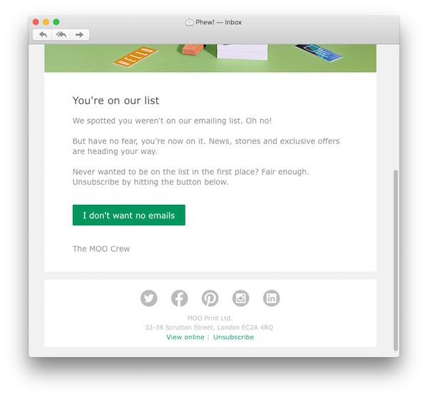
While some marketers might think that this is a slick approach to lure customers into reading their company’s newsletter, this approach annoys me a lot because now it’s on me to take additional steps if I do not want to subscribe to these emails. Which, of course, reflects back on the entire company, and makes me wonder how customer-oriented they actually are. Most importantly, I’ll unsubscribe anyway.

A much friendlier way would be to send me an email which courteously invites me to sign up and includes a “Yes, please sign me up” button. That way, if I am not interested, I’ll simply delete the email, and I’m done.

Thankfully, the unsubscribe button in Moo’s email is big and bold, and impossible to miss. When you click it, you’ll see this in your browser:

The page contains the site's full masthead with the main navigation, as well as their full footer with circa 35 links. Plus three marketing blurbs about next day delivery, etc. The actual unsubscribe notice loses a lot of visual weight this way, as do the

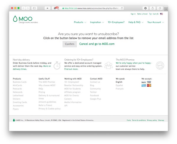
If all I want to do is to quickly unsubscribe from their newsletter, there is way too much information on this page. It takes extra cognitive load to take it all in and understand where the actual confirmation message is. Which is not a trivial point, because you have to confirm your unsubscribe request by clicking a button.

And see what their designers did there? Thanks to the color selection, the “lifeless gray” Confirm button has less visual prominence than the “vibrant green” Cancel link next to it, so your eyes are (intentionally) guided to the latter.

Showing the same plethora of navigation options and marketing texts as on the previous page, Moo is now

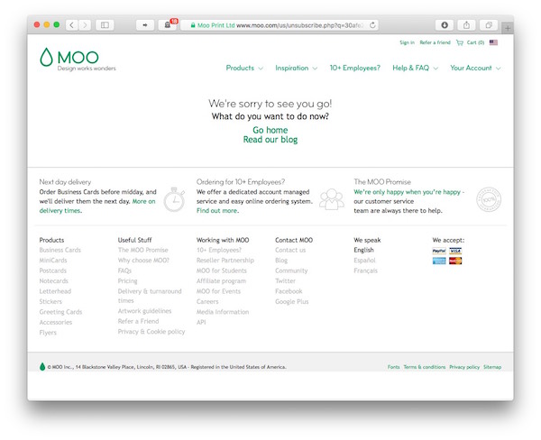
What I want to do now? Since I came to the site to unsubscribe from the unsolicited newsletter, I don’t really want to spend any more time here. In fact, this has already taken too long, so why try to make me spend even more time on the site?

Great with civil liberties, not quite so great with web design

I have deep respect for the work of the American Civil Liberties Union — but not so much for the design of their unsubscribe confirmation screen.

The page is separated into three groups:

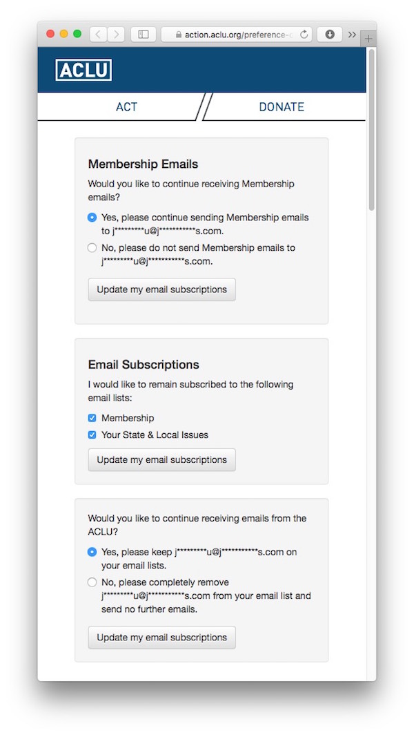
What is the difference between “Membership emails” and “Membership email lists?” Why is the email address displayed in four places? Do all of the three Update buttons submit changes across the entire form? Why do two sections use radio buttons, while the other uses checkboxes?

Especially in the context of this form’s complexity and vagueness, it isn’t very helpful that the confirmation message generically refers to “updating your email preferences.” If you make the process so complex, why not expressly state which emails, if any, I should expect to still receive in the future?

The confirmation text only states

A webpage in true Redmond fashion

Microsoft brings the complexity of the unsubscribe page (on which I arrived after clicking “unsubscribe” in a promo email from Microsoft-owned Skype) to a whole new level.

Their designers chose tiny text for the body copy, dropped in rich Windows 7’ish icons, placed links all over the place, and threw in an entire FAQ for good measure.

Gosh, where to begin.

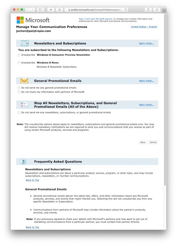
Specifically note how the checkboxes are mapped backwards: Checking an option does not mean that you want to receive that newsletter, but that you want to unsubscribe from it. Which is like saying, “Choose ‘Yes’ if you do not want to receive this.” Very odd, very confusing.

What you see after clicking Save feels as bloated as the form itself.

The confirmation contains four bullet points, listing which changes have been made to the subscription settings. Interestingly, this page uses the same inverted-logic as the configuration page: E.g., one bullet item says,

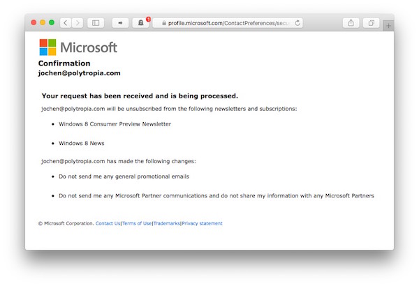
It’s commendable that this page details what changes you’ve just made. But why is it presented in such a convoluted layout? I’d find it much easier to grasp if the page contained two bulleted lists, one with the offerings I am now subscribed to, and one that shows what’s still available, but that I have not subscribed to.

(That said, this page recreates the order the item order found on the configuration page, so there is a perfectly solid reason for this layout. I’d still find it more accessible to group items by subscribed/unsubscribed, instead.)

In my case, things were even simpler, since I had unsubscribed from all of Microsoft’s promotional emails. Instead of seven lines of clunky text, a single one would have sufficed: “You will no longer receive any promotional emails from us.” A little bit of server-side logic can do usability wonders sometimes.

Killing time with an unsubscribe page

And this years award for Quirkiest Email Unsubscribe Page goes to Sears. And they’ve truly earned it.

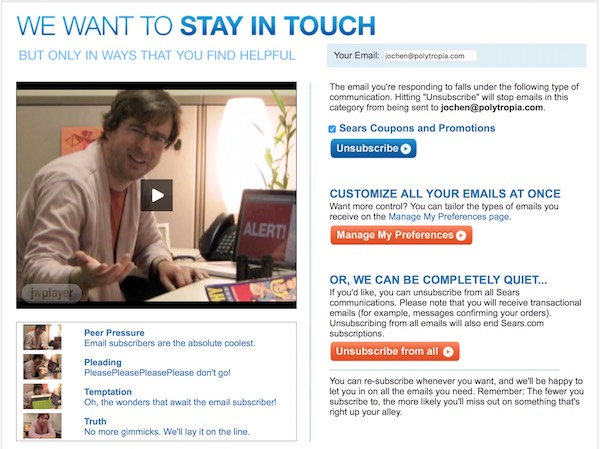
When you click Unsubscribe in one of their email newsletters, the marketing department at Sears doesn’t think it’s enough to confront you with a bloated form. They also offer you four video clips to choose from! Maybe some customer will find these funny, but when I clicked Unsubscribe in their email, I had already made my decision, so why go to these lengths to try to make me stay?

Sometimes I wish I could see into a marketer’s brain and understand where ideas such as the above page come from…

The benchmark design for unsubscribing from email newsletters

What, then, is a great way to handle an unsubscribe request?

As I had said at the beginning, for me this is all about quickly and conveniently canceling an email subscription, so ideally I would click on the unsubscribe link in an email and simply see a confirmation that I’ve been unsubscribed.

Like this:

Short, sweet, and to the point, this page only says

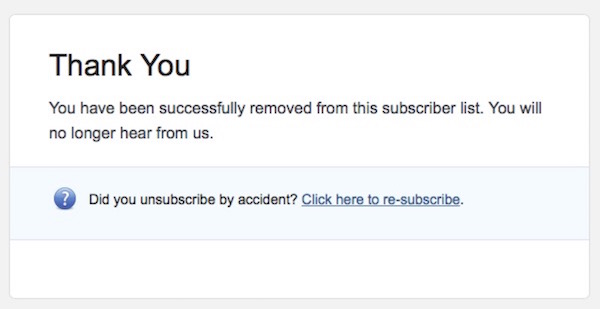
Click the link, read a very clean, very concise message presented in a light-weight design, and DONE!

This specimen pushes absolutely zero marketing fluff on you, and you don’t have to take any further steps to “confirm” your decision. And just in case that you unsubscribed by mistake, there’s a handy and friendly link to undo that change.

So: Which of these workflows would you prefer? (Yes, that’s a trick question.)

Don’t underestimate the importance of the unsubscribe experience

When designing an unsubscribe workflow for email newsletters, keep in mind that people who follow that process don’t necessarily abandon your company for good. They might just be overwhelmed with email.

How efficient and user-friendly this workflow is, will reflect how your company — and overall brand — values your customers’ time in general.

Please Tell Me Who Will Transport My Online Order

When you order something online, wouldn’t it be great if you could tell which carrier will deliver your order? Let me tell you a quick anecdote why I wish that every online retailer would provide this information.

A crappy delivery of a premium product

On a frosty March evening in 2015, three boxes were delivered to our home. They contained a brand new laptop and some peripherals.

Although the order confirmation stated that a signature was required on delivery, the driver just dropped the boxes off on our front porch. We were both home at the time; the driver simply didn’t bother to ring our doorbell.

The tracking page for the order shows a

If I hadn’t checked the online tracker one more time that evening, the shipment would have sat outside in the freezing cold overnight. Or might even have been stolen.

The delivery was a day late, too. Unfortunately, the tracking page did not give any reason for the delay beyond stating “REDELIVER ON NEXT BUSINESS DAY.”

Also, this carrier does not seem to consider Saturdays to be business days, as I found out via another shipment. The data in the screenshot below — December 4th, 2015 — was a Friday. Despite the “REDELIVER ON NEXT BUSINESS DAY” status, it still didn’t arrive on the 5th, but on the following Monday.

This tracking page is similar to the previous one, but it is for a different order. In this case, the shipment was due on December 4th, 2015, also

It’s not just me being excessively picky or demanding: The support forums at Amazon and Apple, who both use this carrier, are overflowing with complaints from customers who are extremely unhappy with this carrier.

All together now: “UX is all about setting expectations!”

It’s needless to say that I’d love to avoid having anything delivered by this company in the future. And I am more than willing to pay a premium to achieve this goal.

I do want to know with certainty, though, that I’m not paying extra and still have to deal with these people. Which is why I sincerely appreciate that, for example, the great folks at Adafruit make it very clear who they will entrust with getting your purchases to you.

Adafruit offers four shipping methods on their site: UPS ground, UPS 3 day select, UPS 2nd day air, and UPS next day air. It even displays a little UPS icon. Below the list of options, which also notes the respective shipping charges, it states that they do not offer Saturday delivery service for UPS.

They also do not offer Saturday delivery, but they very prominently state as much right in the appropriate context of the shipping options.

Apple, on the other hand, leaves you in the dark about which livery the truck will have that stops by your house to drop off your freshly ordered goodies.

Apple lists three shipping options, free 2-business day, next day, and next day before noon. They do not identify the carrier, though.

Let me have more trust in my options

I wonder why a premium brand like Apple would collaborate with a below-par discount service provider in the first place. If they do go that route, though, they should at least give me a premium delivery option that reliably selects a different carrier and, thus, results in a more enjoyable overall customer experience.

After all, who wants to be all excited with anticipation for two days, looking forward to a shiny new laptop, only to find that machine in the morning, frozen to death on the front porch.

Oh, sorry, I meant “excited with anticipation for three days,” because “REDELIVER ON NEXT BUSINESS DAY,” you know.

Downloading Speaker Slides from a Conference

Last month, my wife and I attended the O’Reilly Design Conference in San Francisco. The conference offered great keynotes and presentations, and the venue — Fort Mason Center — was spectacular.

O’Reilly has compiled a list of the event’s keynote videos and speaker slides. Some slide decks can be downloaded directly from that page, while others are hosted on Speaker Deck or SlideShare. The workflows for downloading the decks from the latter two sites create surprisingly different user experiences.

Speaker Deck: “Click. Done!”

On Speaker Deck, the prominent “Share” section contains a Download PDF button. Click that button, and the PDF file instantly opens in the browser, from where you can easily save it to your computer. Alternatively, you can right-click on the Download button and directly download the file via the context menu.

Clean, quick, easy. Nice!

SlideShare: “No account? Not signed-in? No PDF!”

SlideShare’s Download button is just as easy to find.

Click it, though, and instead of just starting the download, you see a dialog box about “Clippings.” At this point, I was just trying to download the file, so I chose to “[c]ontinue to [the] download.”

Clicking the link underneath the button does start the download — if, that is, you are signed into SlideShare. If you aren’t, you are requested to log into the site.

That, of course, also means that if you don’t yet have an account for SlideShare, you have to sign up for the site before being able to download any of the slide decks. At least the triggered download will start automatically once you’ve completed the login procedure.

Cumbersome by design

You can often hear designers and users complain about LinkedIn’s user interface, and it is LinkedIn that owns SlideShare. This simple download workflow is a good example for a less-than-stellar design decision.

Note how the clippings dialog box does not have a “Don’t ask me again” checkbox. And indeed: every time you decide to download a slide deck, that process will be interrupted by having to make the decision fore or against clippings. Every single time.

Worse yet, even if you adopt that feature by clicking Start clipping, and clipping a flew slides “just to be sure,” the dialog box will still appear whenever you click Download. In other words, even when the dialog box has done its duty, it will still come back time and again.

Who controls the content that you own?

This odd behavior aside, there’s a deeper, more philosophical issue to think about here.

Websites like SlideShare or Speaker Deck don’t own their users’ works, they just host them.

What does it say about a company, then, that they require you to have an account with them before you can access hosted content that, say, a conference speaker has made available? Why did Speaker Deck decide to make this process as painless as possible, while SlideShare uses it to attract new users? What would SlideShare lose by allowing a direct download without requiring visitors to log in?

And finally, does a conference speaker’s choice of provider reflect back on that speaker, because this download process might be perceived as being part of the overall presentation experience?

That said, from this conference attendee’s point of view, the most desirable option for this workflow actually is finding a direct download link to the PDF files right on the conference website. It doesn’t get much more efficient and convenient than that.