Instant Airline Reward Miles Credit

Claiming missing airline reward miles was covered in four previous articles on this website now, but here’s a twist to that process that makes me revisit this topic one more time.

The first article in the series dates back to August 2010 and compared the workflows for claiming uncredited airline reward miles between Lufthansa’s Miles & More program and British Airways’ Executive Club.1

At the time, I did put in a claim for uncredited miles with Lufthansa, but did not have any similar request for British Airways. Thanks to my parents being on British Airways flights before signing up for BA’s loyalty program, I finally did get to test the entire process with an actual mileage claim.

Method A: “Type a lot, wait a couple of weeks, and then we’ll see what happens.”

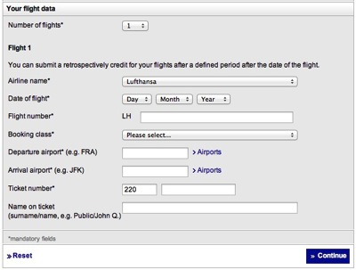
As a quick reminder, here’s the online form that Lufthansa requires you to fill out for claiming yet-uncredited reward miles:

The Miles & More reward miles claim form has eight fields for entering data like airline name, date of flight, etc. Of these eight fields, no less than seven are mandatory.

It is safe to assume that, like any other airline, Lufthansa keeps old booking records. With the ticket number serving as a unique identifier, why then are you required to fill in seven fields?

Method B: “Enter one number. Done!”

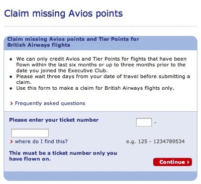
British Airways’ form requests that you enter exactly one data item which is, of course, the ticket number.

The British Airways form for claiming missing reward miles requires you to enter just the ticket number. Oddly though, this needs to be slit into two fields, one of which holds the first three digits, and the other holds the remaining ones.

When I tried this last time with a ticket number whose associated flights had already credited to my account, the website listed the respective flights’ miles as having been “[c]laimed previously through British Airways.”

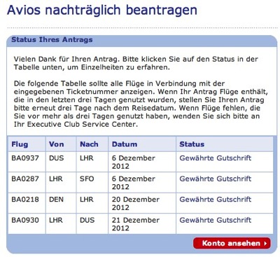
My parents’ newly created accounts had a mileage balance of exactly zero when I brought up the claim form this time. Entering a ticket number brought up a table of flights that was similar to the one I had seen previously.

After you enter the ticket number, and click Continue, the BA website will look up the flights that are linked to the number, and display them in a table.

The status, however, was now given as “Gewährte Gutschrift”: “Credit Granted”.

Clicking the “Konto ansehen” (“View Account”) button took me back to the account’s main page, and the balance now showed a non-zero amount.

Not only was it enough to enter just the ticket number; the respective reward miles were credited immediately without any wait time!

The possible impact of claiming miles from a partner airline

The mileage credit I had requested from Miles & More had been for a partner airline, and not for a flight with Lufthansa themselves. This may explain why it took a few weeks to see those miles added to my account.

It does not explain, however, why Lufthansa generally insists that you enter multiple redundant data items, whereas British Airways impressively demonstrates that this process works just fine if all you have is the ticket number.

No-reply emails are bad. This is worse.

In yet another attempt at claiming missing airline reward miles, I had contacted Lufthansa’s Miles & More loyalty program about some serious problems with their website.

They responded via email a few days later, explaining that, in order to use the online mileage claim form, you must have purchased a ticket directly from their (partner) airline.

That, however, was exactly what we had done.

Hence, I wrote another email to provide them with more details and included a link to my blog post — just in case their developers would want to investigate this further.

The next email I received from Lufthansa was definitely not what I had expected.

Forcing the customer onto a detour from email to web

Here’s a screenshot of the original German email:
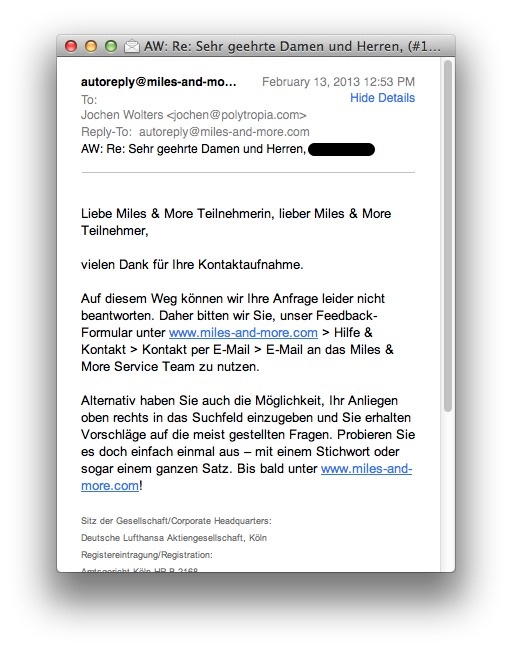
A Mail.app window with Lufthansa's response to my email inquiry.

Allow me to translate for your reading pleasure:

Dear Miles & More participant,

thank you for contacting us.

Unfortunately, we cannot answer your inquiry this way. Therefore, we ask you to use our feedback form at www.miles-and-more.com > Help & Contact > Contact via E-Mail > E-mail the Miles & More Service Team.

Alternatively, you can enter your request in the top-right search field, and you will receive suggestions regarding the most commonly asked questions. Why don’t you just give it a try — with a keyword or even an entire sentence. See you soon at www.miles-and-more.com!

When you contact a company for customer support these days, they often do not accept direct responses to their emails. Instead you’re being steered to another communications channel, like a web form.

Another tell-tale sign that you are not supposed to respond directly is a from: address that begins with something like do-not-reply@… .

With the original Miles & More email, though, that was not the case: Nothing in it mentioned that I could not simply reply, nor was it sent from a no-reply email address. In fact, that email even had its reply-to set to its sender:

The email header of the original response from Miles & More shows that it was sent from service@miles-and-more.com, and its reply-to field is set to the same address.

There’s a case to be made for online contact forms

Generally, forcing customers to use an online contact form, makes things considerably easier for the company.

It ensures that a modicum of the customer’s personal data is collected via mandatory form fields; it allows routing the inquiry to the correct company department by making the user pick from a finite set of inquiry types; and it encourages the customer to keep their messages short by offering a fairly small text field for the actual inquiry.
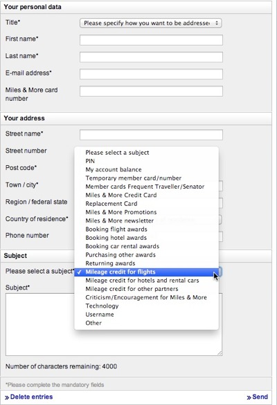
The contact form on the Miles & More website requires entry of personal details like name and address, and a subject must be picked from a popup menu that has twenty items. These menu items include 'PIN', 'Booking flight awards', or 'Technology'.

That said, I had already provided all that information when I submitted my original inquiry via this very form. Linking the email exchange to that data would have been a snap, because a case number was included in the subject line of all emails going back and forth, including their eventual “can’t talk to us this way!” message2.

Case closed. Somehow.

The initial response did include a snail mail address for the Miles & More support center. I have since sent paper copies of the tickets to that address and, hopefully, will receive the desired mileage credit.

Nevertheless, it does make me wonder what caused this breakdown in this communications process between Lufthansa and me. Was it an issue with the technical implementation, or is it actually intentional to make it as tedious as possible to keep a customer support case open?
  1. I’ve blacked out the case number in the screenshots. 

A Progress Bar For a Bus Ride

Progress bars are a staple of user interface design. They let you check the progress of a lengthier process — like copying a large file — with just a quick, cursory glance. And by observing how quickly the bar moves, you can intuitively estimate how long it will take for the process to complete.

Mac OS X's file copying progress dialog contains a prominent progress bar. Additionally, it displays detailed information about the name of the copied files, the copy destination, the amount of data already copied and remaining, and an estimate of the remaining time required for the process to complete.

Progress bars — they’re not just for digital devices

At London’s Heathrow airport, you can find progress bars in an unusual setting: Namely, on-board the shuttle buses that run between the airport’s five terminals.

The buses feature monitors that display useful information on how to transfer between terminals. At he bottom of the screens, a progress bar visualizes the route from one terminal to another.

A monitor suspended from the bus' roof displays comic-style people on an escalator and states,'On arrival follow the purple connection signs'. The progress bar at the bottom shows that the bus has already gone three quarter of the way to its destination, Terminal five.

The number of the destination terminal is shown at the end of the progress bar3. A nifty bus icon represents the vehicle’s current position along its route.

Although the bus icon does not move along its path all that smoothly, seeing it progress at all does help ease that infamous “Are we there yet?!” feeling — especially when you’re worried about making your connection flight.

When (your users are) in a rush, stop cycling screen contents

Here’s an interesting detail: While the bus is moving, the display cycles through several different information screens. Once it approaches its destination, however, it settles on a single screen, which announces the terminal you’re just arriving at.

Once the bus arrives at Terminal five, the screen shows 'Terminal 5' in large type and displays a large icon that indicates connecting flights. As expected, the progress bar has completed, the bus icon is now hidden, but the T5 indicating the destination is still visible.

By making the display static towards the end of the journey, all passengers immediately get off the bus, instead of possibly blocking the aisle while waiting for another screen-full of information to appear.


  1. Note how the direction of movement in a progress bar is from left to right, at least in our part of the world where we read and write from left to right. I wonder whether someone who grew up with a right-to-left script would consider the opposite orientation “more natural”.