When Buttons Get in the Way of Touch Screen Gameplay

Playing games on a touch screen device can be a delightful experience: being able to directly manipulate objects with your fingers on the screen without having to go through a “control intermediary” like a joystick makes for immersive and engrossing gameplay.

With the entire screen being used as a game controller, however, game designers must pay special attention to the placement of on-screen menu navigation controls: your enjoyment of a game will decline rapidly if you’re repeatedly catapulted back to the main menu screen, just because you inadvertently hit the wrong button while tackling a difficult game level.

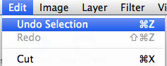
Aim… fire! — Aim… fire! — Aim… RESET LEVEL?!?

In the physics-based puzzle game Ragdoll Blaster 2, your aim is to hit a target with ragdolls, which you shoot from a cannon. To clear the ballistic path towards the target, you shoot the ragdolls against objects like boxes, wheels, etc. to move them out of the way, make them spin, and so on. Inertia for the win!

Your finger’s position on the touch screen aims the cannon and also controls the force with which the poor ragdolls are sent on their trajectory — the farther your finger is away from the cannon, the stronger the blast.

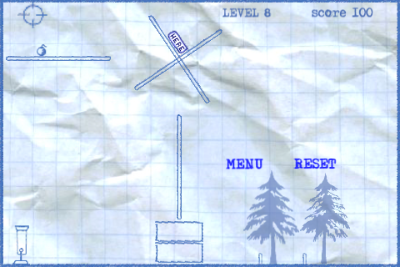
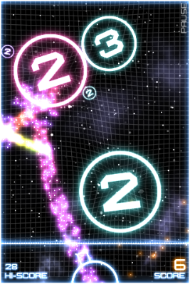
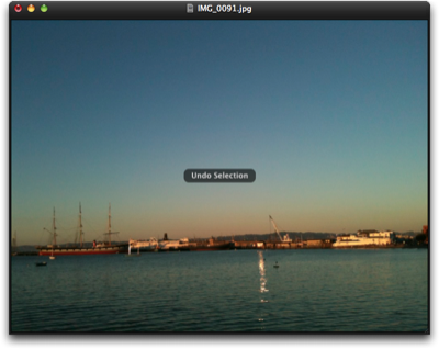
In the level shown below, you need to set the big wheel in motion by shooting the cannon that is mounted to the wheel’s rim (it’s the weird contraption seen at the wheel’s apex). The rebound from shooting a ragdoll applies force to the wheel, and if you aim it right so that the force is tangential to the wheel’s circumference, the wheel starts turning.

RagdollBlasterBigWheel

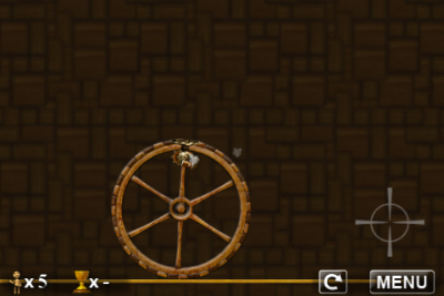
The crosshairs on the screen indicate the position of the player’s finger, which, in this case, is very close to the two on-screen buttons, “restart level” and “menu.” It’s way too easy to hit either button while feverishly tapping the screen to get that big wheel rollin’. Consequently, getting through this difficult level is extremely frustrating.

The buttons’ default position is the lower right corner of the screen. In a few levels, the designers have placed them in other corners, thus showing that they are aware of the issue. Nevertheless, in some of the game’s levels, the buttons still do get in the way, adding the kind of difficulty to solving those levels that goes well beyond what the player perceives as “pleasantly challenging.”

Ragdoll Cannon, which is one of two games found in Physics Gamebox, works off the same game idea, and it also features similar “reset level” and “menu” buttons. In this game, however, the buttons are not always tucked away in a corner of the screen, but sometimes show up nearer the screen’s center, too.

RagdollCannonButtons

Even with the buttons being moved out of harms way as best as possible, there is a more robust approach: a slider.

When a simple tap shouldn’t do

The music performance application MorphWiz uses most of the screen to display an x/y-“keyboard:” the horizontal axis represents pitch, the vertical is used for modulation such as morphing between two different waveforms.

MorphWiz’ user interface displays only two controls that are not related to actually performing with this instrument: the sound preset selector (the two arrows) and the slider in the top left corner to bring up the app’s main menu.

MorphWizPerformanceView

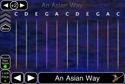
The slider works just like the one that you use to unlock your iPhone or iPad: to go to MorphWiz’ main menu, you have to consciously move the slider upwards — it’s not enough to casually brush against it with your finger, whether intentionally or by accident.

What’s more, if your finger happens to end up on the menu slider while you’re playing MorphWiz, it will ignore the finger press: if you hold down a finger to play and then move it over the menu slider, nothing happens. MorphWiz just continue to play the sound.

In true multi-touch fashion, you can access the slider while playing, but with another finger: if you operate the slider with a “new” finger in addition to the one(s) you’ve been playing music with, it does react to your input. The same applies to the two preset selector arrow buttons.

This behavior of the slider makes it virtually impossible to leave MorphWiz’s performance screen and dive into the app’s configuration mode unless you really want to do so.

Such a slider, when used for navigating away from a game screen, could also go a long way in preventing gamer frustration.

Menu navigation controls don’t always get in the way

Not all games require work-arounds for on-screen buttons, though. They work just fine as long as they are not positioned within the area of the touch screen that is used for controlling the game.

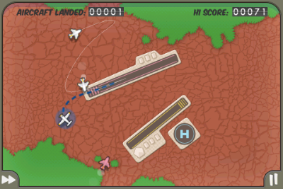
In the game Flight Control, you direct airplanes and helicopters to their respective landing strip or pad by drawing a flight path from the aircraft to the color-coded destination right onto the screen.

In this game, the button to go to the game’s main menu is positioned in the screen’s lower right corner and indicated by the “pause” symbol.

Even when the screen gets crammed with aircraft and you frantically try to keep them from crashing into each other — which, very obviously, ends the game –, the focus of the game is near the center of the screen and the risk of hitting the “pause” button by mistake is all but non-existent.

Flight ControlMainScreen

When you do hit the pause button, a dialog screen comes up in which you can choose to continue playing the current level of the game, or continue to the main menu, which will also reset the level you just played.

Consequently, unlike the Reset Level button in Ragdoll Blaster, even if you do hit the Pause button in Flight Control by accident, you will not lose any progress you have made in the game.

In other words, the worst that can happen is that you literally pause the current level, but you can always return to where you were in the game.

Flight ControlPauseScreen

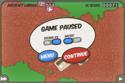
Also note how two key preferences options, namely sound effects and music, are accessible via the pause screen, as well, so you can adjust them without having to leave your current game.

A final example, the shoot-at-orbs game Orbital uses the entire screen as its fire button — with the exception of the miniature-sized “PAUSE” text in the screen’s upper right hand corner.

OrbitalGameScreen

Operation of this button is similar to the Pause button in Flight Control: the chances of hitting the Pause button unintentionally is very slim, and even if you do, the current level is paused, not reset.

You only lose your progress if you continue from the Pause screen — which, of course, also sports a “Return to Game” button — on to the main menu.

When do you need to go beyond buttons?

The most reliable way for designers to decide whether to use plain buttons, and where to place them on the touch screen, is to simply play the game for a while: if you’re accidentally thrown out of the gaming action a few infuriating times too many, try to find an alternative solution. Like, for example, the Menu slider found in MorphWiz.

Applications that do use buttons should always Pause the game, instead of resetting the current level or going straight to the main menu. This adds an extra level of protection against losing game progress versus the simple buttons found in Ragdoll Blaster 2.

“Cancel” is Not Just For Dialogs

One of my favorite features in Apple’s presentation software, Keynote, is the presenter display. During a presentation, the presenter can view additional information on the computer’s main screen, while the actual slideshow is displayed via a projector or on a secondary monitor.1

The items that can be viewed on the presenter display, are:

  • the current slide,
  • build-markers for the current slide,
  • the next slide,
  • a Ready to Advance indicator,
  • the current slide’s notes,
  • the current time, and
  • a timer showing either:
    • a configurable count-down, or
    • the time that has elapsed since starting the presentation.

I want to see what’s coming

When in customization mode — prominently indicated by a yellowish barber pole — all of these elements can be moved freely across the screen. Some can also be resized.

The default arrangement looks like this:

KeynotePresenterDisplayDefault

To show or hide an item in the presenter display, you un-/check its checkbox in an HUD-style dialog box.2

The buttons in the floating dialog box work just as you expect them to: when you click Cancel, all changes you made since entering customization mode will be discarded; clicking OK accepts those changes; and clicking either button will exit customization mode. If you prefer using a key press: the Escape and Return keys are properly assigned to the Cancel and OK buttons, respectively.

Take me back to where I was

There is one problem, though: if you click Use Defaults to restore the presenter view to its fresh-out-of-the-box layout, and then click Cancel, only part of the changes that were caused by pressing Use Defaults will be dismissed — namely the checkbox selection in the dialog box.

The size and position of the displayed elements, however, will remain at whatever the default settings are; they will not be discarded and, consequently, the layout will not be restored to what it was before you clicked Use Defaults.

Have a look at this screenshot, which, by the way, shows my favorite setup for the presenter display:

KeynotePresenterDisplayModified

After clicking Use Defaults, then leaving the customization mode by pressing Cancel, and finally going back to customization mode, this is what the screen looks like:

KeynotePresenterDisplayAfterDefaultCancel

My original selection of what to show on-screen has been preserved, but how those items are shown now reflects the application’s defaults that resulted from pressing Use Defaults in the dialog box.

I am certain that this behavior is a bug, but it serves as a good reminder of considering the proper context for user-selected actions.

The context of Cancel and Undo operations

Pressing the Cancel button is not just about dismissing a dialog box. Much rather, it’s about preventing recent changes from becoming permanent; recent changes that result from a user action.

In a way, you could think of the cancel button’s function as “anticipated undo.”

In the case of the presenter display in Keynote, the action to be “anticipatedly undone” is the entire customization of that presenter display, and not just the change of the selections within the confines of the dialog box.

On a related note, users should be able to easily predict what, exactly, will happen when selecting the actual Undo command from an application’s edit menu.

I’ve been stumped many a time by software applications that only support undoing a selection of actions, instead of every single action that the software lets you perform.

In such applications, if the most recent action, or actions, you performed are not undoable, a seemingly random one that you performed a few steps earlier will be undone, instead. The result of that undo is not be what you expected, and, also, not what you wanted.

Applications can very easily help their users understand what, exactly, will happen when using Undo or Redo, by simply naming the relevant action in the menu command’s label.

Here’s an example from the image editor Pixelmator that makes it perfectly clear what will happen when you execute the command:

PixelmatorUndo

Pixelmator even goes one step further: for some of its commands — including Undo, Redo, and selections — the application displays a small message on the screen that automatically disappears again after a moment. This message lists what action you just performed, like “Undo Selection,” as seen below.

PixelmatorUndoBezelMsg

Thanks to the combination of explicit Undo/Redo labels and this quick status “shout-out,” no guessing is required to understand what you just (un)did.


  1. To use the presenter display, you need to check the option “Use alternate display to view presenter information” in the Presenter Display preferences panel. If you wish to view it without a projector or second monitor attached to your Mac, select Rehearse Slideshow from the Play menu. 

  2. This modal dialog box should not have been outfitted with the standard Close Window button, because that button’s functionality is ambiguous: will closing the dialog box by clicking the close button discard any changes, or will it accept the current settings and layout, before leaving the customization mode?

    The Cancel and OK buttons make it perfectly clear what will happen if you click either one, and they also make the dialog box’s close widget redundant. Hence, the latter should simply not be there. 

A New Poster Child for Web Form Validation

Most websites that allow or require data to be entered into free-form text fields validate this data before accepting it. This is to ensure that, for example, email addresses are valid, phone numbers adhere to a certain format, or that the contents of “Choose Password” and “Retype Password” fields match.

An iterative (and painful) approach to form validation

All too often, form validation is a painful iterative process for the user. It typically goes something like this.

You enter the data into the web form and click Submit. If an error is found in any of the fields, the page with the form is displayed again, now including a message stating that “One or more fields contain invalid data” and highlighting some of the form’s fields.

If you’re lucky, you will find more information on the page about how to fix the errors, like “Phone numbers may only contain digits and dashes”3 or “The password contains invalid characters.”4

When you think you’re done correcting the issues, you hit Submit again, and you may very well be presented with the next batch of fields whose contents don’t validate.

And so it goes until the website deems any and all of your entries to be worthy of acceptance.

Real-time. Relevant. Plain English.

UJAM, a promising new online music creation tool that was launched only recently, provides a much more user-friendly approach to form validation.

The first impression that you get when you open the UJAM.com sign-up page, is that of a standard web form (albeit a very elegantly designed one). As soon as you start entering data, though, whatever you enter is validated immediately and in real-time.

Each text field has its own validation result message displayed right next to it. This message can reflect one of three states — Info, Error, and OK — which are indicated through icons as well as color. Additional information, including instructions on how to fix any errors, is given in plain language.

Plain and simple options, too

The checkboxes at the bottom of the registration form are just as plain and simple: accepting the Terms of Service and the Privacy Policy is straight-forward, and either option links to the related documents.

The two opt-in opportunities — for subscribing to the UJAM newsletter and for allowing UJAM to share your information with third-parties — provide concise information on what either checkbox does. Just as importantly, this web form does not leverage double-negations or similar dark pattern tactics to lure the user into accepting an option against their will.

I may be a bit blinded by the fact that I’m really excited about what UJAM has to offer (and I do not use the term “excited” lightly), but I doubt that I have ever felt quite as confident about properly filling out a web form on the first try as I have when I signed up for a UJAM account.

Update 2011-05-18: In hindsight, it was a good idea to include the disclaimer about me being “a bit blinded:” When I pointed other UX designers to this web form, they immediately criticized some of its design details, and rightfully so.

The validation messages are intrusive: As soon as you begin filling out the form, the validation process starts, and the resulting messages appear almost instantaneously. As a result, the website will most likely reprimand you for an error in your email address or your password, just because you are not typing fast enough.

Additionally, the validation process repeatedly cycles through “no message” to “gray empty message” to “validation status/error”, as seen in this little video clip.

Intrusive, indeed!

Here are a few ideas to make the validation system appear less pushy:

  • Display the informational messages for all fields as soon as the page loads.
  • Increase the delay with which the validation status message is updated.
  • Instead of using a red or green background for the entire message area, restrict color to the icons and the hairline around the text entry field.
  • Use smoother transitions so the changes in icon and text are not quite as abrupt.

Some of the validation messages are curt: The messages should be friendlier than, e.g., “Password is too short”. This specific example also is less than unhelpful, because it does not explicitly state how many characters are required.

Phrasing this as a positive call-to-action makes the interaction with the form friendlier and easier: “Enter a password that is at least 8 characters long.”

The links to the ToS and Privacy Policy are hidden: The text strings “Terms of Service” and “Privacy Policy” next to their checkboxes are clickable, as are most occurences of “Privacy Policy” in the longer text section in the upper right.

During my first visit to this site, these links were easy to find, because of their solid black text color that nicely contrasted the gray of the copy text.

Apparently, the designers have modified this, because those links now have the same color as the copy text. Since they are not underlined or set in bold, either, there is no visual indication of their “clickability” at all.

UJamLinks

Only when you hover over one of the links will the text color be changed for highlighting, as in this screenshot. “Terms of Service” in the upper checkbox is a link as well, but it is literally impossible to recognize it as such.


  1. A common problem with many websites is that they insist that phone numbers be entered in the North-American ten-digit format, even if the site is aiming for an international target audience. 

  2. It never ceases to amaze me how many websites that present this error, fail to provide a simple, explicit list of characters that are allowed for use in a password.