Cleaning up Some Article Meta-Data

Before I launched this website in January of last year, it took me quite a while to decide how to leverage categories and tags towards making it easier for you, valued reader, to find articles that interest you.

Applied Information Architecture

Eventually, I settled on using categories for indicating the general category of the product I was writing about, and applying tags to list the user interface elements I was focusing on.

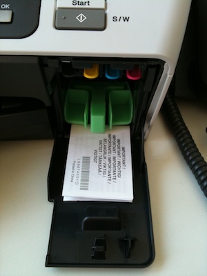
Every article was assigned exactly one product category and one or more UI detail tags, e.g., “Press for Coffee (W)here?,” that covers a coffee pump pot, was categorized as “household items” and tagged “buttons” and “labels,” and “The Bubble Cursor in Action” zoomed in on “cursors” and “target acquisition” while observing “usability basics.”

What’s with the wacky language in the second example, you ask?

Originally, I thought it was kind of funny in a geeky way to “zoom in on” the UI details while “observing” a product category. Maybe you noticed that the custom URLs reflected this, too: for tags, I used a construct like:

https://uiobservatory.com/zooming_in_on/cursors/

Similarly, categories were linked to via:

https://uiobservatory.com/observing/household-items/

Just too much stuff

Over the last few months, that system has turned out to be way too complicated.

With every article I published, I was tempted to add new tags and categories to reflect new UI elements and product categories that I “zoomed in on” or “observed,” respectively.

This becomes obvious when you have a look at the tag cloud:

UIOTags

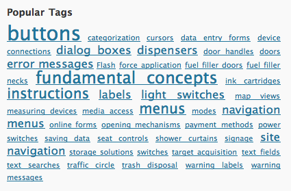
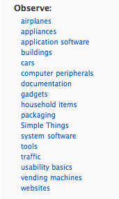
You will most likely not have seen this tag cloud before, because its contents were not exposed on the site — unlike the list of categories, which appears to be almost as uselessly messy as the tag cloud:

UIOCategoriesOld

It was time to fix this, and I hope that the new approach will do just that.

Simplify, simplify, simplify

In the first step, I have completely removed all tags, and not just from being displayed in the articles’ by-lines, but also from the article database.

Secondly, for categories, I have been musing on how, exactly, I want to group the articles on the site. Most UI-related websites and blogs I follow focus almost exclusively on digital devices and software user interfaces. As soon as I fully realized that, I knew that it would make the most sense to categorize my articles based on the complexity and very general category of the devices covered.

Hence, this is the simplified categories structure that I came up with:

  • Usability Basics: Fundamentals of the science of human machine interaction and the art of user interface design.

  • Simple Things: Everyday things with a limited, yet often intriguing user interface, like door handles, coffee pots, and make-up mirrors. According to Donald Norman, users should be able to use these kinds of devices without having to read a manual.

  • Appliances: Stand-alone devices with more complex user interfaces, e.g., ticket vending machines, home theater components, and car dashboards.

  • Computer Software: Any software that runs on personal computers, “smart phones,” tablet computers, etc. This covers applications and operating systems as well as websites.

  • Documents: User manuals, questionnaire forms, etc. This category might as well have been labeled “content usability.”

  • Services: Processes or workflows which are based on interactions between individuals and organizations.

It’s these six categories that you will see in the side bar from now on, and I hope you find them easy to grasp and convenient to navigate.

As for the tags, searching for UI elements like buttons or cursors via the site’s search field should bring up more relevant results than the tags I had applied manually. They will not be missed, I’m sure.

Whaddayasay? Lemme know!

Let me know what you think about this change: pop me an email and share your likes and dislikes about the new setup with me.

Update 2013-02-26: Added the Services category.

Wheat and Chaff in Software Release Notes

Omni Group, the Seattle-based software artisans, have made a name for themselves by creating applications with very meticulously crafted user interfaces. One of their products, the GTD-inspired task manager, OmniFocus, is among the few applications I simply could not live without anymore.

Who moved my actions?

In a recent release, the developers changed a detail in the way OmniFocus displays its data. Due to this change, some data views in the software would now display many more items.1

Lists that previously were tidy, and easy to grasp and to handle, …

… were now swamped with data items.

In case you’re wondering: yes, the source data for both of these screenshots is identical! (Note the size of the scroll bar thumb to get an idea of the total length of this list.)

It only took a few days of working with the new version before I got so frustrated with this new flood of data that I decided to send a feature request to Omni Group, asking them to add an option in an upcoming release that would bring back the old behavior.

And I still haven’t found what I’m lookin’ for…

What I hadn’t realized was that the option that I was asking for had already been added — in the very same release as the display change itself. And yet, I had only found it after reading about it in a tweet. Why hadn’t I found that option myself?

Because I could not see the forest for the trees. Twice.

At first, I had searched OmniFocus’ preferences panes for a way to restore the previous behavior, and had come up empty-handed. Then I scanned the menus and failed again in my search, even though the option in question takes center stage in the View menu.

OmniFocus is very flexible in terms of how it displays its data. Consequently, the View menu has lots of items and plenty of sub-menus. What’s more, at the time I did not know the exact name of this option, of course. And so I literally overlooked what I was searching for.

In that sense, the View menu is forest number 1, so to speak. Forest number 2 are OmniFocus’ release notes.

Release notes of novelesque proportions

Omni Group always provide extensive release notes for all of their applications. Generally speaking, I very much welcome such a level of detail, but it also comes at a price: the sheer amount of information makes it almost impossible to filter out the chaff of countless bug fixes and internal code changes.

Consequently, trying to concentrate on the more useful and important tidbits — from an average user’s point of view — like changes in UI or behavior, is tedious and tiring.

Agile Web Solutions have found a nifty fix for this problem: they label each item in their release notes with colored “New,” “Changed,” and “Fixed” tabs.

By scanning for the “New” tabs, you can easily discover new features in the software that you may want to try out and, possibly, learn how to master.

“Changed” notifies you of changes to existing features that you may already be using, so that you can quickly learn how to adapt to these changes.

And finally, chances are that you can safely skip any items labeled “Fixed,” unless you have been plagued by a certain bug and you now want to find out whether this bug has been fixed yet.

To make these labels truly useful to the user, it is essential that the categorization reflects how the application has changed from the user’s point of view.

In other words, the “New” and “Changed” labels should only be used for new features and changes that manifest themselves in the software’s UI, and not just “under the hood.”

Any modifications like code optimization, data schema changes, protocol adaptations, etc. belong in the “Fixed” category unless they require the user to take action because of them.

Take, for example, the top-most “Changed” item in the screenshot, “Added a workaround…”. From a developer’s perspective, that surely is a “Changed” item, but since the user will not see any differences in the software’s UI because of this change, it should have been listed as “Fixed.”

For release notes as extensive as Omni Focus’ software’s, labeling each and every bullet item would amount to visual overkill, but separating these bullet items into three categories “new,” “changed,” and “fixed,” should be perfectly feasible.

Detailed release notes are a valuable part of the overall documentation of a software application. Classifying the list items as “New, “Changed,” and “Fixed” would make even lengthy, verbose release notes more easily digestible for average users while, at the same time, keeping the information they contained as detailed as expected by expert users and developers.

Update 2011-02-08: My text notes application of choice, Notational Velocity, provides another example for very cleanly laid-out release notes. These are sorted into three categories: “New Additions,” “Behavior Changes,” and “Fixes.”

NVUpdateReleaseNotes

All of the items found in “New Additions” and “Behavior Changes” do affect how the user interacts with the application, and do not reveal any under-the-hood details related to these changes. Such technical details are found exclusively in the “Fixes” section, which refers to, e.g., proxy servers or programming frameworks — terms and concepts that may confuse average users.

Unfortunately, the notes for the update shown here include an important note about compatibility issues, which is placed at the very bottom of the release notes.

NVUpdateReleaseNotesWarning

Users who only take a casual glance at the release notes before hitting Install Update will likely miss this note. This pitfall could be easily avoided by placing warnings like this one at the very top of the release notes.


  1. Some details for those of you who are familiar with OmniFocus: With version 1.8, projects and project groups have become actionable, so that both can now show up in lists when viewing “remaining” items.

    Since I use projects and action groups solely for structuring individual actions, I hardly ever assign contexts to either. As a result, after I had upgraded to OmniFocus 1.8, the list of items in the No Context meta-context had become so huge as to be useless: the few actions that did actually require a context were buried in the countless projects and groups that could very well live without one.

    What’s shown in the screenshot with the single action item is the result of selecting “Hide Parent Items in Context Mode” from the View menu, and is identical to what OmniFocus showed prior to version 1.8 for the same source data. 

Printer Documentation in All the Right Places

Setting up a new desktop printer is easy: remove the printer from its box, insert ink or toner cartridges, plug in the power cord, connect it with the computer, and select the printer driver. That’s straight-forward enough that some users may choose to skip reading the installation manual altogether. Depending on the model, however, there may be some setup details that need special attention. Pointing these out to the user is as easy as putting the required documentation in the right places.

What color is your ink?

A printer model I set up recently, ships with a set of “special ink cartridges [included] inside this box for use during the initial setup process.” I don’t know how these cartridges differ from “normal” models in terms of technical details, but the printer is supposed to be operated with these cartridges first.

To ensure that even users who choose not to read the installation manual, are made aware of this requirement, the manufacturer has placed a little note right inside the ink compartment: open the compartment, and you cannot not discover this information.

Besides explaining about the special type of ink, the note also points out where to find the cartridges inside the printer’s shipping box.

The ink cartridges themselves feature both colored labels and big letters for identifying their contents. The printer’s cartridge release tabs are died in plastic matching the color on the cartridge label, and the letters identifying the colors are molded onto the inside of the ink compartment’s door. Right below the letters is a URL pointing to the page about printer supplies on the manufacturer’s website.

I was a bit surprised that — with the exception of the black cartridge being slightly wider than the other three — these helpful and non-ambiguous visual cues were not complemented by any mechanical lockout feature to prevent the user from inserting a cartridge in the wrong slot.2

Don’t hook me up just yet!

Usually, the driver software that ships with a hardware device must be installed before plugging in the USB cable between computer and device.3 To ensure that the user follows this order of steps during the installation, this particular printer features a small sticker tab placed right above the USB socket.

When trying to hook up the printer, the user cannot help but notice the sticker and its “Install software first” reminder. Once she’s found and (hopefully) read it, the sticker peels off easily, providing unobstructed access to the USB socket.


  1. This assertion is based on a visual inspection of the three color cartridges only, as I did not attempt to insert one into the wrong slot for fear of somehow screwing up the printing system. 

  2. This seems to be a problem specifically with machines running Microsoft Windows: on several occasions I somehow managed to have Windows assign the wrong driver to a newly-connected hardware device. In every single case, “convincing” Windows to un-assign this driver and accept a new one for the device in question, was a royal pain.