The Shower Curtain that has its Priorities Wrong

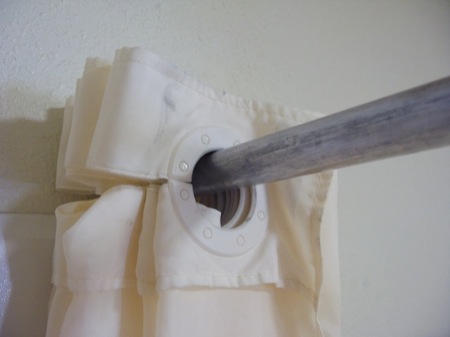
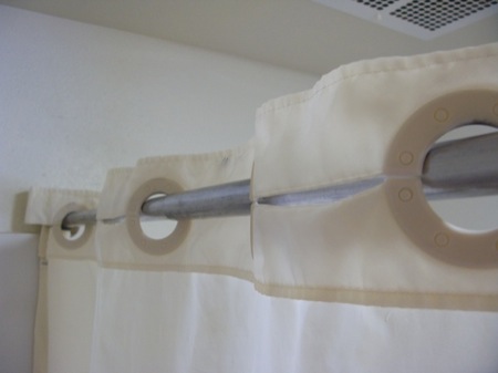
During recent travels, I noticed a novel design for shower curtains. Whereas most curtains are mounted to their rod with eyelet hangers made from metal wire or plastic, these curtains utilize plastic disks that are sewn into the curtain’s fabric.

These disks have a horizontal slot at one side; slots in neighboring disks are pointing towards each other and the fabric between the slots is cut as well. In other words, the center holes in two neighboring disks are “connected” by these cuts and slots.

Pro: easy-on, easy-off

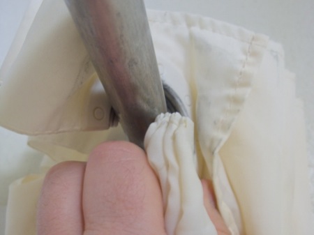
Thanks to this nifty design, removing the curtain from its rod is very easy: open the curtain all the way, grab a stack of disks and bend them to open the slots, and then slide them off the rod.

Standard eyelet hangers usually need to be taken off the rod one hanger at a time. In contrast, with this new design, several hangers can be removed at once, saving hotel staff quite a bit of time and effort when exchanging the curtains during cleanup.

Con: difficult-to-close

When you try to close the curtain, however, you realize that the design is flawed.

You can easily pull the curtain along from one end until it is about two thirds down the rod. At that point, the disks will start to lie flat against the rod, which generates a surprising amount of friction between them.

In fact, the friction will increase to the point where you cannot move the curtain any further along unless you start pulling at the curtain’s center section to move the remaining folds along.

Optimized for the less-common use case

There are two groups of “users” for a hotel shower curtain: the guests who will open and close the curtain when taking a shower, and the service staff who will exchange the curtain for cleaning.

Compared to curtains that are mounted the “old-fashioned” way with eyelet hangers, this disk-hanger design makes it more difficult for the guests to close the curtain while making it easier for the service staff to remove and replace it.

But how often will a curtain like this be opened or closed, and how often will it be replaced?

Assuming that most hotel guests will take a daily shower or bath, and that curtains are only exchanged when new guests move into the room, this curtain will be closed and opened many more times than it is removed from its mounting rod. This is even more true for rooms that are occupied by more than one person.

I think it is fair to say that, while this new design shows off an interesting and inspiring fresh approach, it effectively has been optimized for the less-common use at the expense of its main usage.

What’s more, as much as I appreciate making things easier for service personnel: annoying hotel guests due to having optimized the design of an everyday thing like a shower curtain for non-guest user groups, is a very risky decision.

A New Poster Child for Web Form Validation

Most websites that allow or require data to be entered into free-form text fields validate this data before accepting it. This is to ensure that, for example, email addresses are valid, phone numbers adhere to a certain format, or that the contents of “Choose Password” and “Retype Password” fields match.

An iterative (and painful) approach to form validation

All too often, form validation is a painful iterative process for the user. It typically goes something like this.

You enter the data into the web form and click Submit. If an error is found in any of the fields, the page with the form is displayed again, now including a message stating that “One or more fields contain invalid data” and highlighting some of the form’s fields.

If you’re lucky, you will find more information on the page about how to fix the errors, like “Phone numbers may only contain digits and dashes”1 or “The password contains invalid characters.”2

When you think you’re done correcting the issues, you hit Submit again, and you may very well be presented with the next batch of fields whose contents don’t validate.

And so it goes until the website deems any and all of your entries to be worthy of acceptance.

Real-time. Relevant. Plain English.

UJAM, a promising new online music creation tool that was launched only recently, provides a much more user-friendly approach to form validation.

The first impression that you get when you open the UJAM.com sign-up page, is that of a standard web form (albeit a very elegantly designed one). As soon as you start entering data, though, whatever you enter is validated immediately and in real-time.

Each text field has its own validation result message displayed right next to it. This message can reflect one of three states — Info, Error, and OK — which are indicated through icons as well as color. Additional information, including instructions on how to fix any errors, is given in plain language.

Plain and simple options, too

The checkboxes at the bottom of the registration form are just as plain and simple: accepting the Terms of Service and the Privacy Policy is straight-forward, and either option links to the related documents.

The two opt-in opportunities — for subscribing to the UJAM newsletter and for allowing UJAM to share your information with third-parties — provide concise information on what either checkbox does. Just as importantly, this web form does not leverage double-negations or similar dark pattern tactics to lure the user into accepting an option against their will.

I may be a bit blinded by the fact that I’m really excited about what UJAM has to offer (and I do not use the term “excited” lightly), but I doubt that I have ever felt quite as confident about properly filling out a web form on the first try as I have when I signed up for a UJAM account.

Update 2011-05-18: In hindsight, it was a good idea to include the disclaimer about me being “a bit blinded:” When I pointed other UX designers to this web form, they immediately criticized some of its design details, and rightfully so.

The validation messages are intrusive: As soon as you begin filling out the form, the validation process starts, and the resulting messages appear almost instantaneously. As a result, the website will most likely reprimand you for an error in your email address or your password, just because you are not typing fast enough.

Additionally, the validation process repeatedly cycles through “no message” to “gray empty message” to “validation status/error”, as seen in this little video clip.

Intrusive, indeed!

Here are a few ideas to make the validation system appear less pushy:

  • Display the informational messages for all fields as soon as the page loads.
  • Increase the delay with which the validation status message is updated.
  • Instead of using a red or green background for the entire message area, restrict color to the icons and the hairline around the text entry field.
  • Use smoother transitions so the changes in icon and text are not quite as abrupt.

Some of the validation messages are curt: The messages should be friendlier than, e.g., “Password is too short”. This specific example also is less than unhelpful, because it does not explicitly state how many characters are required.

Phrasing this as a positive call-to-action makes the interaction with the form friendlier and easier: “Enter a password that is at least 8 characters long.”

The links to the ToS and Privacy Policy are hidden: The text strings “Terms of Service” and “Privacy Policy” next to their checkboxes are clickable, as are most occurences of “Privacy Policy” in the longer text section in the upper right.

During my first visit to this site, these links were easy to find, because of their solid black text color that nicely contrasted the gray of the copy text.

Apparently, the designers have modified this, because those links now have the same color as the copy text. Since they are not underlined or set in bold, either, there is no visual indication of their “clickability” at all.

UJamLinks

Only when you hover over one of the links will the text color be changed for highlighting, as in this screenshot. “Terms of Service” in the upper checkbox is a link as well, but it is literally impossible to recognize it as such.


  1. A common problem with many websites is that they insist that phone numbers be entered in the North-American ten-digit format, even if the site is aiming for an international target audience. 

  2. It never ceases to amaze me how many websites that present this error, fail to provide a simple, explicit list of characters that are allowed for use in a password. 

Wheat and Chaff in Software Release Notes

Omni Group, the Seattle-based software artisans, have made a name for themselves by creating applications with very meticulously crafted user interfaces. One of their products, the GTD-inspired task manager, OmniFocus, is among the few applications I simply could not live without anymore.

Who moved my actions?

In a recent release, the developers changed a detail in the way OmniFocus displays its data. Due to this change, some data views in the software would now display many more items.3

Lists that previously were tidy, and easy to grasp and to handle, …

… were now swamped with data items.

In case you’re wondering: yes, the source data for both of these screenshots is identical! (Note the size of the scroll bar thumb to get an idea of the total length of this list.)

It only took a few days of working with the new version before I got so frustrated with this new flood of data that I decided to send a feature request to Omni Group, asking them to add an option in an upcoming release that would bring back the old behavior.

And I still haven’t found what I’m lookin’ for…

What I hadn’t realized was that the option that I was asking for had already been added — in the very same release as the display change itself. And yet, I had only found it after reading about it in a tweet. Why hadn’t I found that option myself?

Because I could not see the forest for the trees. Twice.

At first, I had searched OmniFocus’ preferences panes for a way to restore the previous behavior, and had come up empty-handed. Then I scanned the menus and failed again in my search, even though the option in question takes center stage in the View menu.

OmniFocus is very flexible in terms of how it displays its data. Consequently, the View menu has lots of items and plenty of sub-menus. What’s more, at the time I did not know the exact name of this option, of course. And so I literally overlooked what I was searching for.

In that sense, the View menu is forest number 1, so to speak. Forest number 2 are OmniFocus’ release notes.

Release notes of novelesque proportions

Omni Group always provide extensive release notes for all of their applications. Generally speaking, I very much welcome such a level of detail, but it also comes at a price: the sheer amount of information makes it almost impossible to filter out the chaff of countless bug fixes and internal code changes.

Consequently, trying to concentrate on the more useful and important tidbits — from an average user’s point of view — like changes in UI or behavior, is tedious and tiring.

Agile Web Solutions have found a nifty fix for this problem: they label each item in their release notes with colored “New,” “Changed,” and “Fixed” tabs.

By scanning for the “New” tabs, you can easily discover new features in the software that you may want to try out and, possibly, learn how to master.

“Changed” notifies you of changes to existing features that you may already be using, so that you can quickly learn how to adapt to these changes.

And finally, chances are that you can safely skip any items labeled “Fixed,” unless you have been plagued by a certain bug and you now want to find out whether this bug has been fixed yet.

To make these labels truly useful to the user, it is essential that the categorization reflects how the application has changed from the user’s point of view.

In other words, the “New” and “Changed” labels should only be used for new features and changes that manifest themselves in the software’s UI, and not just “under the hood.”

Any modifications like code optimization, data schema changes, protocol adaptations, etc. belong in the “Fixed” category unless they require the user to take action because of them.

Take, for example, the top-most “Changed” item in the screenshot, “Added a workaround…”. From a developer’s perspective, that surely is a “Changed” item, but since the user will not see any differences in the software’s UI because of this change, it should have been listed as “Fixed.”

For release notes as extensive as Omni Focus’ software’s, labeling each and every bullet item would amount to visual overkill, but separating these bullet items into three categories “new,” “changed,” and “fixed,” should be perfectly feasible.

Detailed release notes are a valuable part of the overall documentation of a software application. Classifying the list items as “New, “Changed,” and “Fixed” would make even lengthy, verbose release notes more easily digestible for average users while, at the same time, keeping the information they contained as detailed as expected by expert users and developers.

Update 2011-02-08: My text notes application of choice, Notational Velocity, provides another example for very cleanly laid-out release notes. These are sorted into three categories: “New Additions,” “Behavior Changes,” and “Fixes.”

NVUpdateReleaseNotes

All of the items found in “New Additions” and “Behavior Changes” do affect how the user interacts with the application, and do not reveal any under-the-hood details related to these changes. Such technical details are found exclusively in the “Fixes” section, which refers to, e.g., proxy servers or programming frameworks — terms and concepts that may confuse average users.

Unfortunately, the notes for the update shown here include an important note about compatibility issues, which is placed at the very bottom of the release notes.

NVUpdateReleaseNotesWarning

Users who only take a casual glance at the release notes before hitting Install Update will likely miss this note. This pitfall could be easily avoided by placing warnings like this one at the very top of the release notes.


  1. Some details for those of you who are familiar with OmniFocus: With version 1.8, projects and project groups have become actionable, so that both can now show up in lists when viewing “remaining” items.

    Since I use projects and action groups solely for structuring individual actions, I hardly ever assign contexts to either. As a result, after I had upgraded to OmniFocus 1.8, the list of items in the No Context meta-context had become so huge as to be useless: the few actions that did actually require a context were buried in the countless projects and groups that could very well live without one.

    What’s shown in the screenshot with the single action item is the result of selecting “Hide Parent Items in Context Mode” from the View menu, and is identical to what OmniFocus showed prior to version 1.8 for the same source data.