About 18 months ago, my wonderful wife and I cut our TV cable. A sleek Apple TV replaced the unwieldy Comcast box, and we now get most of our content from Netflix, hulu, and PBS. We save money, have fewer ads to endure, and when it comes to the user experience, the Apple TV is far ahead of Xfinity. If it weren’t for live football games and Formula 1 races, we wouldn’t miss a thing.1
One aspect of the user interface has been bugging me since we made the switch, though. The next-generation Apple TV, which will likely be announced next week, will hopefully address that problem.
Eventually, it’s almost like old-fashioned TV, but without the channel numbers
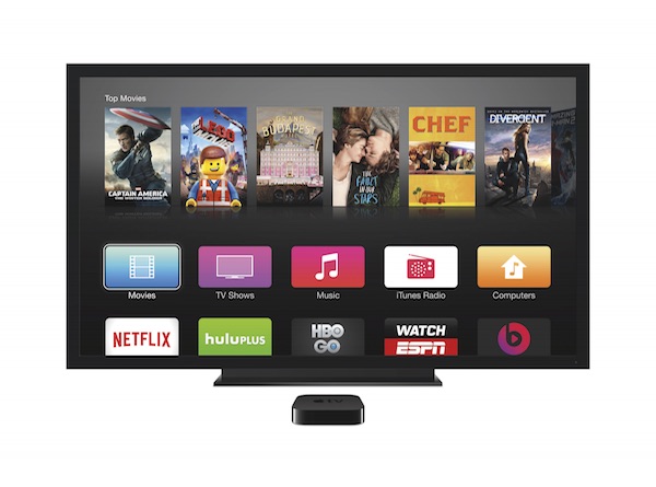
Almost everything on the Apple TV is on-demand. To watch a TV show or movie, you browse or search for it, or pick something from you-might-also-like-this suggestions. Alternatively, you can save titles to a personal watch list for later viewing.
And here’s that major problem: Every channel on the Apple TV has its own, dedicated front-end for browsing and searching, for suggestions, and for a watch list for just that one channel.
Not every title is available on every channel, of course, so if you want to watch a specific movie, chances are that you will have to search in multiple channels until you find what you’re looking for. Similarly, if you want to access a title from a watch list, you need to remember in which channel you saved it. If you don’t, you’ll have to step through multiple channels to find the watch list that it’s on.
Let’s say I’d like to watch François Truffaut’s masterpiece, “The 400 Blows:” Yeah, I’ve seen that somewhere on the Apple TV. Didn’t I save that to a watch list? Let me check Netflix… Nah. iTunes Movies, maybe? Nope. hulu? Uh-uh. OK, let me search for that, then — wait, now was it available on Netflix, or hulu, or where the heck did I see that?!
You get the idea.
Of course, you could consult a site like CanIStream.it, but that would make the overall process even more cumbersome. What I would really like to see in the upcoming Apple TV update, are central screens for unified search and watch list that operate globally on all channels.
One search, one watch list, to rule them all
If I feel like watching an episode of one of my favorite TV shows, I don’t want to have to hunt for it across channels. I want to deal with just a single unified search form: I hit a dedicated button on the remote, enter the title, run the search, and get a list of all options for watching that show right now — regardless of whether it’s served via Netflix subscription, paid iTunes rental, or free PBS series.
The same applies to watch lists: I don’t want to have to juggle multiple lists. Just let me save interesting titles to a single unified watch list. Make it explorable via genre, actors, directors, etc., and tie in some additional information from sources like IMDB or Rotten Tomatoes. Better yet, support multiple lists so each family member can have their own.
Obviously, content providers will not like this approach. Why, for example, would I buy or rent a movie from iTunes, if I can watch the exact same title for free on another channel? And yet, from a user’s perspective, the Apple TV would be so much easier to use if search and watch lists would be unified.
There are rumors that the next Apple TV will support Siri voice control. That could make for a fascinating approach if Siri “becomes” that single-point-of-access global search and watch list.
-
To be honest, this should have read “…I wouldn’t miss a thing,” because my wife doesn’t really care for guys fighting over an egg-shaped ball or cars driving around in circles. ↩