Leave Handling Invalid URLs to the Browser

If you enter an invalid URL into a web browser’s address field, the browser will usually display a reasonably helpful error message.

Safari displaying an error message that it cannot open a web page because it cannot find the corresponding web server

Some internet service providers override this behavior by displaying their own, branded search page. Like this one from CenturyLink, which is named Web Helper service.

CenturyLink's could-not-find-web-server window offers a prominent search field and a list of search-based suggestions, but lacks an explicit error message

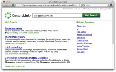
It is easy to see how such “error pages” provide ISPs with extra income from sponsored search results (read: paid ads).

Nevertheless, they are a poor substitute for the browser’s built-in error handling, because it creates usability problems:

  1. The ISP’s search page masks the underlying error,
  2. it obscures the URL that was entered originally, and
  3. restoring the default behavior is tedious.

Masking the underlying error

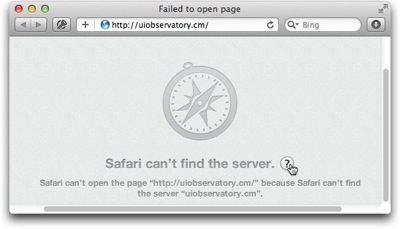
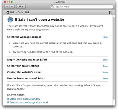
The error message that appears in Safari is unambiguous. It says exactly what went wrong in easy-to-grasp language.

Users who may still be confused by the error message can click on the Help button next to the message text to summon a help page in OS X’s Help Center, which lists possible causes for the error, and provides useful instructions on how to fix it.

A page in OS X's Help Center lists possible causes for Safari to be unable to open a web page and suggests fixes

Contrast that to CenturyLink’s page, which completely fails to explain what just happened, and why you are seeing it instead of the web page you originally wanted to visit.

Thankfully, there is a link at the top (and bottom) of the page, labeled “Why am I here?”, that promises to answer this very question.

https://uiobservatory.com/media/2012/CenturyLinkWebHelper_WhyAmIHere.jpg” alt=”When clicking on “Why am I here” in CenturyLink’s search page, a verbose text explains why the page is being shown” border=”0″ width=”400″ height=”250″ />

Compared to Safari’s concise error message, the explanation is much more verbose and purely descriptive. It does not contain a single prompt telling the user what to do now, as in “To fix this problem, do this!”

As a result, understanding what went wrong, and learning how to solve the problem, take more effort.

Obscuring the original URL

Look at what happens to the data, i.e., the URL, that you enter into the browser.

Safari retains the originally entered URL. CenturyLink's Web Helper modifies it

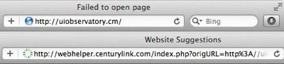
Safari leaves it unchanged despite the error. In contrast, CenturyLink uses a redirect to hop over to their search page, which replaces the link in the browser’s address field.

In cases where the error is caused by a typo, seeing just the original URL that you had entered makes it much easier and faster to verify what you had typed, and to fix any typos that you may find.

Making it tedious to restore the default behavior

As stated in the “Why am I here?” text, you can opt-out of this service. All you need to do is change a setting on the Web Helper service’s preferences page, and click Save.

https://uiobservatory.com/media/2012/CenturyLinkWebHelper_OptOut.jpg” alt=”You can opt out of CenturyLink’s “Web Helper” service via simple change of settings on their preferences web page” border=”0″ width=”400″ height=”250″ />

Once the changes have been confirmed, you will be spared CenturyLink’s Web Helper page and see Safari’s plain old error message, instead.

Changes you make to your CenturyLink settings are confirmed after you click Save

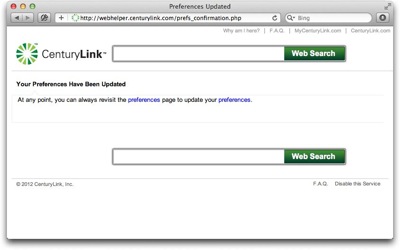
If, that is, you changed the setting on a computer that is connected directly to your CenturyLink modem. Otherwise, the setting won’t stick, even though the website presented you with that confirmation screen.

https://uiobservatory.com/media/2012/CenturyLinkWebHelper_FAQ.jpg” alt=”CenturyLink’s “Web Helper” FAQ explains that for the settings changes to stick, you need to connect your computer directly to the modem” border=”0″ width=”400″ height=”250″ />

What “directly connected to the modem” means is this: Plug one end of an ethernet cable into your computer, and the other right into the modem’s LAN socket.

Depending on your network setup, this is a non-trivial task.

In our home, for example, we use an older Qwest-branded Actiontech M1000 modem. This device only has a single Ethernet port, to which our WiFi router is connected. All of our computing devices go through this router to connect to the Internet.

As an important detail, I have configured our modem to operate in “bridge mode”, and user name and password for signing into our ISP’s network are configured in the router, not the modem.

To follow CenturyLink’s instructions for disabling their Web Helper service, I would need to unplug the router from the modem; connect one of our computers to the LAN socket on the modem; find our credentials for PPPoE access and enter them into the computer’s Network preferences; and then I could finally opt out of the Web Helper service in the hopes that this setting would stick.

What a mess!

The least that CenturyLink could do is to let you change the Web Helper setting via their customer account dashboard. Better yet, just get rid of this page already, or make it opt-in. Why?

Because any state-of-the-art web browser provides better error messages for, and faster and easier recovery from, invalid URLs than customized “error response” pages like CenturyLink’s.

And if you really need to perform a web search for finding the proper URL, there’s a prominent field for that in every browser, anyway.

OS X Lion Acquitted of Breaking the Web

Please accept my apologies for this article’s overly dramatic headline, but how else can you properly respond to the accusation that “Mac OS X Lion’s scroll breaks the web“?

According to the article’s author, Pablo Villalba, a feature that premiered in OS X 10.7 Lion — overloading the scrolling gesture with “Show previous/next page” commands — leads to interaction mayhem (emphasis his):

[This behavior] can be disabled with a system-wide setting from Preferences -> Trackpad -> Mouse gestures (disable two-finger swipe), but my problem with it is that it breaks the web with a non-standard behavior, and gives you no JS API to prevent it.

Thankfully, the situation is not quite as gloomy, because Villalba’s claim is flawed:

  1. The swipe-for-page-turn behavior is not non-standard,
  2. it does not break the web, and
  3. disabling it on a website-by-website basis would be the wrong solution.

Just another way to turn a page

Macs equipped with a multi-touch trackpad have offered a two-finger gesture for scrolling window contents for a few years now.

Under OS X 10.7 Lion, this gesture does double-duty for page turning: If the window contents cannot be scrolled (e.g., if the document is fully visible), or if you have scrolled the content as far as it will go, the gesture will switch from scrolling to jumping to the previous or next page in a document.

This two-finger-swipe-to-turn-the-page behavior is a system-wide feature in OS X Lion, and is supported by several applications. For example, you can use it to turn pages in a PDF document in Preview, or to step through photos in Aperture.

In principle, it is just another way to trigger a common operation. As such, it complements existing keyboard shortcuts and button clicks, and constitutes perfectly standard behavior on any Mac running OS X Lion.

If going to another webpage in Safari via the two-finger swipe is breaking “the” web, why doesn’t Villalba accuse the Previous/Next Page buttons of the same crime?

Admittedly, using one interaction for triggering different commands is always problematic, because the user needs to understand what command will be triggered based on the software’s current mode of operation.

Consequently, the risk of inadvertently moving away from the current webpage via the two-finger swipe is likely higher than inadvertently clicking the Previous/Next buttons. But this is not the core problem here.

The real problem is that, for applications, the web’s page metaphor does not make sense.

Web apps and the page metaphor don’t mix

The original concept for the World Wide Web was based on hypertext, and the data you would view right inside the browser was mostly that: interlinked text.

For this kind of data, a page is a natural “serving size”, and this fact is reflected in the way browsers let you navigate “pages”.

If you’re dealing with an interactive web application, however, the page metaphor does not make sense. For a web application, its user interface is the only “page”, and browser features for handling pages — including the Previous/Next Page commands — are not only meaningless. They can even interfere with the proper functioning of such an app and also lead to data loss.

The problem, therefore, does not lie in how you step away from a webpage running an app — via clicking a button, pressing a keyboard shortcut, or gesturing on a trackpad –, but in the very existence of these page-turning functions.

Keeping things consistent across, and within, apps

To address this problem for his own web application, Villalba would like to disable Safari’s turn-the-page gesture programmatically. He bemoans that, as of yet, there is no way to do this.

As I explained above, though, using this gesture for page turning is not limited to the Safari web browser. It is a system-wide feature in OS X Lion. Therefore, if a user has chosen to use this feature, it should work consistently across, as well as within, applications.

If it were possible to disable the gesture on a website-by-website basis, then that actually would break “the web” for any user who wants to use the gesture.

Instead of letting web developers disable system-features in this manner, I would prefer another solution to the very real problem that Villalba talks about.

An application mode in web browsers

The features and related user interface elements that browsers provide for handling web content as pages is what gets in the way when running a web app.

One possible solution, therefore, could be based on a dedicated “application mode” that is supported across different browsers and invoked by a simple, standardized command or tag.

In this mode, the “Previous/Next Page” buttons would be deactivated, forcing the user to stay on the web app’s page. Selecting the Close Window command would present a warning dialog whose text could be customized programmatically, and the user’s response to it passed on to the web app, before it is requested to quit.

Surely there are other functions that web app developers would like to see being enabled or disabled based on this app setting. Also, I’m not sure exactly how these features should be implemented design-wise: How should the application mode status be communicated to the user?Should there be an override for deactivated functions? Etc.

In any case, the key is that the solution is standardized across browsers and web applications, and that it provides a flawless user experience that does not rely on the design and coding skills of the individual web applications’ developers.

Just as importantly, the application mode must not modify any interactions — like scrolling or page selection in a browser — that may be un-conventional overall, but perfectly common on a specific computer platform.

More Hotel Room Observations

As I’ve stated before, hotel rooms are amazing places for interaction designers to explore. The people who stay here come from a range of cultural backgrounds, and their technical ability varies greatly. This makes designing user interfaces for this environment a formidable challenge, because all artifacts in a hotel room must be usable by every one of those guests.

Here are some fresh observations from a recent stay in Denver, Colorado, and related, useful design guidelines.

Don’t baffle me with wrong affordances!

One of the first discoveries when we walked into the room, was this knob on the night stand.

Night stand that, right below its top, features a knob that looks exactly like those on the TV console dresser

How neat: Looks like you can pull out a board to extend the nightstand’s surface! Only you can’t.

Although the knob looks identical to these two on a fully functional drawer, …

Front of the TV console dresser with three drawers, the top one of which sports two knobs

… the one on the nightstand does nothing. It’s pure decoration. And awful design, because things that look identical should work in identical manners.

Make devices physically easy to use!

Our room had a balcony, that you access through a sliding glass door. Its lock is a poster-child for visibility: Not one detail of its inner workings is hidden behind a cover.

Lock on balcony sliding door, consisting of two brackets connected by a U-shaped bolt

Although this makes it easy to understand how the lock works, it is painfully difficult to actually operate it.

The fit of the lock is very tight. Unless you manage to move the door to just the right position in which the friction between the bolt and the holes is minimized, it is simply impossible to pull the lock bolt out of these brackets.

The lack of a proper handle on the bolt only makes matters worse, and we managed to send the thing flying across the room more than once.

Provide useful instructions for non-simple devices!

Not all things in a hotel room are as simple as the balcony lock. Some of them, like this coffee maker, require instructions to make them work.

Small, two-cop coffee maker plus paper cups, coffee pouches, and condiments

Instructions should be easy to find, easy to read, and easy to understand.

The coffee makers instructions, however, are hidden on the inside of its lid, and nothing on, or near, the device points to that location.

The “manual” itself uses tiny low-resolution images, which are difficult to decode. For example, compare steps two and three: Can you make out the two disks representing the coffee pads inside the machine?

Lid of the coffee maker, lifted up, and displaying iconic brewing instructions on its inside

Why not place a placard next to the machine to make the instructions as easy to find as possible? This would also provide ample room for bigger, easier-to-decipher images, as well as plain text instructions.

The device’s user interface could also use a bit of attention.

The coffee maker from above with three buttons on the top

Its three buttons would benefit from higher-contrast labels, and coloring the more-important “Stop” button red would make it easier to distinguish between it and the “Brew” buttons.

Clue me in on how this thing works!

Speaking of easy-to-use buttons, this beautiful block of chromed metal is the toilet flush-lever. It does stand out from the off-white ceramics of the bowl, so it’s easy to find.

Its very clean rectangular shape, however, fails to provide any visual clues as to how to operate it.

Chrome toilet flush lever on the side of the tank

To trigger a flush, you need to push down on the rear (i.e., wall-side) end of the lever. A little indentation on the lever would remove any doubts about where to place your finger, and in which direction to move this control.

Help me find stuff quickly!

We prefer to fine-tune our rooms’ temperature, but sometimes it’s difficult to find the respective control panel.

See that little box on the wall to the right of the TV? That is the A/C control panel.

Wall of our hotel room, showing HVAC unit in the far corner and HVAC control panel close by, separated by a desk and TV console

The corresponding heater/AC unit is that large thing towards the far end of this wall, several meters away from the control panel.

It’s almost funny how unfortunate the control panel’s mounting location has been chosen, because when you enter the room, it’s hidden behind the narrow column on the wall that you can see near the photo’s right edge.

And when you lie down in bed, it’s hidden behind the huge-screen TV. In fact, my fiancée noticed the panel just when we were about to leave the room to check out …

To close this article on a positive note, something that is essential to us traveling geeks was wonderfully easy to find in this room: Power sockets!

Instead of rummaging around under desks, behind TVs, or inside fridge closets for precious electrons to recharge iPhone & Co, two empty sockets were in plain sight

Base of the desk lamp with the lamp's power switch and two 110V power sockets

Placed in the base of the desk lamp, they are easy to find, convenient to access, and provide power exactly where you will need it.

Yet more (if older) hotel room observations

If you find “hotel room usability” as exciting as I do, you will enjoy reading my observations on a radio alarm clock designed specifically for hotel rooms, a usability problem with hotel safes, an annoying shower curtain, a make-up mirror with a touch user interface, and even something as mundane as an elevator button panel.