As I’ve stated before, hotel rooms are amazing places for interaction designers to explore. The people who stay here come from a range of cultural backgrounds, and their technical ability varies greatly. This makes designing user interfaces for this environment a formidable challenge, because all artifacts in a hotel room must be usable by every one of those guests.
Here are some fresh observations from a recent stay in Denver, Colorado, and related, useful design guidelines.
Don’t baffle me with wrong affordances!
One of the first discoveries when we walked into the room, was this knob on the night stand.
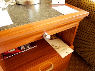
How neat: Looks like you can pull out a board to extend the nightstand’s surface! Only you can’t.
Although the knob looks identical to these two on a fully functional drawer, …
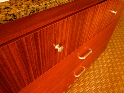
… the one on the nightstand does nothing. It’s pure decoration. And awful design, because things that look identical should work in identical manners.
Make devices physically easy to use!
Our room had a balcony, that you access through a sliding glass door. Its lock is a poster-child for visibility: Not one detail of its inner workings is hidden behind a cover.
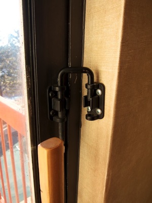
Although this makes it easy to understand how the lock works, it is painfully difficult to actually operate it.
The fit of the lock is very tight. Unless you manage to move the door to just the right position in which the friction between the bolt and the holes is minimized, it is simply impossible to pull the lock bolt out of these brackets.
The lack of a proper handle on the bolt only makes matters worse, and we managed to send the thing flying across the room more than once.
Provide useful instructions for non-simple devices!
Not all things in a hotel room are as simple as the balcony lock. Some of them, like this coffee maker, require instructions to make them work.
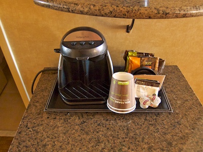
Instructions should be easy to find, easy to read, and easy to understand.
The coffee makers instructions, however, are hidden on the inside of its lid, and nothing on, or near, the device points to that location.
The “manual” itself uses tiny low-resolution images, which are difficult to decode. For example, compare steps two and three: Can you make out the two disks representing the coffee pads inside the machine?
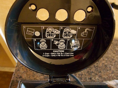
Why not place a placard next to the machine to make the instructions as easy to find as possible? This would also provide ample room for bigger, easier-to-decipher images, as well as plain text instructions.
The device’s user interface could also use a bit of attention.
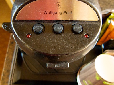
Its three buttons would benefit from higher-contrast labels, and coloring the more-important “Stop” button red would make it easier to distinguish between it and the “Brew” buttons.
Clue me in on how this thing works!
Speaking of easy-to-use buttons, this beautiful block of chromed metal is the toilet flush-lever. It does stand out from the off-white ceramics of the bowl, so it’s easy to find.
Its very clean rectangular shape, however, fails to provide any visual clues as to how to operate it.
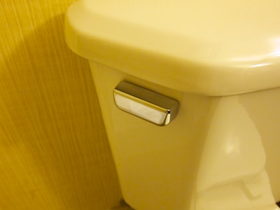
To trigger a flush, you need to push down on the rear (i.e., wall-side) end of the lever. A little indentation on the lever would remove any doubts about where to place your finger, and in which direction to move this control.
Help me find stuff quickly!
We prefer to fine-tune our rooms’ temperature, but sometimes it’s difficult to find the respective control panel.
See that little box on the wall to the right of the TV? That is the A/C control panel.
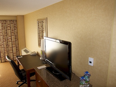
The corresponding heater/AC unit is that large thing towards the far end of this wall, several meters away from the control panel.
It’s almost funny how unfortunate the control panel’s mounting location has been chosen, because when you enter the room, it’s hidden behind the narrow column on the wall that you can see near the photo’s right edge.
And when you lie down in bed, it’s hidden behind the huge-screen TV. In fact, my fiancée noticed the panel just when we were about to leave the room to check out …
To close this article on a positive note, something that is essential to us traveling geeks was wonderfully easy to find in this room: Power sockets!
Instead of rummaging around under desks, behind TVs, or inside fridge closets for precious electrons to recharge iPhone & Co, two empty sockets were in plain sight
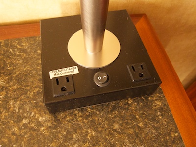
Placed in the base of the desk lamp, they are easy to find, convenient to access, and provide power exactly where you will need it.
Yet more (if older) hotel room observations
If you find “hotel room usability” as exciting as I do, you will enjoy reading my observations on a radio alarm clock designed specifically for hotel rooms, a usability problem with hotel safes, an annoying shower curtain, a make-up mirror with a touch user interface, and even something as mundane as an elevator button panel.