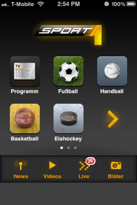
My favorite sports news app is Sport1, which is offered by the German TV channel of the same name. Its current version covers eight sports genres like soccer, Formula 1, or U.S. sports.
The app presents these genres, plus four additional functions, as icons on a screen that looks very similar to the standard iOS Springboard for launching applications.

A total of twelve icons is spread out over multiple screens, which can hold up to six icons each. To flip between the screens, you use the familiar horizontal swipe gesture.
The app also lets you re-order these icons, so that you can compile your favorite sports genres onto one screen: As you would in Springboard, to enter editing mode, you tap-and-hold any of the icons until the latter start wiggling.
While in editing mode, you drag the icons around to arrange them. And when you’re done, you tap the “Anordnung speichern” (“Save Arrangement”) button to save your changes.
As you can see, the Sport1 app very closely mimics both the appearance and the behavior found in Springboard. There are, however, two noticeable differences: In addition to the swipe gesture, the app supports navigation arrows, and icons are automatically re-arranged if you leave any empty spots on a screen.
Turning helpful arrows into sources of confusion
The navigation arrows can be hidden via a checkbox — “Pfeile anzeigen” = “Display arrows” — that appears while the app is in edit mode.
If this option is checked, the arrows appear in the place of a regular genre icon. Unless the app is in editing mode!
While in editing mode, the arrows are always hidden, regardless of the setting for this option. This leads to an annoying problem: If you fill all six spots on a screen, all icons are re-arranged as soon as you leave editing mode to make room for the navigation arrows.
What you see in the screenshot above will, after exiting editing mode, look like this: The Basketball icon had to move to the next screen to allow the right-arrow to be displayed.
One way to address this would be to also display the arrows in editing mode. In that case, it would be essential to properly restore the previous icon arrangement when checking and un-checking the arrow option, though.
Every empty seat must be filled
A useful way to arrange app icons on an iOS device is to use “themed” screens. E.g., you could have a screen for games, one for communication apps, one for utilities, etc.
This works just fine, because Springboard won’t “re-flow” all icons to completely fill all spots on a screen. If you wish, you can have just a single icon on a given screen.
Not so in the Sport1 app.
Let’s say, you’re mainly interested in Formula 1, soccer, and U.S. sports1, and you would like to place just these three genres on the app’s main screen. The app does let you configure that arrangement, as you can see here:
As soon as you leave editing mode, however, the app just re-flows all icons so that the three empty spots in the bottom row are now also filled.
Oddly enough, this does not happen when the navigation arrows are active. In that case, the icons are not re-flowed.
Why should the decision about whether you would like see those navigation arrows have any impact on how the icons are (re-)arranged? Is this just a bug, maybe?
Mimic, or don’t mimic. There is no “sort-of”.
The icon screen in the Sport1 app re-creates the iOS Springboard’s appearance and basic behavior so closely, that a user can reasonably expect it to work exactly like the “original”.
Expanding and modifying the original’s behavior, however, may confuse users because the way the Sport1 app works differs from what they’ve come to expect based on their experience with the original “role model”, Springboard.
-
Go Niners! ↩