Apple is a company that, by and large, groks good design. Their teams’ creations regularly constitute industry benchmarks, both in terms of industrial as well as user interface design.
Like everyone who makes stuff, some of Apple’s design decisions may be debatable, but they rarely make choices that are outright, facepalm-inducing mistakes violating the very foundations of design.
Unfortunately, just today, I happened to stumble over one of the latter.
“Catch me!”, says the button, and runs
If you synchronize your calendars in Apple’s iCal via iCloud and an error occurs, a little hazard triangle appears next to the iCloud label in the calendars list.
The moment you move your mouse pointer over that icon to find out what went wrong, the icon jumps to the left, because it happens to be in the location that is usually reserved for the Hide button. Which, ironically, is itself hidden and only appears when you hover the mouse pointer over it.
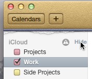
I’m not sure why Apple’s designers got rid of the disclosure triangle, which has been a UI staple on the Mac for ages, and replaced it with a literal Hide button. This is one of those design decisions I’d consider “debatable”.
Placing another button directly on top of the Hide button, however, and making it jump out of the way when hovered over, is something I’d immediately list under the “what the heck where they thinking?!” heading.