Downloading User Guides Should Be Easier Than This

These days, technical products rarely ship with a full set of printed documentation. What you’ll usually find in the box is just a small, flimsy, almost-unreadable-because-the-font-is-so-tiny “Getting Started” leaflet. Want to obtain the full user guide? Download a PDF file!

This works just fine for software applications: As long as there is an internet connection, the application can directly download any digital documentation. For hardware gadgets, however, the process tends to be more complicated and error-prone.

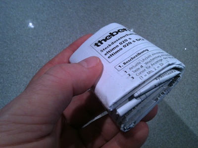
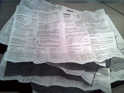
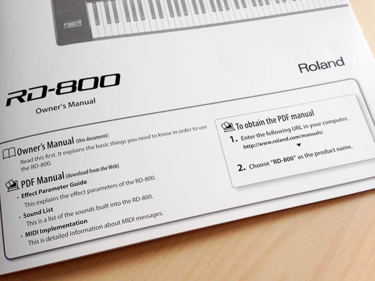
The manual that was in the box

In the hopes of rekindling my musical talent, I replaced my simplistic MIDI keyboard with a Roland stage piano. I was pleasantly surprised to find a complete, printed owner’s manual inside the box.

Additional documents covering more advanced topics are available for download: An Effect Parameter Guide, a Sound List, and an overview of the instrument’s MIDI Implementation.

A prominent notice right on the front page of the printed manual describes the process for downloading the digital documents:

To obtain the PDF manual

  1. Enter the following URL in your computer: http://www.roland.com/manuals/
  2. Choose “RD-800” as the product name.

The front page of the printed manual that shipped with the piano. Instructions for downloading additional PDF manuals appears on its front page.

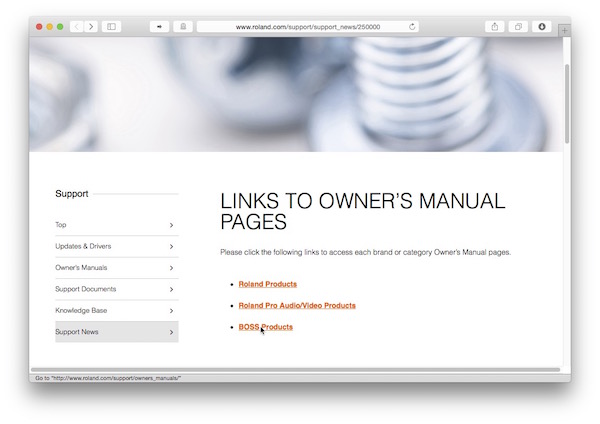
When you follow the link to http://www.roland.com/manuals/, you’ll see a page that lists three product categories.

This step feels confusing, because you have to already know the appropriate category, research it, or find it through trial and error. The “information scent” that this link trio provides just isn’t that great.

The landing page for downloading

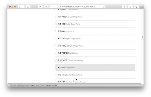
Clicking any of the links takes you to a list of products. Even though the list is divided into four letter ranges (A–G, etc.), each of the pages is very tall, as you can gauge from the size of the scrollbar thumb in the screenshot. This makes for quite a bit of scrolling.

A product list page showing instruments from the RD stage piano product line. The window's scrollbar thumb is very short, indicating that the page is very tall and contains many list items.

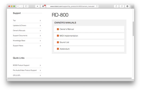
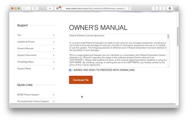
The detail page for a product lists all related documents that are available for download. Before you can actually get a document onto your computer, though, Roland makes you agree to a “Software License Agreement.”

The product page for the RD-800 lists four documents for download: Owner's Manual, MIDI Implementation, Sound List, and Addendum. The latter apparently contains the effect parameter guide.

Isn’t it a bit odd that you have to agree to a software license for downloading a user guide? Worse yet, you have to do so for every document:

  1. Click a document link
  2. Check the I Agree And Wish to Proceed With Download option
  3. Click Download File
  4. See the document appear in the browser window
  5. Save the document to your computer
  6. Navigate backwards two pages
  7. Start over until you have downloaded all documents

A page displaying a lengthy legalese

Compare that process to 1.) right-clicking a document link and 2.) selecting “Save to Downloads Folder” from the context menu. If you try that on the Roland site now, what you’ll find in the downloads folder is, of course, the HTML file for the software license page.

Why make this process so hard?

What bad things could a customer possibly do by downloading manuals if they weren’t required to agreeing to the user license? How useful are these manuals if you don’t own the product they belong to? Why not make this process a little bit easier for those who have actually purchased the product whose features are described in the downloadable manuals?

Imagine if, in place of the three product category links, a real-time search field appeared on the “Owner’s Manuals” landing page: As soon as you start typing into the field, it summons a filtered list of product names. E.g., type “rd,” and you will see the list of all pianos in the RD product line.

Select your specific model from the list, and you’re taken to the respective downloads page. And on that page, the links point directly to the PDF files.

If it is really necessary to force the user to the sign the software license, let’s display the license text and an I Agree button over the downloads page. As soon as you, the user, click that button, the license disappears to make way for the download links.

In the grand scheme of things…

The hiccups of the download process won’t really impact my enjoyment of this fabulous instrument. Nevertheless, it would be nice if companies — especially major industry players like Roland — would make download processes for manuals, drivers, etc. that little bit more user-friendly.

A User-Customizable User Guide

Manuals that ship with hardware appliances often contain instructions in more than one language. Such multi-lingual documentation simplifies logistics and reduces costs, because only a single document needs to be handled during production, and a single product package can be sold in multiple countries.

For the users, however, these manuals come at a price. They can be more tedious to navigate than a single-language document, and they require more storage space.

When I recently unpacked an electronics gadget, the manual inside the box was folded into a dense, almost children’s fist-sized wad of paper.

Stack of unfolded individual paper sheets making up the user manual

At first sight, it reminded me of an oversized version of the information flyers that you find in medicine packages — and whose folding pattern is so complex that you can never get it back into the box.

Unexpectedly, the wad unfolded into several individual double-sided sheets, each of which contains instructions in two languages.

Stack of unfolded individual paper sheets making up the user manual

Two perforation lines run from top to bottom along the sheets’ centers.

Close-up of the two parallel perforation lines along the center of a sheet from the manual

Thanks to the perforation, you can rip each sheet in two, so that you end up with a customized manual that only contains instructions in your own language.

Single sheet from the manual in front of a stack of the remaining sheets in other languages

This design is a double-edged sword, because you throw away the majority of the printed document, so that the waste of resources — paper, ink, and energy — is the same as with bound booklets.

Customizing the document in this manner does make it more usable, though, because it reduces its content scope and physical size to just exactly what you need.

I wonder if there is a way to apply this approach to larger documents whose contents exceed a single page per language.

A “We’re Closed Today” Notification With a Few Gaps

A few days ago, I walked to my nearest post office branch to send out some packages. Surprisingly, and disappointingly, they were closed. This poster, affixed to the main door, explained why:

Poster mounted on a door, stating that the post office is closed for the day

The text on the poster reads:

Closed on 25 October 2011

Unfortunately, we cannot be at your service on 25 October 2011 due to a company meeting as provided for in the [German] industrial relations law ([reference to section of the law]).

Basic Postbank services (e.g., withdrawal of cash) in the near vicinity:

[addresses of three other branches]

Hoping that the temporary closure was limited to this specific branch, I headed over to the main post office near the city center — only to find the same poster there, as well.

After I had wasted more than an hour hauling my packages around town, I couldn’t help but wonder how a better-designed version of the poster could have saved me time, effort, and good mood.

Inform me about what’s going on, but make it precise

The text on the poster is very exact about explaining the reason for the closure, but it fails to explain the closure’s scope. It would have required just a few more words to make this clearer:

Due to an all-hands company meeting, all mail offices in Aachen will be closed on 25 October 2011. We regret that we cannot be of service to you on that day.

Inform me about possible alternatives

Listing three branches that are open and provide at least some services, is helpful. There is a caveat, though: These are not full-service mail offices, but so-called “Partner-Filialen”, i.e. “partner agencies”.

In most cases, what you will find in these locations are Deutsche Post-branded service counters inside regular shops like supermarkets, newsstands, etc. The poster, however, bears the Postbank logo and explicitly refers to “Basic Postbank services (e.g., withdrawal of cash)”.

What if I need to change an insurance contract? Is that service available in any of those three locations? And what about mail services: can I send my packages from there?

Not knowing exactly where which services are available makes it unnecessarily difficult to decide which of the “partner agencies” to go to. Much more so, since, despite the phrase “in the near vicinity”, neither of the three shops is closer than a brisk 20 minutes’ walk from where I saw the poster!

Ideally, the poster would have provided bulleted lists of all services available at the respective partner agency. And Deutsche Post already does have that information in a database, as evidenced by their online branch finder.

Inform me in a context that is useful to me

This branch finder on Deutsche Post’s website displays both full-service branches as well as partner agencies on a map. Clicking on a location brings up a window with opening times, available services, etc.

Map view of Post's online branch finder, displaying a branch's details like opening times, etc.,

And yet, before I headed out the door with my packages, I had checked the opening times for my nearest as well as the main post office branches via that web page. But there was no mention whatsoever that these would be closed for the day.

What is the point of listing opening times if a branch is not open at all?

It baffles the mind why no-one at Deutsche Post had thought of adding this essential-for-the-customer-experience piece of information to their website.

Error messages: Like digital, like analog

In a way, you can think of this poster as an “error message in the analog domain”. As such, the same key guidelines that apply to its digital counterpart should apply to the poster, as well:

  • Explain what happened, why it happened, and what the user/visitor/customer can do to fix the problem
  • Write the message’s contents so they’re meaningful to the user
  • Provide the message in the appropriate context

Deutsche Post’s poster feels like a — fictitious, mind you… — error message in Microsoft Word that says “Could not save your most recent document. Try some other word processor. [OK]”, and which appears right after you quit the application.

That said, Deutsche Post’s user-friendly online branch finder shows that they’re on the right track. So, hopefully, next time they shut down every post office in my hometown for a full day of “betriebsverfassungrechtlich vorgesehene Betriebsversammlung”, I’ll be able to find out about it well before leaving my house.