A UI for a Sit/Stand Desk — How Complex Can It Be?

The sit/stand desk in our home studio is the best furniture investment we ever made. Prolonged sitting is linked to serious health risks, and a sit/stand desk helps alleviate those risks. I also feel that literally changing my perspective at the desk helps me think more clearly and concentrate longer.

Two directions equals two buttons

The desk is motorized, and its entire user interface consists of two buttons embedded in a little control panel. The triangular shape and orientation of the buttons clearly reflect which one will raise the desk, and which one will lower it. Push a button, and the desk starts moving; release the button, and the movement stops.

A small plastic enclosure contains the two buttons. The enclosure is mounted directly underneath the desktop. Both buttons are next to each other, but with ample space between them to prevent pressing the wrong one by mistake.

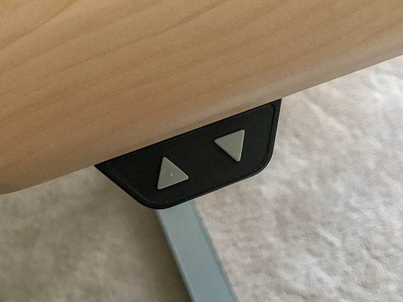
You can easily tell the buttons apart even without looking at them: a little bump is molded onto the top of the “Up” button, while the surface of the “Down” button is perfectly smooth. By just feeling for that bump, you can identify the desired button.

As a neat detail, the entire panel fully slides underneath the desktop, so you can’t accidentally bump into it and hurt yourself.

Adjust your desktop with the touch of a butt(on)

In my previous job, I was lucky enough to also have a sit/stand desk at work. It’s a different model from the one we have at home. Besides offering buttons for manually adjusting its height, this model features three preset memory slots and even displays the current desk height.

While I think that the height display is a bit gratuitous and gimmicky, the memory slots are a nice feature. Being able to “drive” the desk all the way to your preferred standing or sitting height with a simple tap of a button makes that adjustment more convenient and more precise.

Unfortunately, the convenience and precision come with an annoying side effect, and it’s the control panel’s design that is to blame.

The control panel houses six buttons, arranged in two stacked rows of three buttons each. The top row has buttons 1 through 3 for recalling memory presets. The second row holds the button for storing a new preset, and the

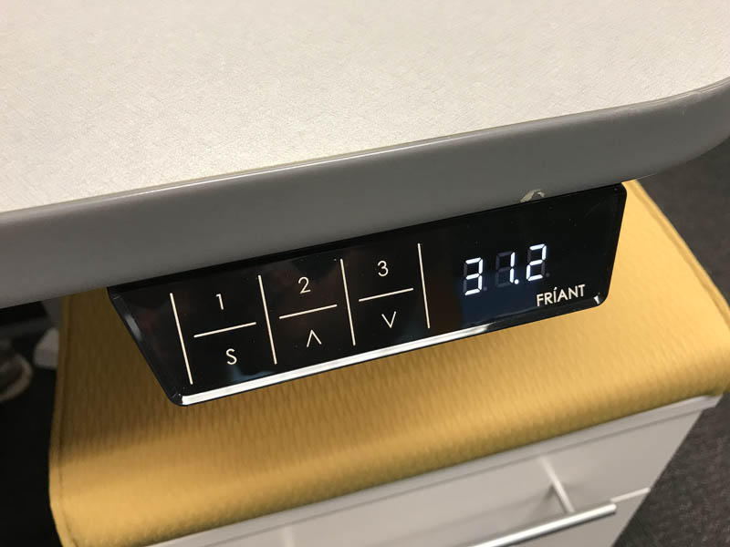
The control panel is implemented as a touch screen. This makes it way too easy to trigger any of the desk’s functions by just leaning against the desk’s edge. If you trigger any of the three presets this way, the desk will relentlessly move towards the height it just recalled from memory.

Of course you can make the desk’s motor stop, but doing so is not obvious: you “just” need to touch any of the panel’s buttons to do so. Once you learn this, it might be easy enough to remember, but having a dedicated “cancel” or “stop the motor” affordance exposed right on the panel, would be much more user-friendly.

The fundamental accessibility flaw of touch-control buttons

There is a much bigger problem with using a touch panel for this kind of application, though, and it’s a more general issue, too: the near-complete lack of accessibility for vision-impaired users.

The markings and labels on the buttons are screen-printed, and the layer of paint is so thin that you can hardly feel them at all. Hence, you cannot easily differentiate and locate the six buttons just by running your finger tips over the panel. And, of course, this being a touch panel, running your fingers might also immediately trigger a button.

Just like users with 20/20 vision need meaningful visual feedback on their computer screens, vision-impaired users need meaningful acoustic and/or tactile feedback.

In this particular example, the simple, mechanical two-button solution provides just that, including the fine detail of the bump on the “Up” button. While modern, sleek, and “shiny,” the touch-screen approach pales in comparison when it comes to usability and accessibility.

The Struggle With Defective Train Doors

A car’s fuel gauge displays the fill level of the vehicle’s fuel tank. Although the two are closely associated, the gauge is mounted in the dashboard, far away from the tank.

The tank’s fill level is most relevant to the driver while operating the car, of course. And so it is displayed within the driver’s “use context,” instead of, say, being indicated on the fuel filler door.

More generally speaking, information must be displayed in the context within which it most relevant and most “findable” for the user.

I was reminded of this when I read the following story on Twitter about several people struggling with a defective door1.

So many “dumb” users — or are they?

6 dumb people with 2 baby strollers and plenty of suitcases are standing in front of a defective [train] door for one full hour. Although there are multiple out-of-order signs on the door, they only realize [that the door won’t open] after pressing the open button ten times. So one of them runs ahead to the next door and blocks it until everyone in that party has gotten off the train.

At the same time, three other people are standing outside the train, and one after the other, they push the open button five teams each, before they head to another door.

And surely, Deutsche Bahn will be to blame again.

Here is a photo of a similar door that’s also out-of-order. Note the location of the signs in the windows.2

Train door showing four out-of-order warnings placed in the door's windows.

When a user interface does not behave as expected, users often develop “UI tunnel vision:” instead of looking for helpful clues outside of the narrow context of the UI controls, they tend to focus on those controls even more.

This behavior is often exacerbated if users are nervous or in a rush. As a result, they can overlook a sign that is — literally — right in front of their nose.

Out of sight, out of mind

Look at the photo and imagine that you focus on the round, green open button. You will realize that it is perfectly possible to overlook the out-of-order notices on the door’s windows — especially when you are eager to get onboard, and there are people standing around you that are just as nervous to get on the train now.

I’ve committed that very “user error” myself.

When I arrived at my destination, I tried to open “my” door by moving its handle. Although the handle went through the full arc of operation, the door wouldn’t unlock. It took me a while to finally notice the “door-won’t-open” sign on the window and, thankfully, managed to find another exit just in time before the train was about to leave the station again.

Interestingly, other passengers were waiting with me at that same door.

None of us had noticed the out-of-order sign.

Display information in the relevant context

Deutsche Bahn has used this design for years now, but it obviously doesn’t work well.

What I would love Deutsche Bahn to user-test is this: Place at least a part of the warning signs right on top of the open buttons. Cover old-fashioned door handles in a cloth bag, and place the sign close to the handle.

This not only places the information right where users focus their view when trying to open a door. The signs also provide a tactile “hint” if they feature a rougher texture than the smooth plastic of the buttons or handles.

Of course, without actual testing, there is no telling whether this solution would work, either. Then again, instead of sticking with a design that is flawed, they should at least try to find a solution that makes their passengers’ experience that little bit less stressful.


  1. Translated into English from these German tweets: Tweet 1Tweet 2Tweet 3Tweet 4 

  2. Image of the train doors is an excerpt from this photo by Armin Schwarz. Used with kind permission. 

A Red Ribbon to Your … Mounting Hardware?

People who love books also tend to love book shelves. And, man, do I love books.

Consequently, I occasionally install new shelves when I run out of space after a few too many I-hope-I-find-the-time-to-actually-read-all-of-these book purchases.

Some of the books on my shelves, showing titles related to cognitive psychology and creativity

The packaging of my favorite shelves sports a nifty feature: Before you even open the carton, you will notice a “very red” ribbon at one of the carton’s short sides. The ribbon’s end is being held in place by a prominent label that says, “Hardware Enclosed.”

The large carton containing the shelves' parts. The red ribbon is clearly visible on the cardboard.

There’s treasure at the end of the ribbon

When you follow the ribbon while unpacking the carton, it will lead you to a little cardboard box. That box contains all the hardware required to assemble the shelves.

The small, red cardboard box is attached to packaging elements inside the large carton. The red ribbon attaches to that small box.

The box contains two plastic bags, one of which is marked, “Spare.” To properly assemble the shelves, you need to use all of the items that are contained in the other, non-spare plastic bag.

So if you find any left-over screws, nuts, etc. after you complete the assembly, you don’t have to wonder whether these are spares, or whether you made a mistake: Since all spares are in the “Spares” bag, finding any unused mounting hardware always unambiguously means that you screwed up somewhere along the process.

Two plastic bags contain numerous mounting hardware parts like screws, etc. These bags are contained in the small, red cardboard box that the ribbon is attached to.

The hardware box is stashed deep inside the shipping carton between all the larger wooden parts and numerous styrofoam filler boards. Including the red ribbon as a guide to that box effectively prevents the user from accidentally overlooking the box and possibly throwing it out with the bigger carton.

User Experience relates to all aspects of the product, however mundane they may seem

Considering this unusual eye for (packaging) detail, it fits into the overall picture that the shelves’ assembly guide is very well-written too, and that the assembly process is very straight-forward as well.

Even with something as simple as a bookshelf you can easily tell whether its designers understand how to create a great user experience, or not. If they do, you will see it in the entire product, and not just in a few details.