A car’s fuel gauge displays the fill level of the vehicle’s fuel tank. Although the two are closely associated, the gauge is mounted in the dashboard, far away from the tank.
The tank’s fill level is most relevant to the driver while operating the car, of course. And so it is displayed within the driver’s “use context,” instead of, say, being indicated on the fuel filler door.
More generally speaking, information must be displayed in the context within which it most relevant and most “findable” for the user.
I was reminded of this when I read the following story on Twitter about several people struggling with a defective door1.
So many “dumb” users — or are they?
6 dumb people with 2 baby strollers and plenty of suitcases are standing in front of a defective [train] door for one full hour. Although there are multiple out-of-order signs on the door, they only realize [that the door won’t open] after pressing the open button ten times. So one of them runs ahead to the next door and blocks it until everyone in that party has gotten off the train.
At the same time, three other people are standing outside the train, and one after the other, they push the open button five teams each, before they head to another door.
And surely, Deutsche Bahn will be to blame again.
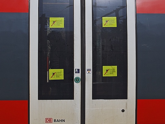
Here is a photo of a similar door that’s also out-of-order. Note the location of the signs in the windows.2
When a user interface does not behave as expected, users often develop “UI tunnel vision:” instead of looking for helpful clues outside of the narrow context of the UI controls, they tend to focus on those controls even more.
This behavior is often exacerbated if users are nervous or in a rush. As a result, they can overlook a sign that is — literally — right in front of their nose.
Out of sight, out of mind
Look at the photo and imagine that you focus on the round, green open button. You will realize that it is perfectly possible to overlook the out-of-order notices on the door’s windows — especially when you are eager to get onboard, and there are people standing around you that are just as nervous to get on the train now.
I’ve committed that very “user error” myself.
When I arrived at my destination, I tried to open “my” door by moving its handle. Although the handle went through the full arc of operation, the door wouldn’t unlock. It took me a while to finally notice the “door-won’t-open” sign on the window and, thankfully, managed to find another exit just in time before the train was about to leave the station again.
Interestingly, other passengers were waiting with me at that same door.
None of us had noticed the out-of-order sign.
Display information in the relevant context
Deutsche Bahn has used this design for years now, but it obviously doesn’t work well.
What I would love Deutsche Bahn to user-test is this: Place at least a part of the warning signs right on top of the open buttons. Cover old-fashioned door handles in a cloth bag, and place the sign close to the handle.
This not only places the information right where users focus their view when trying to open a door. The signs also provide a tactile “hint” if they feature a rougher texture than the smooth plastic of the buttons or handles.
Of course, without actual testing, there is no telling whether this solution would work, either. Then again, instead of sticking with a design that is flawed, they should at least try to find a solution that makes their passengers’ experience that little bit less stressful.
-
Translated into English from these German tweets: Tweet 1 — Tweet 2 — Tweet 3 — Tweet 4 ↩
-
Image of the train doors is an excerpt from this photo by Armin Schwarz. Used with kind permission. ↩