Ambiguity in Two-Factor Authentication Codes

Two-factor authentication is a great method for making logins more secure.1 Although this system is straightforward, I’ve occasionally made a pretty stupid error while using it. Thankfully, it’s an error that can be easily prevented with a simple fix.

Most of the websites, for which I have set up two-factor authentication, send authentication codes to my phone. For privacy reasons, I have configured my phone to notify me of incoming text messages; the notifications will not display the messages’ content, though. That way, if I leave the phone on my desk, someone who walks by can see that I received a message, but won’t be able to read what it’s about.

In addition to a number of app icons, a text message notification appears on an iPhone launch screen. The notification displays the sender's six-digit phone number. Instead of the message's contents, though, it only states

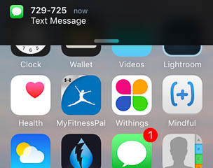
The numbers, from which the codes are sent, usually are six digits long. The authentication codes are six digits long, too. You can already guess where this is going.

If I don’t pay attention, I sometimes enter the phone number instead of the actual authentication code, because that’s what catches my eyes when I look at the notification. On one occasion, I was so distracted that I actually panicked about being locked out from one of my accounts. Until it dawned on me what I had done wrong.

It would be very easy to prevent this error. All it takes is a comparison of the entered code with the phone number. If the system finds a match between the user’s entry and a phone number, it would display a message to make the user aware of their mis-hap.

This simple fix would go a long way in keeping users’ heart rate and blood pressure within healthy limits.


  1. The concept behind two-factor authentication is simple: In addition to the usual username and password credentials, you need to provide additional authentication that is usually linked to another hardware device. E.g., when you log into a website with your username and password, the site texts a code to a mobile phone. To complete the login process, you then need to enter that code. This means that you can only log in if you have know the username and password and you have access to the phone that receives the codes. To learn more, read the Wikipedia article on two-factor authentication

My No. 1 Feature Request for Apple TV

About 18 months ago, my wonderful wife and I cut our TV cable. A sleek Apple TV replaced the unwieldy Comcast box, and we now get most of our content from Netflix, hulu, and PBS. We save money, have fewer ads to endure, and when it comes to the user experience, the Apple TV is far ahead of Xfinity. If it weren’t for live football games and Formula 1 races, we wouldn’t miss a thing.2

One aspect of the user interface has been bugging me since we made the switch, though. The next-generation Apple TV, which will likely be announced next week, will hopefully address that problem.

Eventually, it’s almost like old-fashioned TV, but without the channel numbers

Almost everything on the Apple TV is on-demand. To watch a TV show or movie, you browse or search for it, or pick something from you-might-also-like-this suggestions. Alternatively, you can save titles to a personal watch list for later viewing.

And here’s that major problem: Every channel on the Apple TV has its own, dedicated front-end for browsing and searching, for suggestions, and for a watch list for just that one channel.

Not every title is available on every channel, of course, so if you want to watch a specific movie, chances are that you will have to search in multiple channels until you find what you’re looking for. Similarly, if you want to access a title from a watch list, you need to remember in which channel you saved it. If you don’t, you’ll have to step through multiple channels to find the watch list that it’s on.

This press image from Apple shows the Apple TV user interface. Some channels like Netflix, hulu, and HBO appear on the screen.

Let’s say I’d like to watch François Truffaut’s masterpiece, “The 400 Blows:” Yeah, I’ve seen that somewhere on the Apple TV. Didn’t I save that to a watch list? Let me check Netflix… Nah. iTunes Movies, maybe? Nope. hulu? Uh-uh. OK, let me search for that, then — wait, now was it available on Netflix, or hulu, or where the heck did I see that?!

You get the idea.

Of course, you could consult a site like CanIStream.it, but that would make the overall process even more cumbersome. What I would really like to see in the upcoming Apple TV update, are central screens for unified search and watch list that operate globally on all channels.

One search, one watch list, to rule them all

If I feel like watching an episode of one of my favorite TV shows, I don’t want to have to hunt for it across channels. I want to deal with just a single unified search form: I hit a dedicated button on the remote, enter the title, run the search, and get a list of all options for watching that show right now — regardless of whether it’s served via Netflix subscription, paid iTunes rental, or free PBS series.

The same applies to watch lists: I don’t want to have to juggle multiple lists. Just let me save interesting titles to a single unified watch list. Make it explorable via genre, actors, directors, etc., and tie in some additional information from sources like IMDB or Rotten Tomatoes. Better yet, support multiple lists so each family member can have their own.

Obviously, content providers will not like this approach. Why, for example, would I buy or rent a movie from iTunes, if I can watch the exact same title for free on another channel? And yet, from a user’s perspective, the Apple TV would be so much easier to use if search and watch lists would be unified.

There are rumors that the next Apple TV will support Siri voice control. That could make for a fascinating approach if Siri “becomes” that single-point-of-access global search and watch list.


  1. To be honest, this should have read “…I wouldn’t miss a thing,” because my wife doesn’t really care for guys fighting over an egg-shaped ball or cars driving around in circles. 

Downloading User Guides Should Be Easier Than This

These days, technical products rarely ship with a full set of printed documentation. What you’ll usually find in the box is just a small, flimsy, almost-unreadable-because-the-font-is-so-tiny “Getting Started” leaflet. Want to obtain the full user guide? Download a PDF file!

This works just fine for software applications: As long as there is an internet connection, the application can directly download any digital documentation. For hardware gadgets, however, the process tends to be more complicated and error-prone.

The manual that was in the box

In the hopes of rekindling my musical talent, I replaced my simplistic MIDI keyboard with a Roland stage piano. I was pleasantly surprised to find a complete, printed owner’s manual inside the box.

Additional documents covering more advanced topics are available for download: An Effect Parameter Guide, a Sound List, and an overview of the instrument’s MIDI Implementation.

A prominent notice right on the front page of the printed manual describes the process for downloading the digital documents:

To obtain the PDF manual

  1. Enter the following URL in your computer: http://www.roland.com/manuals/
  2. Choose “RD-800” as the product name.

The front page of the printed manual that shipped with the piano. Instructions for downloading additional PDF manuals appears on its front page.

When you follow the link to http://www.roland.com/manuals/, you’ll see a page that lists three product categories.

This step feels confusing, because you have to already know the appropriate category, research it, or find it through trial and error. The “information scent” that this link trio provides just isn’t that great.

The landing page for downloading

Clicking any of the links takes you to a list of products. Even though the list is divided into four letter ranges (A–G, etc.), each of the pages is very tall, as you can gauge from the size of the scrollbar thumb in the screenshot. This makes for quite a bit of scrolling.

A product list page showing instruments from the RD stage piano product line. The window's scrollbar thumb is very short, indicating that the page is very tall and contains many list items.

The detail page for a product lists all related documents that are available for download. Before you can actually get a document onto your computer, though, Roland makes you agree to a “Software License Agreement.”

The product page for the RD-800 lists four documents for download: Owner's Manual, MIDI Implementation, Sound List, and Addendum. The latter apparently contains the effect parameter guide.

Isn’t it a bit odd that you have to agree to a software license for downloading a user guide? Worse yet, you have to do so for every document:

  1. Click a document link
  2. Check the I Agree And Wish to Proceed With Download option
  3. Click Download File
  4. See the document appear in the browser window
  5. Save the document to your computer
  6. Navigate backwards two pages
  7. Start over until you have downloaded all documents

A page displaying a lengthy legalese

Compare that process to 1.) right-clicking a document link and 2.) selecting “Save to Downloads Folder” from the context menu. If you try that on the Roland site now, what you’ll find in the downloads folder is, of course, the HTML file for the software license page.

Why make this process so hard?

What bad things could a customer possibly do by downloading manuals if they weren’t required to agreeing to the user license? How useful are these manuals if you don’t own the product they belong to? Why not make this process a little bit easier for those who have actually purchased the product whose features are described in the downloadable manuals?

Imagine if, in place of the three product category links, a real-time search field appeared on the “Owner’s Manuals” landing page: As soon as you start typing into the field, it summons a filtered list of product names. E.g., type “rd,” and you will see the list of all pianos in the RD product line.

Select your specific model from the list, and you’re taken to the respective downloads page. And on that page, the links point directly to the PDF files.

If it is really necessary to force the user to the sign the software license, let’s display the license text and an I Agree button over the downloads page. As soon as you, the user, click that button, the license disappears to make way for the download links.

In the grand scheme of things…

The hiccups of the download process won’t really impact my enjoyment of this fabulous instrument. Nevertheless, it would be nice if companies — especially major industry players like Roland — would make download processes for manuals, drivers, etc. that little bit more user-friendly.