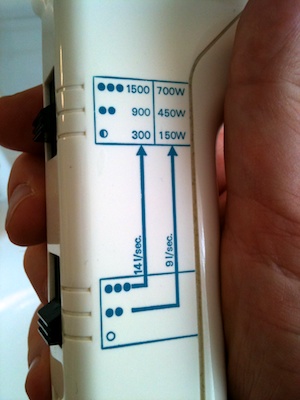
Although my hair is “a bit” longer than average, I am too lazy to use a hair dryer unless I’m in a hurry and need to dry my hair fast. In one such situation, I had to wonder whether the hair dryer had been conceived by a designer who’s into science. Check out the verbose labels next to the switches:

The mapping and visibility of the two switches are excellent: when holding the hair dryer in your hand, moving the switches upward (i.e., in the natural “more” direction) increases air throughput and temperature, and from the notches in the enclosure the user can easily tell that each switch has three settings. The printed labels, however, provide excessive and overly technical information.
Does an average user immediately understand what the units mean: that “l/sec.” stands for air throughput and “W” for power consumption of the heater element, i.e., temperature? And if they do understand, will they know how much warmer 1500W feels versus 900W? How much stronger 14l/s is compared to 9l/s?
Just as confusing for someone who is into math, is that the half and full bullet characters do not scale with the stated units: the ratios of the power settings are 1x – 3x – 5x1, not 1x – 4x – 6x, as implied by the bullets, and the same holds true for the other switch. And then there are the arrows between the two switches plus the table.
That is a lot of pseudo-scientific appeal for something as straightforward as a hair dryer. Consequently, I am certain that, instead of trying to interpret the labels, most users will choose a configuration by simply trying out different settings and picking the one that feels right. I know I did, and I do hold an engineering degree…
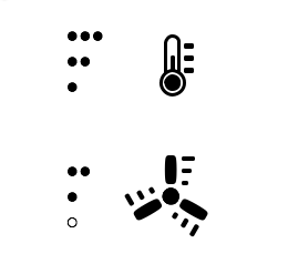
In this case, simplifying the labels might cost the hair dryer some of its “a-device-for-true-pros” appeal, but it would make it much easier to use for the majority of its users. As an alternative to what you see in the picture above, I would prefer something as plain as this2:
