Bill Waterson’s “Calvin and Hobbes” has been one of my favorite comic strips for years. Although I have quite a few of their wonderful books in my dead-tree library at home, in weak workday moments devoid of self-discipline, I sometimes check out the comic’s online version.
When I did so today, I noticed something odd: somewhat absentmindedly and occupied with other trains of thought, I repeatedly clicked on (what I assumed was) the “previous comic” navigation button.
Until, that is, I realized that, instead of moving backwards through older comic strips, I was actually going back and forth between only two of them. The reason? Bad UI design.1
When you point your web browser to the generic web link http://www.gocomics.com/calvinandhobbes, the website displays the most recent comic strip — you’re at the “end” of the publishing timeline. There are no more-recent comics than the one shown.
Consequently, the designer decided that not to display the navigation controls for moving “forward” along the comic’s timeline: the only available controls are for moving to the very first Calvin & Hobbes comic; for moving to the previous comic; and for bringing up a calendar widget.
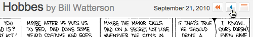
As soon as you move to the previous comic, however, you also need controls for moving to the next strip, as well as for moving to the most-recently published one. The designer (correctly) placed these to the right of the calendar view to balance out the “first” and “previous” buttons.
Because the navigation buttons are right-aligned with the comic strip, though, the button for “next comic” ends up in the exact position that was occupied by the “previous comic” button before.
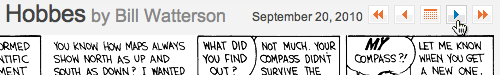
Unless you make up for this shift by moving the mouse pointer, you click on “next,” then “previous,” then “next” again, then “previous” again, and so forth.
Don’t hide. De-activate!
Just like in native software applications, unavailable UI widgets on web pages should be represented by grayed-out, un-clickable placeholders. That way, all controls remain in their original place at all times.
When implementing such a navigation widget, however, designers need to make sure that the whole group renders properly for all navigation states.
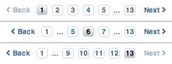
Here’s why that is important: the page navigation for Customer Reviews on the iTunes Store does use “de-activated” widgets for “previous” and “next” links. The ellipsis graphic is slightly narrower than the number buttons, though. As a result, when an ellipsis is displayed, the alignment of the buttons is slightly off. In case of two ellipses being shown, the “back” link slightly moves position, as well.
-
Admittedly, my absentmindedness played a big role here, too, of course. I dare say, however, that this does not make the design any less problematic. ↩