While I hope to finally be done with writing about claiming missing airline reward miles, another travel-related area should provide many more interesting things to share with you: Staying at a hotel.
Here are three new observations from that realm.
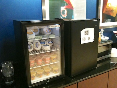
What’s in that fridge?
Whether you’re staying at a budget motel or pick luxury accommodation, breakfast is almost always served as a buffet. At swankier places, fruit, dairy, cold cuts, etc. are presented on elegant porcelain plates, seated on piles of crushed ice to keep the products fresh.
Less luxurious hotels usually serve pre-packaged, (more or less) brand-name-quality items that you will find at any supermarket. Instead of the more elegant “iced buffet” setup, more perishable products are simply stored in a fridge.
The challenge for the restaurant management, then, is to make it easy for their guests to find the breakfast delights they are looking for.
The straight-forward solution is a fridge with a glass door.
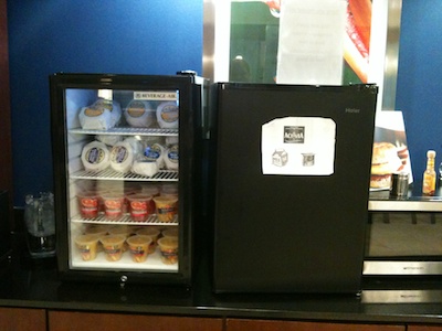
You can instantly see what’s inside that fridge. Before you open the door, you can conveniently make selection, which also benefits the environment as it preserves energy.
The second-best approach is to list the fridge’s contents on its door. Best intentions of the restaurant staff notwithstanding, I found the 90s style clip-art-sporting label on this fridge a bit lacking in design prowess, but also in terms if information architecture.
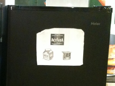
The Activia logo at the top is only meaningful to someone who knows that brand, as is the somewhat obscure Activia-branded yoghurt cup on the right. The milk carton is more easily understood, but the “perspectivized” word “Milk” is difficult to read, especially from a distance, and especially for older eyes.
My guess is that simply placing the words “Milk & Yoghurt” in large type on that fridge would be much easier to understand for the average guest.
How (the heck!) do you open this thing?
The much more painful challenge that almost every guest had with both fridges, though, was actually opening them. Here’s a shot from a somewhat different perspective.
See how both fridges lack an easily distinguishable handle?
Almost every person I observed was running their hands along the edges of the door to find a way to grasp it. The solution to this usability riddle is a groove that runs along the top of the door, and which you can grab — kind-a, sort-a — with the tips of your fingers.
Even after people had found that groove, they still struggled with predicting towards which side the door would open. Although the hinge brackets are visible, guests did not seem to notice them. No wonder, since the hinges’ black paint “nicely” blends in with the rest of the enclosure.
How expensive would it have been for the manufacturer to add a plain, simple, and highly visible handle to the fridges’ doors?
The position of such a handle would unmistakably indicate where and in which direction to pull, and on what side the door opens. They would also make it easier to get a good grasp on the doors, especially for older users or those with limited mobility in their fingers.
One set of controls for show, another for functionality
Moving from the breakfast buffet area into our room, this hotel features the typical, all-American, wedged-underneath-the-window air conditioning device. If you’ve ever stayed at a hotel with this kind of cooler/heater combo, you know that they can be ridiculously noisy. This specific unit was no exception.
Thankfully, its control panel is in plain sight right on the unit, and the controls themselves are simple enough to quickly spot the colder/warmer buttons, as well as the main power switch.
To my dismay, however, I kept pressing the buttons, but nothing happened.
My assumption was that, for some reason, guests were not allowed to change the machine’s setting. It’s that thing about “to the user, the UI is the system”. I.e., if the user interface does not seem to work, something in the system is either broken, or I’m not allowed to operate it or modify its configuration.
My assumption was wrong.
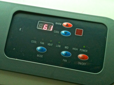
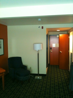
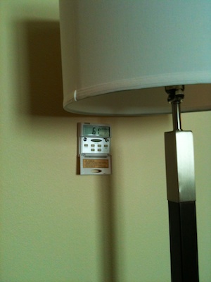
The next morning, after a somewhat sleepless night, we noticed a second control panel mounted to the wall opposite from the window, all the way across the room. You can see it in this photo, if you look very closely: It’s that minute silvery-white rectangle just below the floor lamp’s screen.
Here’s a better view:
It took just a few button presses to verify that this control panel worked just fine.
To whomever designed that Activia-branded dairy label for the fridge: Can you please print out a sheet that says “Adjust via thermostat on opposite wall”, and scotch-tape it over the A/C unit’s built-in controls? And, yes, in every room in your hotel, please!
Thanks!