When you search the web these days, you will notice that most search engines automatically correct “mistakes” in your search terms: If you submit a search that resembles a more common word or spelling, the sites modify it accordingly.
This is helpful if you make an actual typo, but can get in the way when searching for a more exotic word or phrase. Therefore, the search engines not only notify you of any such correction; they also allow you to choose which of the two searches you actually would like to run.
To find out how Bing, DuckDuckGo, Google, and Yahoo implement this feature1, I searched for “ux desine,” which — not surprisingly — all of the sites changed to “ux design.”
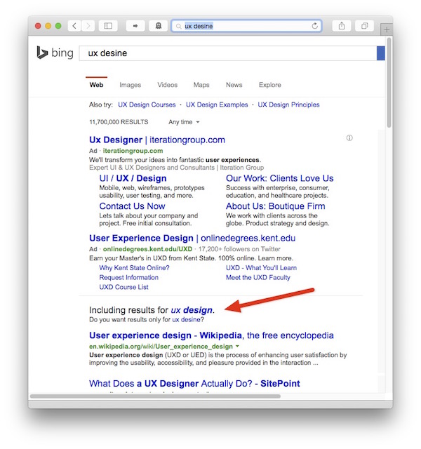
Bing
The auto-correct notice appears below a few ads that are shown at the top of the results page. The notice is easy to spot, but it’d probably benefit from a bit more white space above and below it, so it stands out more.
The notice’s text is easy to understand: The displayed search results are based on both the original search term and the corrected one. By clicking either link in the notice, you can summon matches for only one of the two.

But there’s a problem: For this specific search, the auto-correct notice still appears on-screen without any scrolling. If you look at the Yahoo example below, however, you can see that, at least on smaller laptop screens, ads at the top of a results page can potentially push the notice off the screen.
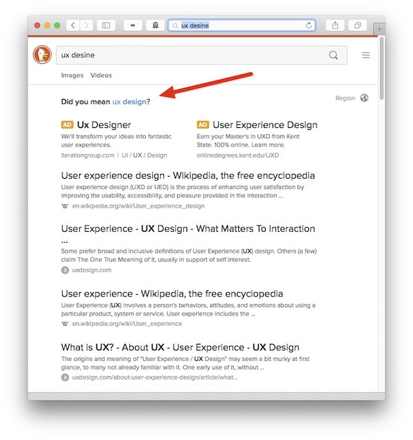
DuckDuckGo
In DuckDuckGo, the auto-correct notice is located at the very top of the page, so it’s easier to spot than its Bing counterpart. Its text is confusing, though.
The notice states, “Did you mean ux design?,” but the results on the page already contain that phrase. So, are the displayed results based on my original search term, or the auto-corrected one, or do they combine results for both?

Google also displays the notice at the top of the page.
In contrast to DuckDuckGo, however, the text is unambiguous: The search is based only on the auto-corrected search term. If you would like to see results for your original term, you need to click a link in the notice.
I’m not sure why Google also makes the auto-corrected search term clickable, because, at this point, it is already displaying the results for it. Maybe its function is to place the auto-corrected text into the search field.

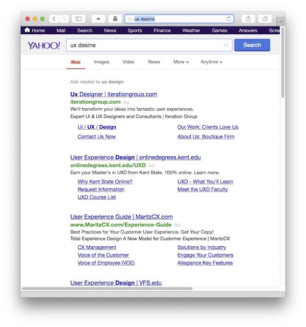
Yahoo
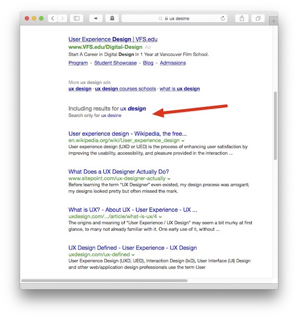
Yahoo cooperates with Bing for search functionality. The auto-correct notice and its placement are similar between the two.
Unlike Bing, Yahoo’s ads push the auto-correct notice off the screen for the given search term. This makes the notice more difficult to spot compared to it being anchored to the top of the page.

The way that Yahoo marks ads exacerbates the problem: Instead of displaying a little “Ad” label next to each ad block, there’s a single line, “Ads related to ux design,” at the top of the page. When you scroll down on the page, and that line is moved off screen, it’s impossible to tell which links on the page are ads, and which are actual search results.
Note how this ad “warning” also includes the auto-corrected search term, whereas both the browser and Yahoo’s search field contain the original term. Unless you scroll down, you won’t see the explanation of why the two search terms differ, nor would you be able to tell what terms the search is based on.

One web searcher’s opinion
Of these four approaches, Google’s easily is my favorite:
-
The auto-correct notification always appears at the top of the page, so I can instantly verify that the results actually match my intended search,
-
the notice’s text is unambiguous and easy to understand, and
- I can also precisely search for either my original search term, or for the corrected version.
-
According to Wikipedia, Bing, Google, and Yahoo! are the most popular search engines in the English-speaking world. DuckDuckGo seems to be the most popular non-user-tracking English-language search engine. That’s why I picked these four. ↩