Yet Another Attempt at Claiming Missing Airline Reward Miles

Back in August 2010 I had tested how you can claim missing airline reward miles via the websites of Lufthansa and British Airways, respectively. Just recently I was on two flights with United airlines, for which I still need to claim my reward miles. This made for the perfect opportunity for a follow-up on this topic.

Alas, in the almost one-and-a-half years since, almost nothing has changed.

The same-old, same-old (both good and bad)

British Airways rebranded their miles to “Avios”, so the wording of the link for claiming un-credited miles may just be that little bit less intuitive now. It is still in the same convenient location, though.

On the British Airways website, a link labeled 'claim missing avios' is located directly underneath the list of recent account transactions.

On Lufthansa’s Miles & More website, the previous text-only navigation menu has been replaced with a set of icons that mimic the look-and-feel of the iPhone’s Launchpad. In that menu, the “Request Miles” link/icon combo is a bit easier to find.
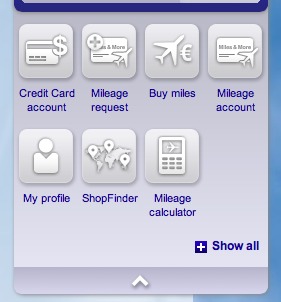
The Lufthansa Miles and More website displays a main navigation menu that consists of a number of icons with labels, one of which shows a loyalty card with a plane symbol and a plus sign, and labeled 'mileage request'.

Unfortunately, my key complaint still applies: Where British Airways is happy to ask for just the ticket number to get the claim process started, Lufthansa still requires you to fill out this extensive form:
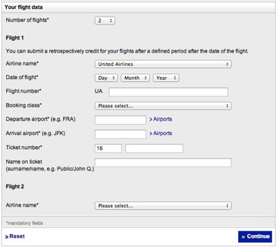
The form on the Lufthansa website contains eight data items, namely airline name, date of flight, flight number, booking class, departure airport, arrival airport, ticket number, and name on ticket. Of these, only the latter field is optional. All seven others are required.

Obviously, such minor changes alone would not justify writing about this topic again. The serious new problems I experienced with the Miles and More website now are well worth sharing with you, though.

Unknown #1: The flight class

The form requires picking a booking class. That information is not found on the boarding pass, but according to the confirmation email, the classes for my two flights were “G” and “K”, respectively.

Surprisingly, the popup menu does not offer the former at all:
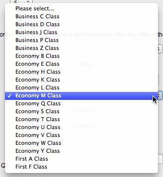
The booking class menu contains five items for business class, thirteen for economy, and two for first, but none of these are of type G.

Since the second flight was listed as a “K” class, I simply selected that class for the first flight as well.

Unknown #2: The flight number

On the boarding pass, the flight number is stated as “UA1555Y”. Nevertheless, the Miles & More website considers this number invalid:

The error message reads, 'Error with flight 2: Please enter a valid flight number'. The flight number field with the offending Y character is highlighted.

Admittedly, this problem is not directly linked to the website’s design. In fact, the error message is displayed prominently, and thanks to the high-contrast highlighting, it’s easy to find the field whose entry needs fixing. Also, in the confirmation email, the flight number is listed without the trailing “Y”.

Nevertheless, this is something that the website could take care of automatically: it could silently discard the offending character, or at least offer via a dialog box to fix this, saying something like: “The flight number ‘UA1555Y’ you have entered is invalid. Did you mean ‘UA1555’?”.

In this instance, it was easy to correct “my” mistake, but the biggest problem was yet to come.

Unknown #3: The airline code (Say what?!)

After hitting return, the form came back with the following error messages:

For both flights, an error message is displayed, reading 'The entered airline code is invalid'.

None of the form fields was highlighted, so it was impossible to tell which data item needed to be modified to make the website accept my input.

The only thing I could think of was to add the airline code to the flight number. Unfortunately, entering “UA268” instead of “268” did not help, as the site now complained about an invalid flight number.

If you think about it, the ticket number should be perfectly sufficient to verify a mileage claim. This is especially true if the ticket was purchased directly from a partner airline’s website.

Instead, you have to meticulously and manually copy a whole bunch of data from the boarding passes into the form. And once you did, you may very well be confronted with an error that you, as the user, cannot fix, but that stubbornly prevents you from submitting said data.

So I’m stuck now. And used the only option I had.

I’ve contacted Lufthansa via their website’s contact form and hope they will tell me what to do next. Who knows: Maybe they will even take the time to explain the problem to me.

As soon as I hear back from them, I’ll update this post. Stay tuned!
Setting Preferences for Future Features Right Now

Twitter is joining the group of companies that aim to track their users’ every website visit. In this case, the tracking is supposed to serve as the foundation for “tailored suggestions” about whom to follow on Twitter.

I prefer not to be tracked this way, so I consider it a good thing that you can opt-out from this feature, if you prefer that your web habits not to be tracked.

Webpage excerpt: After signup, you can uncheck this box in your account settings next to the heading Personalization. Personalization: (checkbox) Tailor Twitter based on my recent website visits.

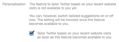
The bad thing is that the opt-out checkbox is missing from my settings page. In its place is a note that this feature is not available to me.

Webpage excerpt: Personalization: The feature to tailor Twitter based on your recent website visits is not available to you.

A similar note appears when I visit my Web Personalization Preview:

Webpage excerpt: (heading) Twitter cannot provide tailored suggestions. (body) Tailored suggestions are not currently available to you, and your visits to websites that have Twitter buttons or widgets are not collected to tailor your experience. Learn more about how this works and your additional privacy controls. (button) Twitter home

If things remained as they are right now, I’d be perfectly happy. Alas, the note on the Preview page includes the word “currently”, so this feature may be enabled for my account in the future.1

If I were seriously paranoid about Twitter tracking my web visits, I’d have to regularly check my preferences on the Twitter website, just in case the feature is enabled, and Twitter would not notify me about it.

Wouldn’t it be nice if I could simply opt-out right now?

Right now, I know that Twitter is working on a feature called “tailored suggestions”; that I do not want to use that feature; and that I (will) have to opt-out from it. Right now, I’m also viewing my Twitter Settings page. So, if that checkbox were available right now, even though the feature isn’t, I’d be done dealing with tailored suggestions for good. Right now.

Webpage excerpt: Personalization. The feature to tailor Twitter based on your recent website visits is not available to you yet. You can, however, switch tailored suggestions on or off now. The setting will be honored once this feature becomes available to you. (checkbox) Tailor Twitter based on your recent website visits as soon as this feature becomes available to you

As it is, though, I will have to wait and see whether this feature will become available and, if so, hope that Twitter will notify me about it — or that I remember to check the site myself every now and then, lest I be tracked after all.


  1. I live in Europe, and the tailored suggestions FAQ explicitly mentions that “[i]f you’re in Europe, the feature is not currently available to you […]. Thanks for your patience.” They do not elaborate, however, on whether this has anything to do with European privacy laws, etc., nor whether or when they plan to introduce the feature in this region. 

A Simple and Effective Mechanical Status Indicator

Very high up on my list of things to avoid is being hit in the head by something heavy and rigid flying through the air. Like, say, a car’s trunk cover enclosure, a specimen of which you can see in the photo below.

It’s that pretty hefty bar below the headrests that runs across the full width of the car:

Station wagon's trunk with retracted trunk cover.

This enclosure houses a (horizontal) trunk cover — to shield whatever’s placed in the trunk from prying eyes — and a (vertical) divider net — to make whatever’s in the trunk stay in the trunk if the driver needs to brake hard.

Thanks to folding rear seats, this car’s cargo area can be extended. When you do so, the cargo cover needs to be mounted in a different location further towards the front of the vehicle.

To that end, the enclosure sports buttons on either side that, when pushed down, will disengage the enclosure from its bracket.

Push button on trunk cover enclosure.

When putting it back into its regular mounting position, it is essential that the enclosure properly snaps back into position in the brackets — lest it morph into that heavy and rigid flying thing mentioned earlier.

A feedback mechanism, literally

Whoever designed this part has come up with an ingenious method to unambiguously notify the user whether she has properly mounted the cover enclosure.

Note the bright red bar on the mounting bracket.

Trunk cover mounting bracket with a red bar on its inside surface.

When you press the unlock buttons on the cover, they will remain in the “pushed-in” position. Only when the locks are properly engaged, will they pop out again.

Consequently, the red bar remains visible until you fully push the enclosure into position so that its locks engage and the buttons pop up to cover the red bar.

Push button on trunk cover enclosure. The button is down, revealing the red bar on the enclosure's mounting bracket.

By cleverly utilizing the mechanics of the cover enclosure’s unlock buttons, the designer has created a very simple, very effective status indicator.

And it doesn’t even use electricity!

Let’s make it a design pattern!

The same approach is found in the handles for unlocking the folding rear seats: A part of the tumbler handle is colored red, and this part is only visible while the seat back is unlocked.

Handle integrated into the rear seat back in the unlocked position, revealing a red area on the handle.

Push the seat all the way back to engage the lock, and the tumbler handle will move into a position in which the red surface is hidden.

Hand on the rear seat back with two fingers inserted into the unlock handle and pulling the seat back towards the car's front.

Besides the clever status indicators, the seat back unlock handle’s mechanical design is note-worthy, too.

Two interactions for the price of one

Your hand’s natural motion for folding down the seat is to pull the seat back’s top edge towards the front of the car. The seat’s unlock handle is recessed into the top of the seat back, and the surface against which you have to push to operate the handle is the one towards the front.

That is, it lies directly in the path of that natural motion for folding down the seat, so to speak! Therefore, instead of operating the unlock mechanism with one hand and moving the seat back with the other, you place two fingers inside the handle and pull forwards. This one motion first unlocks and then moves the seat back.

IMG folding down rear seat back

Very simple, very effective, just like the “status indicators”.