A Customer Hotline Call Beyond Awesome

When I first started working on this article, I considered adding a new item, “Services”, to the list of categories on this site.

Then again, making a phone call is one of the most common man-machine interactions imaginable: Pick up a handset, enter a number, and wait for someone at the other end to pick up.

Phone calls definitely should be “simple things”. Should be!

The automated phone system mess

Deploying a computer-based phone system is much cheaper than employing people, though. As a consequence, phone calls to companies tend to be much more complicated than they should be.

Instead of simply telling a human what you need, you have to wade through a multitude of menus: “If you would like to place an order, press 1. If you have a support question, press 2. …”

Building appropriate “information scent” into these systems to help users find what they need, is a challenge. And so is letting the user know her position within the menu structure without being able to provide visual clues.

If you manage to get through to a human, they will likely ask you for information that you had entered at the very beginning of the call, like a credit card or membership number.

And then there’s the most offensive of all company hotline behaviors, the time-out1: A number of times that I was put on hold, the system would inform me after some ten minutes, or so, that “All agents are currently engaged. Please try calling us again at a later time.” — and simply hang up on me.

“Your call is important to us”, my ass!

People, not machines

I was reminded of just how awful these user experiences are when I called my health insurance to request a document which is only available in paper form.

The phone is picked up after a few rings. By a human. And a very friendly and helpful one, at that.

I greet her, give her my name, and tell her what document I would kindly ask them to send me.

She quickly confirms that she understands what, exactly, I need, and then tells me she has to put me through to a colleague of her’s.

A few bars’ worth of reasonably bearable phone muzak later, another person picks up the phone. Again, I greet him, give him my name, and ask him for the document.

Without asking me for any further personal information, he inquires “Are you still at [my current street address]?” — “Yup, that’s my address!” — “OK, consider the document on its way. Is there anything else I may help you with today?”

Wow. Just. Wow.

Just to be on the safe side here: Did you notice how this call did not involve any automated phone system at all? All I had to “deal” with here were people. Friendly, helpful, competent, real people.

Smart use of technology makes for better UX

The only piece of information I had mentioned to either agent was my name. During previous calls I had also had to give them my insurance number, but not this time.

The only way they could have identified me is via phone caller-ID. I would expect their in-house phone system to be hooked into their CRM software, so that as soon as someone calls, whose phone number they have on file, that caller’s record is immediately brought up on the agent’s screen.2

This kind of phone support is not just some proof of concept. It is a brilliantly designed, everyday customer experience, ensuring that a phone call to this company is, indeed, a pleasant and effective “simple thing”.


  1. As an interaction designer, I find it immensely difficult in general to come up with any justification for time-outs. In fact, the only one kind I would not debate are security-relevant log-in time-outs like those found on banking websites. 

  2. Some of you may worry about privacy issues here, but this being my health insurance provider, my phone number definitely is among the least sensitive pieces of information they store about me. 

Niftiness in a Simple Installation Tool

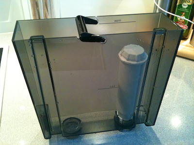
Hot beverages like coffee and tea usually taste better when you prepare them with filtered water. To that end, some coffee machines can be equipped with water filters like the one shown below (the white cylinder is the filter).

Water tank from a coffee maker with a white filter cartridge mounted in its inside

According to the manufacturer, the cartridge should be replaced about every two months. Consequently, the removal and installation of the cartridge is a fairly frequent process.

The filter is screwed into place, but getting a good grip on it is difficult, because the tank is very narrow, and the filter does not extend to the tank’s top edge.

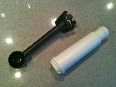
Water filter cartridge and installation tool next to each other

To simplify the installation procedure, the machine ships with an installation tool. A cage-like structure on the tool snaps onto the non-threaded end of the water filter. (The thing at the other end of the installation tool is a measuring scoop.)

https://uiobservatory.com/media/2011/FilterInstallationToolCloseup.png” alt=”Close-up view of the tool’s “cage” and the complementary connecting end on the water filter” border=”1″ width=”400″ height=”300″ />

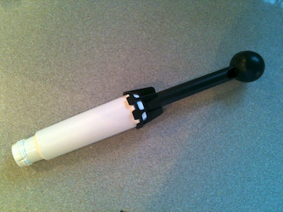
The connection is tight enough so it won’t come lose when screwing the filter in or out, yet the tool can be separated from the filter without having to apply too much force.

Installation tool snapped onto water filter cartridge

With the help of this tool, installing and uninstalling the filter becomes a breeze, but its sophistication goes beyond serving as just a grip extender.

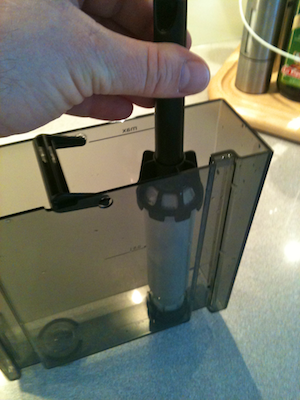
Hand holding the installation tool while mounting the filter cartridge into the water tank

The cage structure houses a slip clutch: When you reach the maximum allowed torque while twisting the filter into place, the clutch will start slipping. This nifty feature effectively prevents you from accidentally over-tightening the filter thread and possibly breaking the tank.

Five Ways to Request an Application Restart

Sometimes when you modify a preference setting in a software application, a restart is required for the change to take effect.

Such settings used to be accompanied by a line of text, stating that “Changes to this option won’t take effect until you relaunch the application”.

Nowadays, applications are more helpful in reminding you of a required restart, or even take care of that for you.

To give you a few examples for how developers address this process, here is a look at five Mac OS X applications that require a restart when you show or hide their icon in the Dock or menu bar.

Growl: Do what I say (if you know what that is)!

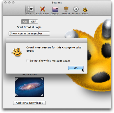
After changing the icon setting in Growl, a dialog box informs you that the application “must restart for this change to take effect”.

Dialog box displayed in front of Growl's preferences window, and stating that a restart is required for a settings change to take effect

When I saw this dialog box for the first time, I expected the application to restart once I would click the OK button. I found that idea irritating, because I thought, “What if I don’t want to restart the app now? Where’s the Cancel button? Why can’t I back out of this?”

And then I did click OK — and wondered whether the program was buggy, because nothing happened.

It took me a while to understand that this dialog box is purely informational. It does not serve as a warning that the app would actually restart as soon as you click OK.

I would find it helpful if the dialog box expressly prompted you to initiate that restart, e.g., by adding something like “Please quit and restart Growl when you’re done adjusting the settings”.

Better yet, provide a Restart button right inside the dialog box.

Mouseposé: Would you like to restart now, or wait a while?

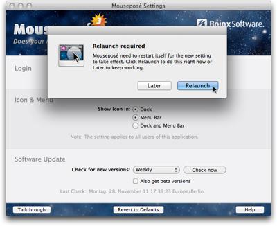
The “Relaunch required” dialog box in Mouseposé does include a Restart button. A button labeled Later lets you defer the relaunch.

Dialog box displayed in front of Mouseposé's preferences window, and stating that a restart is required for a settings change to take effect

If you do click Later, the change you made to the Show Icon radio buttons is retained, even though the corresponding changes have not been applied to the application’s behavior.

For example, when you change the setting from “Dock and Menu Bar” to “Menu Bar”, and click “Later” in the dialog box, the icon is still shown in both locations.

I see two problems in this behavior.

First, you cannot rely on the preferences displaying the application’s actual settings — i.e., how it behaves right now —, nor can you easily go back to the previous settings.

Second, once you’ve deferred the relaunch and worked with the application for a while, you may forget about having changed any settings. If you then relaunch the application, its changed behavior may come as a surprise and confuse you.

Skitch: Lemme take care of that for you

Skitch‘s icon options are similar to Mouseposé’s. Instead of bringing up a dialog box and allowing the user to defer the relaunch, however, Skitch completely automates the process.

https://uiobservatory.com/media/2011/AutoRelaunchSkitch.png” alt=”Skitch preferences window with a note underneath the “show icon in” option, explaining that the application will automatically restart after a settings change if that is required” border=”0″ width=”400″ height=”302″ />

As it says in the info text underneath the radio buttons, Skitch will simply relaunch if the settings change requires it. The user does not have to do anything, except wait for the application to restart.

Tell me where I can find you

The icon options in Skitch and in Mouseposé have something important in common: You cannot hide both Dock and menu bar icons at the same time. The application will always appear in at least one of these two locations.

Other programs support being turned into background-only applications that are completely hidden from the user’s view. Usually the only means to summon these applications is a keyboard shortcut.

TextExpander: Restart now, or else …

TextExpander is one such application that can hide from the user.

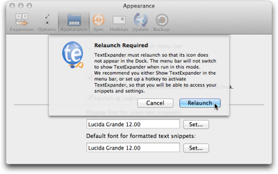
When you select the “Hide TextExpander icon in Dock” option, a warning dialog box will not only inform you that a relaunch is required. It also recommends you define a keyboard shortcut and/or activate the software’s menu bar icon so that you can easily access the application after the relaunch.

Dialog sheet explaining that TextExpander needs to be restarted for a settings change to take effect

Unlike the previously mentioned software programs, TextExpander does not allow deferring the restart. If you choose Cancel, TextExpander clears the option’s checkmark you had just set.

A detail that I found mildly irritating about this dialog box is that its text message always stays the same, regardless of whether a keyboard shortcut has been set or whether the menu bar icon is visible.

I wish the application would provide a bit more guidance to the user by reflecting these settings. E.g., if a keyboard shortcut is set, the dialog box could remind the user accordingly: “To open TextExpander, press Command-Alt-Control-T. You can modify this keyboard shortcut in the Hotkeys preferences panel.”

LaunchBar: Treacherous toggle button at work

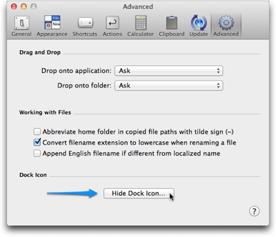
In LaunchBar, you can only show/hide the Dock icon, because the application does not have a regular menu bar to begin with. Instead of a checkbox for this option, LaunchBar uses a toggle button.

I’ve written about potential problems with “treacherous” toggle buttons before, and the one in LaunchBar has similar issues.

LaunchBar's Advanced preferences panel featuring a button to 'Hide Dock Icon…'

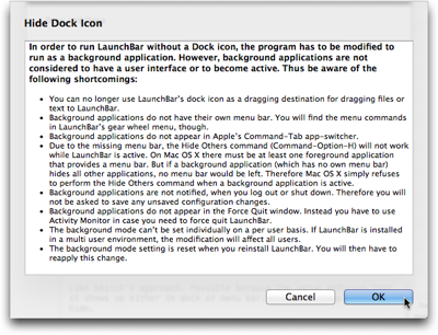
When you click the button “Hide Dock Icon…”, an elaborate message will point out to you what side effects this setting will have.

Dialog sheet in LaunchBar with a long bulleted list outlining the effects that hiding the application's icon from the dock will have

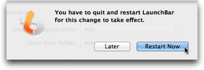
When the button says “Show Dock Icon…” while you click it, this message does not appear. A relaunch reminder appears after every single click on the button.

LaunchBar's dialog sheet to inform the user that a restart of the application is required

The label on the “Hide/Show Dock Icon…” button will change if you defer the restart, so that it can get out of sync with the actual application’s behavior, just like the settings controls in Mouseposé.

What’s more, when you click Later in the relaunch warning dialog and then repeatedly click the “Hide/Show Dock Icon…” button, the bulleted warning list will show up every time you click “Hide …”.

In contrast, the restart warning never appears again until you actually do quit the and then restart LaunchBar.

A personal opinion

Changing the icon settings in Mouseposé and Skitch is risk-free: You will always be able to “find” either application, because they do not allow you to hide both Dock and menu bar icons at the same time. Consequently, there is no need for a warning beyond requesting the relaunch.

In cases such as these, I like Skitch’s approach of simply restarting itself as necessary, as it does not require any decision making from the user. It just takes care of what needs to be taken care of. “Let the machine do the work for you.”

If there is a risk involved in the settings change — like the application becoming “invisible”, etc. — a confirmation dialog is required.

For these, I prefer TextExpander’s approach of forcing the user to make a decision then and there: Accept the settings change and restart the application, or cancel the restart and discard the settings change.

This is the only way to ensure that what’s displayed in the application’s user interface reflects the actual settings in the application’s guts and, consequently, the software’s behavior.