Wheat and Chaff in Software Release Notes

Omni Group, the Seattle-based software artisans, have made a name for themselves by creating applications with very meticulously crafted user interfaces. One of their products, the GTD-inspired task manager, OmniFocus, is among the few applications I simply could not live without anymore.

Who moved my actions?

In a recent release, the developers changed a detail in the way OmniFocus displays its data. Due to this change, some data views in the software would now display many more items.1

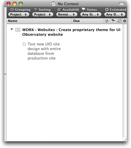
Lists that previously were tidy, and easy to grasp and to handle, …

… were now swamped with data items.

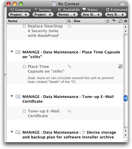
In case you’re wondering: yes, the source data for both of these screenshots is identical! (Note the size of the scroll bar thumb to get an idea of the total length of this list.)

It only took a few days of working with the new version before I got so frustrated with this new flood of data that I decided to send a feature request to Omni Group, asking them to add an option in an upcoming release that would bring back the old behavior.

And I still haven’t found what I’m lookin’ for…

What I hadn’t realized was that the option that I was asking for had already been added — in the very same release as the display change itself. And yet, I had only found it after reading about it in a tweet. Why hadn’t I found that option myself?

Because I could not see the forest for the trees. Twice.

At first, I had searched OmniFocus’ preferences panes for a way to restore the previous behavior, and had come up empty-handed. Then I scanned the menus and failed again in my search, even though the option in question takes center stage in the View menu.

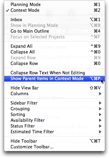
OmniFocus is very flexible in terms of how it displays its data. Consequently, the View menu has lots of items and plenty of sub-menus. What’s more, at the time I did not know the exact name of this option, of course. And so I literally overlooked what I was searching for.

In that sense, the View menu is forest number 1, so to speak. Forest number 2 are OmniFocus’ release notes.

Release notes of novelesque proportions

Omni Group always provide extensive release notes for all of their applications. Generally speaking, I very much welcome such a level of detail, but it also comes at a price: the sheer amount of information makes it almost impossible to filter out the chaff of countless bug fixes and internal code changes.

Consequently, trying to concentrate on the more useful and important tidbits — from an average user’s point of view — like changes in UI or behavior, is tedious and tiring.

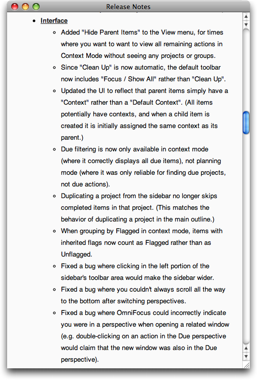
Agile Web Solutions have found a nifty fix for this problem: they label each item in their release notes with colored “New,” “Changed,” and “Fixed” tabs.

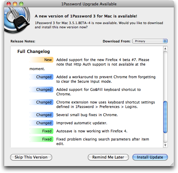
By scanning for the “New” tabs, you can easily discover new features in the software that you may want to try out and, possibly, learn how to master.

“Changed” notifies you of changes to existing features that you may already be using, so that you can quickly learn how to adapt to these changes.

And finally, chances are that you can safely skip any items labeled “Fixed,” unless you have been plagued by a certain bug and you now want to find out whether this bug has been fixed yet.

To make these labels truly useful to the user, it is essential that the categorization reflects how the application has changed from the user’s point of view.

In other words, the “New” and “Changed” labels should only be used for new features and changes that manifest themselves in the software’s UI, and not just “under the hood.”

Any modifications like code optimization, data schema changes, protocol adaptations, etc. belong in the “Fixed” category unless they require the user to take action because of them.

Take, for example, the top-most “Changed” item in the screenshot, “Added a workaround…”. From a developer’s perspective, that surely is a “Changed” item, but since the user will not see any differences in the software’s UI because of this change, it should have been listed as “Fixed.”

For release notes as extensive as Omni Focus’ software’s, labeling each and every bullet item would amount to visual overkill, but separating these bullet items into three categories “new,” “changed,” and “fixed,” should be perfectly feasible.

Detailed release notes are a valuable part of the overall documentation of a software application. Classifying the list items as “New, “Changed,” and “Fixed” would make even lengthy, verbose release notes more easily digestible for average users while, at the same time, keeping the information they contained as detailed as expected by expert users and developers.

Update 2011-02-08: My text notes application of choice, Notational Velocity, provides another example for very cleanly laid-out release notes. These are sorted into three categories: “New Additions,” “Behavior Changes,” and “Fixes.”

NVUpdateReleaseNotes

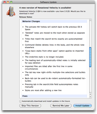
All of the items found in “New Additions” and “Behavior Changes” do affect how the user interacts with the application, and do not reveal any under-the-hood details related to these changes. Such technical details are found exclusively in the “Fixes” section, which refers to, e.g., proxy servers or programming frameworks — terms and concepts that may confuse average users.

Unfortunately, the notes for the update shown here include an important note about compatibility issues, which is placed at the very bottom of the release notes.

NVUpdateReleaseNotesWarning

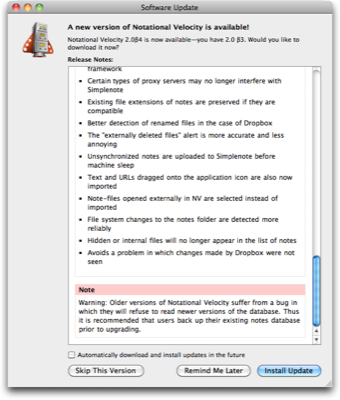
Users who only take a casual glance at the release notes before hitting Install Update will likely miss this note. This pitfall could be easily avoided by placing warnings like this one at the very top of the release notes.


  1. Some details for those of you who are familiar with OmniFocus: With version 1.8, projects and project groups have become actionable, so that both can now show up in lists when viewing “remaining” items.

    Since I use projects and action groups solely for structuring individual actions, I hardly ever assign contexts to either. As a result, after I had upgraded to OmniFocus 1.8, the list of items in the No Context meta-context had become so huge as to be useless: the few actions that did actually require a context were buried in the countless projects and groups that could very well live without one.

    What’s shown in the screenshot with the single action item is the result of selecting “Hide Parent Items in Context Mode” from the View menu, and is identical to what OmniFocus showed prior to version 1.8 for the same source data. 

A DRM-Induced Usability Nightmare

To most media company executives, Digital Rights Management is a means to prevent pirating of their digitally distributed content. Alas, what they rigorously keep ignoring is that the restrictions that come with DRM-“protected” content only affect honest customers, whereas pirates couldn’t care less.

Sometimes, DRM matters are made even worse by technical implementations that are plagued by major usability issues, resulting in an abysmal overall user experience.

A soulful case-in-point

Motown’s legendary studio band, The Funk Brothers, are among my all-time musical heroes. Their story is told in a wonderful documentary, entitled “Standing in the Shadows of Motown,” which has been published on DVD a few years ago. As an enticing bonus, the DVD contains two Windows Media video files with the entire movie in HD format.

Sorry, Mac, you can’t play!

For a Mac user, the most common way of viewing video files is by opening them in QuickTime Player. While the QuickTime media architecture does not have built-in support for Windows Media files, you can make it “understand” Windows Media content by installing a software package called Flip4Mac.

When I tried to open one of the two HD videos in QuickTime player, however, Flip4Mac brought up an error message, stating that it is “unable to play DRM protected content.”

After I had dismissed the Flip4Mac error message, the QuickTime Player displayed another, which, due to the way it was phrased, added some confusion instead of helping me fix this problem.

Flip4Mac is the software officially endorsed by Microsoft for playing .wmv files under Mac OS X. Due to its lack of DRM support, though, the only way to view DRM-infested Windows Media content is on a machine running Microsoft Windows.

And even on that platform, some Windows Media files remain barred from — perfectly legal — access…

Software that’s old and tired

For those rare occasions when I need to test a website in Internet Explorer, I have a very clean and very up-to-date installation of Windows XP SP3, which I run under VMware Fusion on my Mac.

Assuming that I would be able to view the HD videos on this virtual machine, I launched WinXP in Fusion, opened the movie DVD in Windows Explorer, and double-clicked its dvdrun.exe file.

And up came this dialog box:

I wasn’t exactly sure which application this dialog box belonged to, but I did get my hopes up about being able to watch the movie files after all. Until…

Confirming that both of these requirements were met was as easy as launching Internet Explorer 8 and running an online search for “Artisan Entertainment.” One of the results was the Wikipedia entry for this company, which, incidentally, stated that they had been acquired by Lions Gate in 2003.

When an error message is factually wrong as in this case, this is not just a matter of bad design, what with the message being useless for finding a fix for the underlying issue. More often than not, it also means that said underlying issue is much worse than what it says in the error message.

Can I see your PC’s ID, please?

The one remaining option I could think of at this point was to open the movie files directly via double-clicking. As a result, Windows informed me about requiring some kind of update:

Security Update Required

The owner of the protected content which you wish to access requires an update to some Microsoft DRM components (Digital Rights Management) on your computer.

If you click “OK,” a unique identifier and a DRM security file will be sent to a Microsoft service on the Internet. The file will be replaced by an adapted version containing your unique identifier.

This way, the protection through DRM will be increased.

The “More Information” button leads to a page on the Microsoft website, stating the following:

Security Upgrade

Owners of secure content may also require you to upgrade some of the DRM components on your computer before accessing their content. When you attempt to play such content, Windows Media Player will notify you that a DRM Upgrade is required and then ask for your consent before the DRM Upgrade is downloaded (third party playback software may do the same). If you decline the upgrade, you will not be able to access content that requires the DRM Upgrade; however, you will still be able to access unprotected content and secure content that does not require the upgrade. If you accept the upgrade, Windows Media Player will connect to an Internet site operated by Microsoft and will send a unique identifier along with a Windows Media Player security file. This unique identifier does not contain any personal identifiable information. Microsoft will then replace the security file with a customized version of the file that contains your unique identifier. This increases the level of protection provided by DRM.

Note how this text slyly mentions “personal identifiable information” while leaving the user in the dark about what, exactly, the “unique identifier” contains. It neither explains what this identifier’s function is, nor how it “increases the level of protection.”

I’m not sure whether this is just bad technical writing, or whether this text is intentionally vague. In any case, the result of this phrasing is that, to a non-techie user, this request may sound like this: “Before we let you view this content, we’ll have to do something to your computer, but we don’t really want you to know what exactly that is. Just trust us!”

I also wonder whether this is a one-off process that will enable viewing other DRM-“protected” content on this computer in the future, or whether this process has to be followed for every single file or, at least, for every unique publisher/content provider.

A server detour to nowhere

Once the update process had completed, the Windows Media Player launched and started loading the movie file. Instead of simply playing the video, however, a window titled “License Acquisition” was opened:

Apparently, the “security update” did not suffice. I had to go through further licensing hoopla before accessing content that — just as a quick reminder — I had paid for.

It didn’t take too long, and that black void in the window was filled — with a default webview error message:

What you see in this screenshot is the standard error message — “This program cannot display the webpage” — that an IE-based webview will display when it is unable to connect to a server.

This message along with its trouble-shooting tips is, of course, completely and utterly useless at this point, because it is out of context: I am not accessing this website in a browser, but in a native application. Consequently, there is no way I could, say, manually enter the webserver’s URL again. I don’t even know what that URL is.

The only thing I can do at this point is verify that my machine’s Internet connection is working properly. If it does and, therefore, is not the cause for this error, I’m simply stuck.

Considering how old the DVD is — some seven years, or so — I assume that Media Player cannot fetch the required licensing information because the licensing server simply does not exist anymore or that it has moved to another domain.

The proper way to handle this problem would have been to display a message, stating that the software “Cannot retrieve the digital license required for viewing this video. Please verify that your Internet connection works properly, and try again. [OK]”

In fact, why not add an extra dose of honesty to that message: “If the problem persists, you’re screwed, because you won’t be able to access digital content that you honestly paid for. Sucker!!”

Adding insult to injury, I got to see this when I closed the Windows Media player application:

You have acquired a new license for protected content.

You should save your licenses in case the original licenses may be damaged.

Would you like to save the licenses now?

Clicking Yes is followed by a confirmation dialog, listing the path to the license file.

At the end of this annoying little DRM dance, Windows Media Player still added the movie file to its play list as if it were perfectly accessible.

Alas, it wouldn’t start playing, of course. And to nicely round off this awful experience, clicking the Media Player’s play button would start the whole process all over again.

DRM: As tiresome and offensive as it’s always been

Digital Rights Management technology not only puts limitations — and oftentimes severe limitations — on how honest customers can access digital media content they legally purchased. DRM can also be plagued by major usability problems, as seen in this case:

  • The software licensing check is not transparent: the user is confronted with additional windows with confusing wording that, from a non-technical user’s point of view, are not directly related to viewing the content.

  • “Unlocking” the content requires network access: if you try to initially access the content while you don’t have Internet access — on a plane, on a train, in a hotel, etc. — you’re out of luck. Also, you cannot tell from the information provided by Microsoft whether this update is required for each new content file you want to access, or whether a single update will suffice for accessing “protected” content in the future.

  • Due to technical problems, the content may not be accessible at all, and there is no proper information why this is the case. If the licensor goes out of business, you may even lose access to their content for good.

It’s long overdue that media companies stop bossing their customers around once and for all: get rid of DRM technology and let your honest customers enjoy the media they purchased whenever, wherever, and however they want.

You know, just like pirates have been doing all along.

A Hardware Checkbox for Daylight Saving Time

For those of us who live in countries that observe daylight saving time, a little peculiar clock adjustment dance around the house has become a ritual that we perform twice a year. Going from device to device, we adjust all our clocks by one hour.

Most state-of-the-art computer operating systems can do this automatically or at least provide a simple checkbox to de/activate DST.2 Hardware devices like microwave ovens, video recorders, or alarm clocks, however, tend to require much more effort, since adjusting the clock on such devices usually is a tedious affair to begin with.

Enter the “DST hardware checkbox” which I found on an alarm clock radio. Thanks to this switch, adjusting the clock for daylight saving time (almost) becomes a no-brainer.

The switch is mounted on the back of the device, but is still easy to find, and the label is big enough to read. In fact, thanks to its location, it does not add any clutter to the UI elements on the front panel that users access much more often.

The switch could be made even more user-friendly by making its labels more meaningful. Unless you read the clock’s manual or just try out what that switch does, the “ST” label and the little “sun-rise/-set” icon may be a tad cryptic. Also, the settings “-1” and “+1” feel odd to any math-savvy technophile.

While replacing the “-1” with a “0” and the “+1” with “+1h” could be a small step in the right direction, why not go ahead and label the switch like this:

This would also provide a kind of “built-in documentation” for all of those people who, every time “ST” turns to “DST” or vice versa, have a hard time figuring out whether to set the clock forward or back by an hour.

Update 2010-11-19: Via email, Scott McIntyre pointed out a problem with the DST switch:

The tricky bit with the DST switch is that a naive user will just set the clock for the first time without regard to whether the switch is in the right position, since it doesn’t need to be set in the right position to get the clock to show the right time. So when DST time change comes around, the switch will either work magically (woo!), or will set the time the wrong way and be useless.

In that case, I would expect that the user has tried to make sense of how the device works by deducing the controls functions from their labels and/or by playing around with them. Had she read the documentation, she would have learned how to use the DST switch while following the setup process for the alarm clock (assuming that the documentation would explain the switch as part of the “getting started” instructions, that is).

It would make for an interesting usability test to analyze this kind of discovery process: ask people who are not familiar with the device to compile a list of its features, and explain how these features are accessed and operated — without letting them read the device’s documentation.

What happens when they come across a control whose function they cannot deduct from the control’s label: will they play around with it until they find out; will they eventually want to resort to the manual; or will they choose to ignore it altogether? And in case of the latter, will they go back to such a previously-ignored control later on to find out what it does, after all?

In a way, this goes back to two key usability concepts: “visibility” and “speaking the user’s language.”

A device that clearly communicates its feature set to the user through highly visible, clearly labeled controls, makes it much easier for the user to gauge the features’ importance, and decide which of them to use, and which to (consciously) ignore.

In that sense, a user who immediately understands that a particular control is used to switch between “standard time” and “daylight saving time” by just looking at the very switch itself, will either know what to do with that switch, or skip it. In which case I would expect them to ignore it in the future as well.

What’s more, a user who does use that switch in the scenario that Scott describes, would need to “grok” it just once, namely when incorrectly ”adjusting” the clock for DST by throwing that switch. When that happens, it takes a one-time correction of the device’s clock to ensure that it will work in the future.


  1. For a related topic, see my article “What Time is Your Zone?” about selecting a computer’s time zone under Mac OS X, Ubuntu Linux, and Windows.