My password manager of choice is Agile Web Solutions’ 1Password, which holds all of my sensitive information like passwords, credit card numbers, banking data, etc. When you log into a website for the first time, 1Password can automatically grab the username and password and lets you add them to the application’s encrypted database via a little toolbar right inside the browser.
In case this automatic process fails, you can save the login credentials manually. And, for a while, I simply could not figure out how to use this feature…
The application’s documentation describes the manual-save function as follows:
Some websites perform some “tricks” that prevent 1Password from detecting that a login occurred, so the Autosave bar does not appear. When this happens, you can manually save the Login by selecting Save Login from the 1Password toolbar menu
Note how this explanation does not mention at what point in the login process you should select the Save Login command.
When using the auto-save feature, 1Password will bring up the corresponding toolbar after you have entered your credentials and hit the submit button. Based on that experience, I assumed that this order of actions also applied when saving logins manually. But when I tried this approach, 1Password told me that “[n]o logins [were] found on this page.”
So I tried choosing the Save Login command before entering any data, expecting to somehow “arm” 1Password for magically intercepting the login data — even though it had failed to do so while unsuccessfully attempting to auto-save those very credentials. While this did not bring up any error messages, the resulting database items were empty.
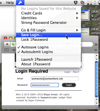
And of course they were empty. When you think about it for a moment, there is only one configuration in which 1Password can definitely harvest the login credentials from a webpage: that is when a) that login information has been entered into the login form on the page and b) the page containing the form is still being displayed in the browser.
Hence, the proper way to use this feature is to:
- Enter the credentials
- Select Save Login
- Hit submit to log into the website
In hindsight, it is painfully obvious that this is the only process order that makes sense. Until my mind adapted the mental model it held for this process, however, I simply did not “see” this solution.
Because 1Password does such a wonderful, near-magical job of compiling data from websites under normal conditions, I was expecting it to always execute something complicated “under the hood.” Consequently, I also assumed that I needed to do something non-straight-forward, more-complex-than-usual when the application needed a little help for saving a specific site’s credentials.
Which goes to show that, sometimes, even perfectly good designs cannot prevent our mind from coming up with mental models that are plain wrong.
In this specific case, though, there is a way to prevent others from running into the same problem. Namely by extending the application’s help file to state “…you can manually save the Login by filling out the login form and, before clicking the Login button, selecting Save Login from the 1Password toolbar menu.”
