If you’re at all interested in the mobile phone ecosystem, you will likely have heard about a recent incident at Avery Fisher Hall: The conductor of the New York Philharmonic Orchestra stopped a concert performance, because of an alarm ringing on an iPhone, whose owner thought he had properly silenced the device.
The New York Times has all the details.
The incident received lots of attention on the Internet, with many a commenter accusing the iPhone’s owner — who has kindly been anonymized as “Patron X” — of being simply too stupid to use a “smart” phone.
As a user interface designer, you can view this unfortunate incident as a real-life usability test. And the iPhone failed this test. Yes, the phone failed, and not the user.
The iPhone fails a usability test
Here is a key passage from the New York Times article:
[Patron X] said he made sure to turn [the iPhone] off before the concert, not realizing that the alarm clock had accidentally been set and would sound even if the phone was in silent mode.
“I didn’t even know phones came with alarms,” the man said.
This user was expecting the mute switch to completely silence the phone.
Since he had just gotten the iPhone the day before the concert, he had to rely on his intuition to make sense of the device’s controls and related on-screen messages.
The mental model he came up with for the mute switch was very simple: “This thing switches the phone’s speaker on or off.”1
His exact thoughts might have been different, but the important part is that he was not expecting the general function of the switch to be any more complex than that.
“It’s ‘all sounds on’ or ‘all sounds off’. Got that!”
This is a perfectly sound expectation of how the mute switch works. Here’s is the reason why: There is no indication in the iPhone’s UI that would contradict this straight-forward expectation. I’ll explain that in a minute.
A conflict of expectations, not a conflict of commands
Marco Armend is among those who disagree.
He argues that the iPhone switch works just as it should, and offers this explanation for what went wrong (emphasis his):
The user told the iPhone to make noise by either scheduling an alarm or initiating an obviously noise-playing feature in an app.
The user also told the iPhone to be silent with the switch on the side.
The user has issued conflicting commands, and the iPhone can’t obey both.
Alas, he’s wrong. Well, kind of.
Marco takes the point of view of a programmer. From that perspective, there are, indeed, conflicting commands that the designers of the iPhone’s user interface had to foresee and address.
Keep in mind, though, that Patron X was not only not aware that an alarm had been set unintentionally in the iPhone’s Clock app.2 He claims that he did not even know that that feature existed on his phone.
The expectation of the user clearly was this: “When I flip this switch, the phone won’t make any noise whatsoever during this concert.”
Therefore, from the user’s perspective, only a single, non-ambiguous command was given: Stay quiet, no matter what!
This is not a case of conflicting commands. Instead, it is a matter of conflicting expectations of how the device operates, or should operate. A classical example of the user’s mental model not matching that intended by the device’s designers.
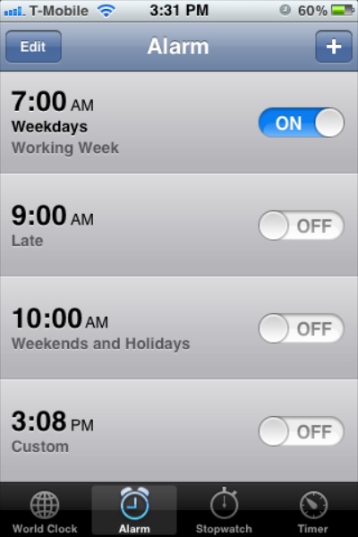
Managing user expectations through status visibility
According to page 11 of the iPhone User Guide (iOS 5 version), the “Ring/Silent switch” operates as follows:
In ring mode, iPhone plays all sounds. In silent mode, iPhone doesn’t ring or play alerts and other sound effects.
Important: Clock alarms, audio apps such as Music, and many games still play sounds through the built-in speaker when iPhone is in silent mode.
Alas, the iPhone’s user interface does not make the user aware of these exceptions at all.
To understand the behavior of the mute switch, you must read the user’s manual. And to apply this understanding, you have to memorize it.
Let’s put this into perspective: A premium “smart” mobile phone whose user interface is considered by some to be the epitome of user-friendliness, requires you to memorize configuration details, because the device does not properly communicate its system status.3
If you take a closer look at the status feedback the iPhone provides with regards to the mute switch, you will find that they do not take alarm settings into account.
When you mute the phone, you feel a single vibration burst, and this info bezel appears on the iPhone’s screen:
https://uiobservatory.com/media/2012/iPhoneMuteSwitch_MutedBezel.jpg” alt=”Screen of a locked iPhone, displaying the “muted” info bezel” border=”0″ width=”300″ height=”450″ />
Un-mute the iPhone, and you get to see this (without any vibration):
https://uiobservatory.com/media/2012/iPhoneMuteSwitch_UnMutedBezel.jpg” alt=”Screen of a locked iPhone, displaying the “_un_muted” info bezel” border=”0″ width=”300″ height=”450″ />
The only setting I could find that affects this behavior is the Vibrate option in the Sounds settings. Un-check that option, and the vibration feedback is now reversed: the phone vibrates when you un-mute it, and stays quiet when you mute it.
The icons shown above look exactly the same, however, regardless of whether an alarm is set, or not.
There is an indication that an Alarm may sound: the clock icon in the status bar. Similar to the bell icons, however, it also has the exact same shape and color, regardless of whether any of the active alarms will actually “make a noise”.
https://uiobservatory.com/media/2012/iPhoneMuteSwitch_AlarmIcon.jpg” alt=”Screen of a locked iPhone, with an arrow highlighting the “clock” alarms icon in the status bar” border=”0″ width=”300″ height=”450″ />
Therefore, if you absolutely, positively must make sure that your iPhone stays quiet while it is muted and the Alarm icon is showing, you will need to open the Clock app and check the list of alarms.
Which list, by the way, again fails to provide visual cues as to which alarms have a sound assigned to it, or which are vibration-only. You can only check this by entering edit mode, tapping an alarm, and checking the Sound setting. Seeing a corresponding icon right in the list items would be useful here.
Of course, you can switch the iPhone off completely, but that would make the very existence of the Ring/Silent switch rather moot. It would also prevent you from quickly looking up a piece of information on the iPhone due to the time it takes the iPhone to cold-start. And if you did do so, you may just be surprised by an alarm going off the moment your log-in screen appears …
As a third option, you could try to memorize which alarms you have set for which times, and whether any of these will play a sound, or not. That is a “suggestion” that you hear a lot from the commenters attacking Patron X over his mishap: “He should have remembered that he had set an alarm that would go off during the concert.”
I cannot begin to explain how stunned I am by these people’s notion that it is perfectly acceptable for a high-tech 21st-century digital device to offload memorizing system status information to its user in this manner.
When designers do not expect their user’s expectations
Given that the iPhone does not present any status feedback — neither visual, nor audible, nor tactile — that it may play a sound while muted, and that a simple control for a simple function should cause the least possible surprise when operated, I think it is perfectly valid and appropriate for a non-expert user of an iPhone to expect the mute switch to work exactly like Patron X thought it would.
I’m not arguing that this simplistic behavior is the most appropriate or the most useful for average users, mind you!
What I am saying, though, is that it is be the most intuitive behavior, i.e., the behavior that a non-expert user would most likely expect to see.
Do tell, little iPhone, what are you up to?
Without hands-on user testing, it is not possible to say which changes to the iPhone’s UI would have been necessary to prevent Patron X from making his mistake.
I have no doubt, though, that more explicit status feedback would have helped immensely.
For example, the “muted” status bezel could display a warning in case an alarm is active that may play a sound.
https://uiobservatory.com/media/2012/iPhoneMuteSwitch_MutedBezelWithAlarmWarning.jpg” alt=”iPhone “muted” info bezel expanded with “Alarm at 8:00pm” warning text” border=”0″ width=”300″ height=”450″ />
For those of us who toggle the Silent mode with the device in their pockets, the iPhone could play different vibration patterns in response to flipping the mute switch.
I assume that the tactile feedback from physically flipping the switch provides sufficient status information about what that switch has been set to. Hence, I don’t think the reversal of the vibration pattern when de-activating silent-mode vibrations is necessary4.
User-testing notwithstanding, the vibration patterns could be modified to vibrate once when the phone is un-muted, stay quiet when it is muted, but vibrate thrice when the phone is muted while alarms with sounds are active.
In other words, “no vibration” means “no sound”. Both vibrations mean “sounds will play”, with the triple-vibe effectively operating like an exclamation mark: “Are you trying to silence me? Well, you better BE AWARE THAT I MIGHT PLAY SOUNDS, you know!”
“Least surprises” is good default behavior
When it comes to making decisions about a system’s default behavior, the “Principle of Least Surprise” is a useful guideline.
In my opinion, the ”Incident at Avery Fisher Hall” is a sign that Apple’s design of the default behavior of the mute switch violates that principle.
Besides adding more explicit status indicators as outlined above, the — again: default — behavior of the mute switch should be to silence all of the phone’s sounds without any exceptions.
To allow users to customize this behavior for their personal preferences, I would test adding an option — “Play sounds in Silent mode” — to the Notification settings.
Every app that can play sounds while the phone is muted, would gain this override option, with its default setting being “Off”.
With a standardized UI for this behavior, the user would have to learn how to set this option for one application in order to understand how to set it for any and all others.
It would also get rid of the guesswork involved with the current design’s imprecise list of “Clock alarms, audio apps such as Music, and many games” by supporting a clear, unambiguous selection of which apps will blare away even during “silent” mode, and which are muted for good.
-
That, of course, was his mental model before his iPhone caused the interruption of the concert. I’m absolutely sure that Patron X has since revised it. ↩
-
Unfortunately, none of the coverage I have read so far addresses how the unintended alarm happened to be set. The fact that it did happen, though, points to a potential UI problem in the Clock application: Why did the user not realize that they had set the alarm? What additional feedback or interactions would have been required to make them aware that they had just set an alarm (presumably) without actually intending to do so. ↩
-
Incidentally, “Visibility of system status” is the top-most item on Jakob Nielsen’s list of “Ten Usability Heuristics“. ↩
-
In fact, I don’t understand what the point of that reversal is, anyway. ↩