Leave Handling Invalid URLs to the Browser

If you enter an invalid URL into a web browser’s address field, the browser will usually display a reasonably helpful error message.

Safari displaying an error message that it cannot open a web page because it cannot find the corresponding web server

Some internet service providers override this behavior by displaying their own, branded search page. Like this one from CenturyLink, which is named Web Helper service.

CenturyLink's could-not-find-web-server window offers a prominent search field and a list of search-based suggestions, but lacks an explicit error message

It is easy to see how such “error pages” provide ISPs with extra income from sponsored search results (read: paid ads).

Nevertheless, they are a poor substitute for the browser’s built-in error handling, because it creates usability problems:

  1. The ISP’s search page masks the underlying error,
  2. it obscures the URL that was entered originally, and
  3. restoring the default behavior is tedious.

Masking the underlying error

The error message that appears in Safari is unambiguous. It says exactly what went wrong in easy-to-grasp language.

Users who may still be confused by the error message can click on the Help button next to the message text to summon a help page in OS X’s Help Center, which lists possible causes for the error, and provides useful instructions on how to fix it.

A page in OS X's Help Center lists possible causes for Safari to be unable to open a web page and suggests fixes

Contrast that to CenturyLink’s page, which completely fails to explain what just happened, and why you are seeing it instead of the web page you originally wanted to visit.

Thankfully, there is a link at the top (and bottom) of the page, labeled “Why am I here?”, that promises to answer this very question.

https://uiobservatory.com/media/2012/CenturyLinkWebHelper_WhyAmIHere.jpg” alt=”When clicking on “Why am I here” in CenturyLink’s search page, a verbose text explains why the page is being shown” border=”0″ width=”400″ height=”250″ />

Compared to Safari’s concise error message, the explanation is much more verbose and purely descriptive. It does not contain a single prompt telling the user what to do now, as in “To fix this problem, do this!”

As a result, understanding what went wrong, and learning how to solve the problem, take more effort.

Obscuring the original URL

Look at what happens to the data, i.e., the URL, that you enter into the browser.

Safari retains the originally entered URL. CenturyLink's Web Helper modifies it

Safari leaves it unchanged despite the error. In contrast, CenturyLink uses a redirect to hop over to their search page, which replaces the link in the browser’s address field.

In cases where the error is caused by a typo, seeing just the original URL that you had entered makes it much easier and faster to verify what you had typed, and to fix any typos that you may find.

Making it tedious to restore the default behavior

As stated in the “Why am I here?” text, you can opt-out of this service. All you need to do is change a setting on the Web Helper service’s preferences page, and click Save.

https://uiobservatory.com/media/2012/CenturyLinkWebHelper_OptOut.jpg” alt=”You can opt out of CenturyLink’s “Web Helper” service via simple change of settings on their preferences web page” border=”0″ width=”400″ height=”250″ />

Once the changes have been confirmed, you will be spared CenturyLink’s Web Helper page and see Safari’s plain old error message, instead.

Changes you make to your CenturyLink settings are confirmed after you click Save

If, that is, you changed the setting on a computer that is connected directly to your CenturyLink modem. Otherwise, the setting won’t stick, even though the website presented you with that confirmation screen.

https://uiobservatory.com/media/2012/CenturyLinkWebHelper_FAQ.jpg” alt=”CenturyLink’s “Web Helper” FAQ explains that for the settings changes to stick, you need to connect your computer directly to the modem” border=”0″ width=”400″ height=”250″ />

What “directly connected to the modem” means is this: Plug one end of an ethernet cable into your computer, and the other right into the modem’s LAN socket.

Depending on your network setup, this is a non-trivial task.

In our home, for example, we use an older Qwest-branded Actiontech M1000 modem. This device only has a single Ethernet port, to which our WiFi router is connected. All of our computing devices go through this router to connect to the Internet.

As an important detail, I have configured our modem to operate in “bridge mode”, and user name and password for signing into our ISP’s network are configured in the router, not the modem.

To follow CenturyLink’s instructions for disabling their Web Helper service, I would need to unplug the router from the modem; connect one of our computers to the LAN socket on the modem; find our credentials for PPPoE access and enter them into the computer’s Network preferences; and then I could finally opt out of the Web Helper service in the hopes that this setting would stick.

What a mess!

The least that CenturyLink could do is to let you change the Web Helper setting via their customer account dashboard. Better yet, just get rid of this page already, or make it opt-in. Why?

Because any state-of-the-art web browser provides better error messages for, and faster and easier recovery from, invalid URLs than customized “error response” pages like CenturyLink’s.

And if you really need to perform a web search for finding the proper URL, there’s a prominent field for that in every browser, anyway.

OS X Lion Acquitted of Breaking the Web

Please accept my apologies for this article’s overly dramatic headline, but how else can you properly respond to the accusation that “Mac OS X Lion’s scroll breaks the web“?

According to the article’s author, Pablo Villalba, a feature that premiered in OS X 10.7 Lion — overloading the scrolling gesture with “Show previous/next page” commands — leads to interaction mayhem (emphasis his):

[This behavior] can be disabled with a system-wide setting from Preferences -> Trackpad -> Mouse gestures (disable two-finger swipe), but my problem with it is that it breaks the web with a non-standard behavior, and gives you no JS API to prevent it.

Thankfully, the situation is not quite as gloomy, because Villalba’s claim is flawed:

  1. The swipe-for-page-turn behavior is not non-standard,
  2. it does not break the web, and
  3. disabling it on a website-by-website basis would be the wrong solution.

Just another way to turn a page

Macs equipped with a multi-touch trackpad have offered a two-finger gesture for scrolling window contents for a few years now.

Under OS X 10.7 Lion, this gesture does double-duty for page turning: If the window contents cannot be scrolled (e.g., if the document is fully visible), or if you have scrolled the content as far as it will go, the gesture will switch from scrolling to jumping to the previous or next page in a document.

This two-finger-swipe-to-turn-the-page behavior is a system-wide feature in OS X Lion, and is supported by several applications. For example, you can use it to turn pages in a PDF document in Preview, or to step through photos in Aperture.

In principle, it is just another way to trigger a common operation. As such, it complements existing keyboard shortcuts and button clicks, and constitutes perfectly standard behavior on any Mac running OS X Lion.

If going to another webpage in Safari via the two-finger swipe is breaking “the” web, why doesn’t Villalba accuse the Previous/Next Page buttons of the same crime?

Admittedly, using one interaction for triggering different commands is always problematic, because the user needs to understand what command will be triggered based on the software’s current mode of operation.

Consequently, the risk of inadvertently moving away from the current webpage via the two-finger swipe is likely higher than inadvertently clicking the Previous/Next buttons. But this is not the core problem here.

The real problem is that, for applications, the web’s page metaphor does not make sense.

Web apps and the page metaphor don’t mix

The original concept for the World Wide Web was based on hypertext, and the data you would view right inside the browser was mostly that: interlinked text.

For this kind of data, a page is a natural “serving size”, and this fact is reflected in the way browsers let you navigate “pages”.

If you’re dealing with an interactive web application, however, the page metaphor does not make sense. For a web application, its user interface is the only “page”, and browser features for handling pages — including the Previous/Next Page commands — are not only meaningless. They can even interfere with the proper functioning of such an app and also lead to data loss.

The problem, therefore, does not lie in how you step away from a webpage running an app — via clicking a button, pressing a keyboard shortcut, or gesturing on a trackpad –, but in the very existence of these page-turning functions.

Keeping things consistent across, and within, apps

To address this problem for his own web application, Villalba would like to disable Safari’s turn-the-page gesture programmatically. He bemoans that, as of yet, there is no way to do this.

As I explained above, though, using this gesture for page turning is not limited to the Safari web browser. It is a system-wide feature in OS X Lion. Therefore, if a user has chosen to use this feature, it should work consistently across, as well as within, applications.

If it were possible to disable the gesture on a website-by-website basis, then that actually would break “the web” for any user who wants to use the gesture.

Instead of letting web developers disable system-features in this manner, I would prefer another solution to the very real problem that Villalba talks about.

An application mode in web browsers

The features and related user interface elements that browsers provide for handling web content as pages is what gets in the way when running a web app.

One possible solution, therefore, could be based on a dedicated “application mode” that is supported across different browsers and invoked by a simple, standardized command or tag.

In this mode, the “Previous/Next Page” buttons would be deactivated, forcing the user to stay on the web app’s page. Selecting the Close Window command would present a warning dialog whose text could be customized programmatically, and the user’s response to it passed on to the web app, before it is requested to quit.

Surely there are other functions that web app developers would like to see being enabled or disabled based on this app setting. Also, I’m not sure exactly how these features should be implemented design-wise: How should the application mode status be communicated to the user?Should there be an override for deactivated functions? Etc.

In any case, the key is that the solution is standardized across browsers and web applications, and that it provides a flawless user experience that does not rely on the design and coding skills of the individual web applications’ developers.

Just as importantly, the application mode must not modify any interactions — like scrolling or page selection in a browser — that may be un-conventional overall, but perfectly common on a specific computer platform.

Is the Menu of the Future Still a Menu?

The team behind Ubuntu Linux is on a mission to redefine how users issue commands to software applications. In a blog post entitled “Introducing the HUD. Say hello to the future of the menu.“, Mark Shuttleworth explains the approach they are researching.

The concept of seamlessly integrating an “intelligent” command line into a modern graphical user interface has been around for quite a while in the form of utilities like LaunchBar, Alfred, or Quicksilver.

These programs allow you to not only find files, but also let you search application-specific data like address book contacts, music tracks, and browser bookmarks, and apply meaningful operations to the search results.

While not quite as powerful, the system-wide search features in Windows 7 and Mac OS X also transcend simple searches based on the files’ names or their content.

What is new about the Ubuntu HUD is its scope: Instead of operating on just files and data, the HUD can also find and execute commands from the application’s menu.

Apple uses a similar approach with a text field inside the Help menu, which lets you search the entire menu structure of the currently active application as well as the app’s help file.

OS X's Help menu displaying its search text field, as well as menu items and relevant help file chapters for the current application based on the entered search term

The key difference between the two approaches is that Apple designed the menu search as an extension of the contextual Help system. As such it complements the application’s menu.

In contrast, the Ubuntu team considers their HUD interface to become a menu bar replacement.

> Say hello to the Head-Up Display, or HUD, which will ultimately replace menus in Unity applications.

As much as I am intrigued by the Ubuntu HUD as such, getting rid of the menu metaphor completely — including keyboard shortcuts — is not just unnecessarily drastic. It is short-sighted and misguided for a number of reasons.

For sheer speed, keyboard shortcuts are hard to beat

When graphical user interfaces were in their infancy, keyboard shortcuts were “invented” to allow users to more quickly invoke commonly used menu commands.

Instead of opening a menu and selecting one of its items with the mouse, you press a combination of a special “command” modifier key and one or more additional keys.1

The key combination for a command is displayed next to its menu item, so you are reminded of it every time you select the command from the menu via a pointing device.

Once you’ve memorized a keyboard shortcut, pressing it takes a fraction of second.

Compare this to the Undo operation in the “Introducing the HUD to Ubuntu” video (which you can watch embedded in Shuttleworth’s article or on YouTube): At 0:50 minutes into the video, you can observe how the user literally types “undo” into the HUD.

It takes the user about three seconds to issue that command!

This single interaction in the video provides sufficient proof that getting rid of keyboard shortcuts would be a seriously foolish move.

The HUD is modal, a keyboard short isn’t (quite)

To ensure that key presses reach their intended destination — either text entry into a document or text field, or a menu command –, the computer needs to be put into a temporary “command” mode when entering keyboard shortcuts.

The machine enters this mode when you press the Command key, and as soon as you let go of the key, it will leave the mode again. When you press the keys that make up a shortcut, Command is merely “first among equals”.

Once you’ve familiarized yourself with a shortcut, you will no longer “build it” key by key — “first, the Command key. Then the Shift key. And now press ‘S’, and there’s Save As…!”

Instead, you will “chord” the command, and it will feel like a single interaction step.

The HUD, in contrast, always requires at least three interaction steps:

  1. Pressing a key (or shortcut) to summon the HUD
  2. Pressing one or more keys to enter the search term
  3. Pressing a key to commit or cancel the selected command

Keyboard shortcuts are non-ambiguous and non-arbitrary

Depending on the search term you enter into the HUD, you may have to make a conscious selection from the list of search results that the HUD presents to you.

If you do have to make a selection beyond accepting or rejecting the “best match” that is automatically pre-selected for you, then that requires another interaction step, possibly consisting of pressing the up or down arrow keys multiple times.

In contrast, a keyboard shortcut always triggers one, and exactly one, command.

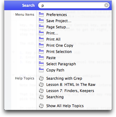
Command-P will always print the current document, but the top match that appears in the HUD when you enter a “P” may just as well be “Preferences”.

Speaking of the match between shortcut keys and commands: Shuttleworth claims that …

> Hotkeys are a sort of mental gymnastics, the HUD is a continuation of mental flow.

At least for basic shortcuts, that claim doesn’t hold water.

When assigning a key to a menu item, developers don’t make random picks. Instead, they carefully choose letters that have a meaningful correlation with the command. Like “Open”, “Save”, “Print”, “Close Window”, or “Quit”.

Note, by the way, how you would start the corresponding HUD search with the exact same letters that are used for the shortcuts!

In cases such as these, where you know exactly which command to execute, the HUD does not offer advantages in terms of learning, recalling, or finding commands.

Some shortcuts use less intuitive letters, like Command-Z for undo, or Command-[comma] for opening an application’s preferences (on the Mac). Once you use them often enough, though, even they will become second nature over time, especially when they are among those commands that are standardized across the entire platform and, thus, trigger the same function in all programs.

Shortcuts and menus leverage motor memory

When you issue a shortcut like Command-Control-F, you will likely not have to consciously place the three fingers on their respective target keys. After you’ve gained enough practice in “chording” the shortcut, your fingers will move into place automatically.

The same holds true when selecting certain commands with the mouse. E.g., on a Mac, the “About [this application]” command’s position in the menu structure is standardized across the operating system.

Therefore, you know (from experience) that your first mouse pointer destination is “somewhere up there in the top-left corner, and it’s the menu directly to the right of that Apple thingy.” Your second destination is the first thing right underneath the menu’s title label.

Even though their positions aren’t standardized as strictly, many other often-used commands — for creating, opening, and saving files, for example — are found in similar locations in every application on the platform.2

Combined with motor memory, selecting a menu item this way can be surprisingly efficient.

Driving around with the mouse? All day!

Here is another quote from Shuttleworth’s article:

> So while there are modes of interaction where it’s nice to sit back and drive around with the mouse, we observe people staying more engaged and more focused on their task when they can keep their hands on the keyboard all the time.

For someone who mainly works with text, that may very well be true.

Watch someone work on non-text data, however, and you’ll observe that, for these people, keeping one hand on the mouse (or graphics tablet, etc.) and another on the keyboard is their standard “mode of interaction”.

This approach is common for any work that involves a continuous mixture of entering keyboard commands and moving objects on the screen, regardless of whether these objects are shapes on a canvas in a graphics editor, audio and MIDI snippets in a track arrange window in a music recording program, or images in a photo management app.

In such cases, you manipulate the on-screen elements with one hand on your pointing device of choice, while using the other hand to enter keyboard shortcuts for copying, pasting, etc., or pressing modifier keys for changing the cursor behavior from dragging to rotation, for example.

Consequently, assuming that keeping both hands on the keyboard at all times is the optimum solution for every type of user is pure nonsense.

For anyone who spends the better part of their working day inside applications like Photoshop, Pro Tools, or Aperture, it would be a nightmare to be forced to use a command line instead of being able to concurrently combine keyboard shortcuts with the extensive use of a pointing device.

The Ubuntu HUD’s content isn’t optimized for its use

When you watch the demo video, keep a close eye on the search results in the HUD. In its current implementation, the HUD provides just a different view on the application’s menu structure. Its output is not optimized for use in this UI control.

For example, at 1:55, the user enters “alic” into the HUD to search for “Alice in Wonderland”. The matching result is listed as “Tools > Bookmarks > Alice in Wonderland”.

What average computer user thinks of an audio track as a bookmark? And how is a bookmark related to tools?

In cases as this, displaying the full menu structure that encloses the “Alice in Wonderland” track, is not adding any useful information. In fact, it even makes decoding that search match confusing.

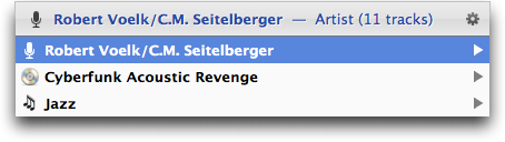
Compare that to how LaunchBar displays a music track: All you see is the track name.

LaunchBar displaying search results as a simple list with a single line of text per item, preceded by an icon indicating the item's data type

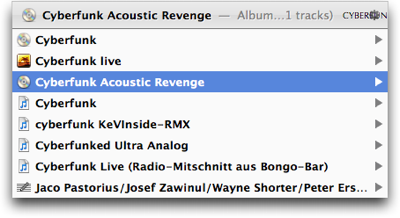
The search results’ types are communicated by simple, reasonably intuitive icons. Unlike the Ubuntu HUD, LaunchBar hides the found items’ meaningless taxonomical overhead from the user.

Using the left and right arrow keys, you can further explore the results list. Moving “right” from the “Cyberfunk Acoustic Revenge” album, you get to see all tracks on that album.

List of song titles displayed by LaunchBar after

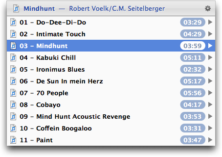
Digging into the selected track, your are presented with the track’s artist, the album that it’s on, and its genre.

Further

The core difference between the Ubuntu HUD (as it is working now) and LaunchBar is that the former is based on a rigid menu structure, whereas the latter searches arbitrary data, and presents it in a way that is meaningful and highly accessible to the user.

Instead of mapping a flattened menu tree structure into a linear text list as demonstrated in the video, the HUD should display its information from a task perspective by:

  • displaying contextual information when it is useful ( “History > Planet Ubuntu” ⇒ “Browser History > Planet Ubuntu”),

  • reducing redundancy (“Bookmarks > Bookmark This Page” ⇒ “Bookmark This Page” or “Edit > Undo Fuzzy Glow” = “Undo Fuzzy Glow”), and

  • speaking the user’s language (“Tools > Bookmarks > Alice in Wonderland” ⇒ “Play Music: Alice in Wonderland”).

In with the new, but do keep the old!

I applaud Ubuntu’s efforts to come up with new ways of interacting with “The Machine”.

The HUD has the potential to combine the best from advanced search technologies like Apple’s Spotlight, smart command line interfaces like LaunchBar or Quicksilver, and new ways to access an application’s menu commands into a single, extremely powerful, yet usable interface element.

Shuttleworth is probably right when he claims that:

> the HUD is faster than mousing through a menu, and easier to use than hotkeys since you just have to know what you want, not remember a specific key combination.

Conversely, though, the HUD isn’t easier to use than a menu nor is it faster than hotkeys.

To use the HUD effectively, you need to have an understanding of which commands it understands, whereas you can browse (and sometimes search) a menu for the commands and functions it makes available.

And while you have to memorize a hotkey in order to you use it effectively, it is much faster to access than entering a command via the HUD.

Therefore, I hope the powers that be at Ubuntu will revise the decision to completely tear out the support for classic menus from their operating system.

Instead, they should let your users decide whether the menu bar is displayed in its standard on-screen location, whether it’s stashed away in the panel, or whether it should be fully hidden from the user’s eye.

Sometimes, new ideas aren’t good enough to fully replace the old ones. But, more often than not, they’re just right to complement and extend them.


  1. The Mac has a dedicated Command key, but other operating systems’ use of the Control key works just as well. For brevity and convenience, I will use the term “Command key” in this article. 

  2. Unless, of course, an app’s developer lacks the required expertise of properly designing a native application for a specific operating system or window manager.