Setting Preferences for Future Features Right Now

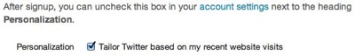
Twitter is joining the group of companies that aim to track their users’ every website visit. In this case, the tracking is supposed to serve as the foundation for “tailored suggestions” about whom to follow on Twitter.

I prefer not to be tracked this way, so I consider it a good thing that you can opt-out from this feature, if you prefer that your web habits not to be tracked.

Webpage excerpt: After signup, you can uncheck this box in your account settings next to the heading Personalization. Personalization: (checkbox) Tailor Twitter based on my recent website visits.

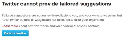
The bad thing is that the opt-out checkbox is missing from my settings page. In its place is a note that this feature is not available to me.

Webpage excerpt: Personalization: The feature to tailor Twitter based on your recent website visits is not available to you.

A similar note appears when I visit my Web Personalization Preview:

Webpage excerpt: (heading) Twitter cannot provide tailored suggestions. (body) Tailored suggestions are not currently available to you, and your visits to websites that have Twitter buttons or widgets are not collected to tailor your experience. Learn more about how this works and your additional privacy controls. (button) Twitter home

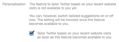
If things remained as they are right now, I’d be perfectly happy. Alas, the note on the Preview page includes the word “currently”, so this feature may be enabled for my account in the future.1

If I were seriously paranoid about Twitter tracking my web visits, I’d have to regularly check my preferences on the Twitter website, just in case the feature is enabled, and Twitter would not notify me about it.

Wouldn’t it be nice if I could simply opt-out right now?

Right now, I know that Twitter is working on a feature called “tailored suggestions”; that I do not want to use that feature; and that I (will) have to opt-out from it. Right now, I’m also viewing my Twitter Settings page. So, if that checkbox were available right now, even though the feature isn’t, I’d be done dealing with tailored suggestions for good. Right now.

Webpage excerpt: Personalization. The feature to tailor Twitter based on your recent website visits is not available to you yet. You can, however, switch tailored suggestions on or off now. The setting will be honored once this feature becomes available to you. (checkbox) Tailor Twitter based on your recent website visits as soon as this feature becomes available to you

As it is, though, I will have to wait and see whether this feature will become available and, if so, hope that Twitter will notify me about it — or that I remember to check the site myself every now and then, lest I be tracked after all.


  1. I live in Europe, and the tailored suggestions FAQ explicitly mentions that “[i]f you’re in Europe, the feature is not currently available to you […]. Thanks for your patience.” They do not elaborate, however, on whether this has anything to do with European privacy laws, etc., nor whether or when they plan to introduce the feature in this region. 

Sometimes, “Pretty Similar” is Not Similar Enough

My favorite sports news app is Sport1, which is offered by the German TV channel of the same name. Its current version covers eight sports genres like soccer, Formula 1, or U.S. sports.

The app presents these genres, plus four additional functions, as icons on a screen that looks very similar to the standard iOS Springboard for launching applications.

Sport1_MainScreen.jpg

A total of twelve icons is spread out over multiple screens, which can hold up to six icons each. To flip between the screens, you use the familiar horizontal swipe gesture.

The app also lets you re-order these icons, so that you can compile your favorite sports genres onto one screen: As you would in Springboard, to enter editing mode, you tap-and-hold any of the icons until the latter start wiggling.

While in editing mode, you drag the icons around to arrange them. And when you’re done, you tap the “Anordnung speichern” (“Save Arrangement”) button to save your changes.

Sport1_MovingIcon.jpg

As you can see, the Sport1 app very closely mimics both the appearance and the behavior found in Springboard. There are, however, two noticeable differences: In addition to the swipe gesture, the app supports navigation arrows, and icons are automatically re-arranged if you leave any empty spots on a screen.

Turning helpful arrows into sources of confusion

The navigation arrows can be hidden via a checkbox — “Pfeile anzeigen” = “Display arrows” — that appears while the app is in edit mode.

If this option is checked, the arrows appear in the place of a regular genre icon. Unless the app is in editing mode!

While in editing mode, the arrows are always hidden, regardless of the setting for this option. This leads to an annoying problem: If you fill all six spots on a screen, all icons are re-arranged as soon as you leave editing mode to make room for the navigation arrows.

Sport1_SixIconEditBefore.jpg

What you see in the screenshot above will, after exiting editing mode, look like this: The Basketball icon had to move to the next screen to allow the right-arrow to be displayed.

Sport1_SixIconEditAfter.jpg

One way to address this would be to also display the arrows in editing mode. In that case, it would be essential to properly restore the previous icon arrangement when checking and un-checking the arrow option, though.

Every empty seat must be filled

A useful way to arrange app icons on an iOS device is to use “themed” screens. E.g., you could have a screen for games, one for communication apps, one for utilities, etc.

This works just fine, because Springboard won’t “re-flow” all icons to completely fill all spots on a screen. If you wish, you can have just a single icon on a given screen.

Not so in the Sport1 app.

Let’s say, you’re mainly interested in Formula 1, soccer, and U.S. sports2, and you would like to place just these three genres on the app’s main screen. The app does let you configure that arrangement, as you can see here:

Sport1_ThreeIconEditBefore.jpg

As soon as you leave editing mode, however, the app just re-flows all icons so that the three empty spots in the bottom row are now also filled.

Sport1_ThreeIconEditAfter.jpg

Oddly enough, this does not happen when the navigation arrows are active. In that case, the icons are not re-flowed.

Sport1_ThreeIconEditAfterWithArrow.jpg

Why should the decision about whether you would like see those navigation arrows have any impact on how the icons are (re-)arranged? Is this just a bug, maybe?

Mimic, or don’t mimic. There is no “sort-of”.

The icon screen in the Sport1 app re-creates the iOS Springboard’s appearance and basic behavior so closely, that a user can reasonably expect it to work exactly like the “original”.

Expanding and modifying the original’s behavior, however, may confuse users because the way the Sport1 app works differs from what they’ve come to expect based on their experience with the original “role model”, Springboard.


  1. Go Niners! 

Don’t Tell Me What I Don’t Need to Know

This afternoon I was getting some writing done, when, out of nowhere, this dialog box appeared:

A standard OS X dialog box, stating that the application Little Snitch is up to date

At the time, the application that is mentioned in this message was not even running!

Little Snitch is a network utility, and it consists of a “daemon” — a software program without a user interface which runs in the background all the time — and a regular application for configuring the software. It’s the latter that allows checking for updates.

I’m not sure whether a bug caused this dialog box to appear3, but, in any case, it provides a great example for what an application should not bother its users with: Anything that does not require the user’s immediate attention, unless she explicitly requested a piece of information.

Don’t bother me unless it’s important and urgent

What’s it really say in that message? “This application is up-to-date. There’s no need for you to do anything at all about this right now. Just sayin’.”

Although this message was anything but important, it showed up front-and-center on my screen, thus interrupting my workflow, and making me lose my focus and concentration.

Compare this to warnings about my laptop’s battery being low, so that the machine will go into hibernation within a few minutes; or about the machine’s hard drive running out of space, potentially preventing me from saving any more files very soon.

In both of these cases, the computer makes me aware of something that could have a serious impact on my ability to properly use the machine. I must do something about it, and I better be quick.

These kind of critical warnings are annoying, too, but if they didn’t appear, the consequences would go well beyond annoying.

Imagine, however, what it would be like to use a computer that also “warned” you of the fact that everything’s OK! “There is lots of space on your hard drive!” “Your battery is fully charged now!” “There is still enough space on your hard drive!”

Unless you explicitly request a piece of information, e.g., by selecting the Check for Updates menu item, you should never be confronted with a dialog box that merely states that “everything’s fine”. There’d be so many of them, you wouldn’t get any work done at all.

What dialog boxes and secret documents have in common

In a way, well-designed dialog boxes are like confidential documents: They should be presented strictly on a “need-to-know” basis only. If the user doesn’t need to know now, software should just remain quiet.

In cases where there is a need to convey non-critical system status information, status icons or status bars are a much less intrusive and more user-friendly approach.


  1. Automatic update checks were added to Little Snitch in the current version 2.5, which was released only last month. Therefore, it is, indeed, likely that this dialog box’ appearance is a bug.