A Candle That Comes With a Manual

Using a candle should be as easy as placing it on a non-flammable surface or candle holder, lighting it, and enjoying its flame’s warm glow. Well, maybe not: it must be much more complicated, or there would not be a need to place such an extensive warning label on a candle. (Right?)

CandleWarningLabel

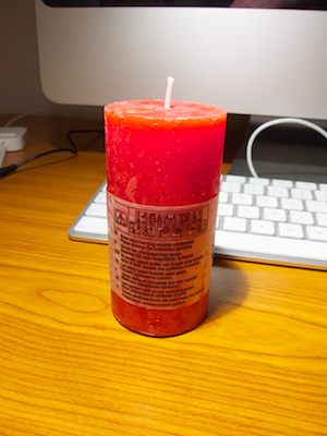
You won’t be able to read this label by candlelight

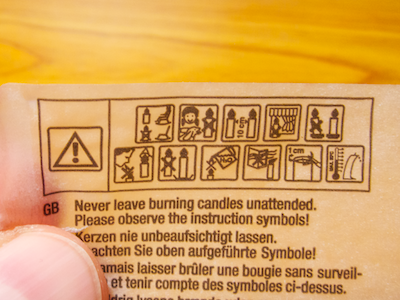
Besides giving the welcome hint that the “packaging” needs to be removed before use, the label states in tiny letters that the user should “Never leave burning candles unattended. Please observe the instruction symbols!”

CandleWarningLabelRemove

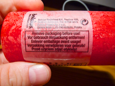
Have a look at these “instruction symbols,” which are placed right above the warning message. They are even more difficult to make out than the warning’s text.

CandleWarningLabelCloseup

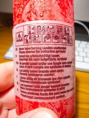
The designer must have invested quite some thought into the symbols’ design, because it is, in fact, possible to interpret the meaning of most of them fairly easily. If, that is, your eyesight is good enough to properly see the symbols. Which begs the question: what is the point of this warning label, then?

Detailed warnings versus common sense

If there is a requirement to include the warnings — e.g., for legal regulations applicable in a geographical region where this specific type of candle is being sold –, then the text as well as the symbols should be much bigger to ensure that even users who lack 20/20 vision can easily see them and also reliably understand their meanings and intentions.

CandleWarningLabelSymbols

If, however, there is no such requirement, the label should not be there at all — except, maybe, to identify the candle’s maker and model. Pointing out all the possible hazards associated with burning a candle, however, only makes that activity seem more dangerous and more mysteriously obscure than it is.

The real issue is that excessive warning labels like this one condition people to rely on explicit instructions instead of trusting their own common sense.

Update 2011-02-09: My good friend FJ told me that he had seen similar warning labels on French and English candles. Consequently, he also assumes that some kind of formal regulation must be behind the symbols.

Apply warning labels to your candles — It’s the Law!

And he’s correct: the symbols found on the candle are based on the DIN EN 15494:2008 industry standard, which has been developed by the European Committee for Standardization and, therefore, has legal force in the entire European Union.

In the introduction to the standard, which can be viewed in German on this Chinese website, it says1:

> The risk of a fire caused by a candle due to inappropriate use can be reduced to a minimum through suitable warning notices. These warning notices should be easy-to-understand and language-independent.

At a minimum, each candle must carry a mandatory set of four warning notices:

  • “never leave a candle burning unattended”
  • “keep the burning candle out of the reach of children or pets”
  • “keep burning candles at least X cm apart”
  • “do not place the burning candle on top of or near flammable items”

The standard defines another eleven notices, e.g., to instruct the user to shorten the candle’s wick to a certain maximum length before lighting it. The candle manufacturers can freely decide whether they will include any of these on their product’s warning labels.

The warning notices can be applied as symbols or as text and …

> … have to be applied to the packaging or the product itself in a visible and easy-to-read manner. If applying the safety notices to the packaging or the product itself is not feasible for practical reasons, user information must be on hand at the point of sale.

Using the candle shown in the photos above, the symbols surely are visible, but — as I had mentioned before — their print size is so small that I doubt that users with average vision will be able to easily make them out, and the same applies to the text.

What’s more, I wonder if the committee members who authored the industry standard have, in fact, carried out user testing to verify that the symbol’s meaning is easily understood and non-ambiguous.

A detour to TV medicine warnings

Until a few years ago, ads for medicine shown on German TV had to include product-related warnings, which were usually displayed at the bottom of the screen. Due to the sheer volume of information that needed to be displayed in a few seconds’ worth of ad time, however, the text’s font size sometimes was too small to be rendered properly given the TV screen’s native resolution, let alone make them readable from normal TV viewing distances.

Nowadays, instead of including the information itself, each medicine ad is followed by the line:

> “To learn about [this product’s] risks and side effects, please consult your physician or pharmacist.”

This message is displayed as reasonably large text on screen and is also read out loud, thus also making it more accessible for vision-impaired people, as well.

When you cannot include usable information, refer the user to another source

This approach of referring customers to an expert instead of including important information in a form that makes it borderline incomprehensible, inaccessible, or incomplete, may also work for candles.

As quoted earlier, the warnings defined by the industry standard can also be made available at the point of sale. Instead of featuring the minute symbols and text on the candle’s label, why not include this text on the label…

> “Never leave burning candles unattended. To learn more about proper handling of candles, ask for the leaflet ‘Burn candles safely!’ at the store where you bought this product.”

… and provide a well-written, easy-to-understand, and easy-to-read flyer about how to safely handle candles at each point of sale?


  1. I translated the quotes from German to English myself, so they will probably differ from the official English version of the DIN EN 15949:2008. 

Affordances of a Traffic Circle

When an intersection was turned into a traffic circle in the East German city of Erfurt, money must have been tight: except for painting a circle on the ground and adding traffic circle street signs, everything else seems to have been left alone. Unsurprisingly, the new arrangement does not quite work as expected.

Flat street surfaces “afford” driving over them, and that is what many an Erfurter driver does when passing through this traffic circle. Also, the traffic circle signs have been mounted right beneath the yield signs, and judging from the video, both seem to have been mounted rather high up the pole, making them easy to overlook.

Compare the scene from the video with this traffic circle (photo by Richard Drdul):

ProperTrafficCircle.jpg

There simply is no affordance to drive straight through the center of this traffic circle — unless you don’t mind to re-shape parts of your car while doing so. If that still is not obvious enough for some drivers, the signs are placed at eye height and in the line of vision when approaching the traffic circle. Drivers literally have to see them.

Even when on a budget, there are ways to design a traffic circle that is (more or less) impossible to miss. All it takes are big, high-contrast arrows on the ground plus slightly raised curbs around the inner section, as seen here (photo by Zork Minos):

ProperTrafficCircleSimple.jpg

Which Floor Should it be?

Another person and me get on a hotel elevator. I press the button for my floor, she presses the one for hers. When the elevator stops at the floor that she selected, a very puzzled look appears on her face. Then she presses the button for one floor higher up. Apparently, she was unsure what button she had to press to get to the desired floor.

Here’s the control panel from that elevator:

ElevatorButtonPanel.png

Look at it in its entirety, and you can easily see that the button for a certain floor is positioned to the right of its label.

The curse of a regular grid

If you focus in on any buttons that are located near the center of the panel, however, it becomes difficult to tell whether the button on the left or on the right of a label is the one to press to get to the desired floor.

ElevatorButtonPanelCloseup.png

Both labels and buttons are positioned on a more or less regular grid, so you cannot easily make out the pairings between the two.

If, once you press a button, the number on a label would light up, you could at least quickly see whether you had made the appropriate choice. Instead, rings around the buttons light up to confirm your selection, as seen is the top-most photograph.

Even more challenging for vision-impaired users

The labels feature braille numbers underneath the digits, which explains the digits’ odd vertical offset. Despite this welcome feature, I would expect blind users to have even more problems with using this panel, because there are no tangible connections between the labels and the buttons.

So, to understand which button belongs to which label, blind users would have to first find the edges of the panel, understand that the panel starts with label plaques on the left and ends in buttons on the right, and, keeping this knowledge in mind, find the right label/button pair on the panel.

Let’s closure this case

Let’s assume that the designers chose the regular grid layout on purpose. In that case, adding more horizontal space between label/button columns to make the panel more user-friendly probably is not an option. Placing the labels right on top of the buttons would also improve on this design, but how about another approach.

With a thankful nod to the Gestalt Law of Closure, I would change the shape of the number labels like this:

ElevatorButtonsRedesign.png

This firmly groups paired labels and buttons together visually. A grid of these labels and buttons with the same spacing as the original would look like this:

ElevatorButtonRedesignGrid.png

By adding a bezel to the label plaque, or by embossing the entire plaque, blind users could also feel the connection between label and button.

Placing the braille dots between the number and the button would achieve two things: the vertical position of the number is more visually pleasing, and after reading the braille pattern, blind users’ fingers would automatically end up properly on the neighboring button.

Update 2011-02-08: This building sports a total of six guest elevators, but they are not created equal: one of the six can take its passengers to an additional floor that remains hidden from view in the other five elevators.

After using the elevators for a few days, my mind had developed a mental model of them, part of which postulated: “To go to the lobby, press the single button that is located, horizontally centered, right below the large panel of buttons.”

One day I got on the elevator and, relying on this mental model, intuitively reached for the 1st-floor button and pushed it as I would normally do. Only this time, I realized that nothing was happening: out of the corner of my eye, I noticed that the ring around the button did not light up even after I had pushed the button repeatedly.

Taking a closer look at the button panel, I now saw that, on this one elevator, there was an additional button labeled B1. Not only was this button placed on the same line as the one for the first floor: in an attempt to preserve the panel’s more or less symmetrical appearance, the 1st-floor button had also been moved one column to the right.

ElevatorButtonPanelPlus1B

As I have written previously, moving controls in a user interface oftentimes creates annoying usability problems. Although the effects in this case are not quite as severe as the ones explained in that earlier blog post, the button for the 1st floor should be found in the same location on all six elevators.

If the majority of users doesn’t have access to a certain feature, hide it

As for the B1 button, I assume that hotel guests ususally cannot even go to that floor. Otherwise, why did the button refuse to accept my (erroneous) request to go to that floor? If it is necessary to somehow “unlock” the B1 floor before being able to use the associated button, why implement it as a button in the first place?

By looking and generally behaving like any other floor button, users expect that it can also be used just like the other ones.

If using a key in one of the locks seen on the panel is required to successfully use that button, one option would be to implement its functionality as part of that very lock. Assuming that this lock controls more than just the B1 floor button, it could have three positions: 1 – special access locked, 2 – special access unlocked, 3 – Go to floor B1. Position three would operate just like the “start engine” position on a car’s ignition lock, i.e., after selecting it, the key would be pushed back to position number 2 by a spring.

This implementation would remove that ominous B1 floor from the users’ view and mind, and prevent accidentally hitting this button when all you want to do is go to the lobby.

Update 2011-02-28: Different hotel, different elevator — different button labels!

This elevator sports much fewer buttons, making it possible to grasp the entire button panel at a single glance. It is much less challenging to make out the pairings between buttons and labels in this case.

And yet, whoever designed this, seems to share my point of view that labels should provide a strong visual cue about which button they belong to:

ElevatorPanelLozingeLabels

What I find surprising, is that the buttons have been crammed together like this. Laying out the floor buttons in a six-high/one-wide column would have made for better mapping; adding more space between the floor, door, and emergency buttons would have created a stronger division into the three functional groups.